
Amicomed
Keeping your blood pressure low
YEAR + TIMELINE
2015 /
8 weeks
AGENCY
Frog design,
Milan studio
TOPIC
Healthcare, Blood pressure, Coach
MY ROLE
UI design,
Documentation
TEAM
Team lead,
UX designer
OUTPUT
Mobile app,
Prototype
¶ Kick-off
Oh man, this was my first professional UI/UX project, made at Frog design, and, oh gosh, 2015 flew! It was through this project that I saw how a team works together, how many people are involved in a digital service creation, and how UX and UI designers work hand-in-hand. I still remember pretty much everything.
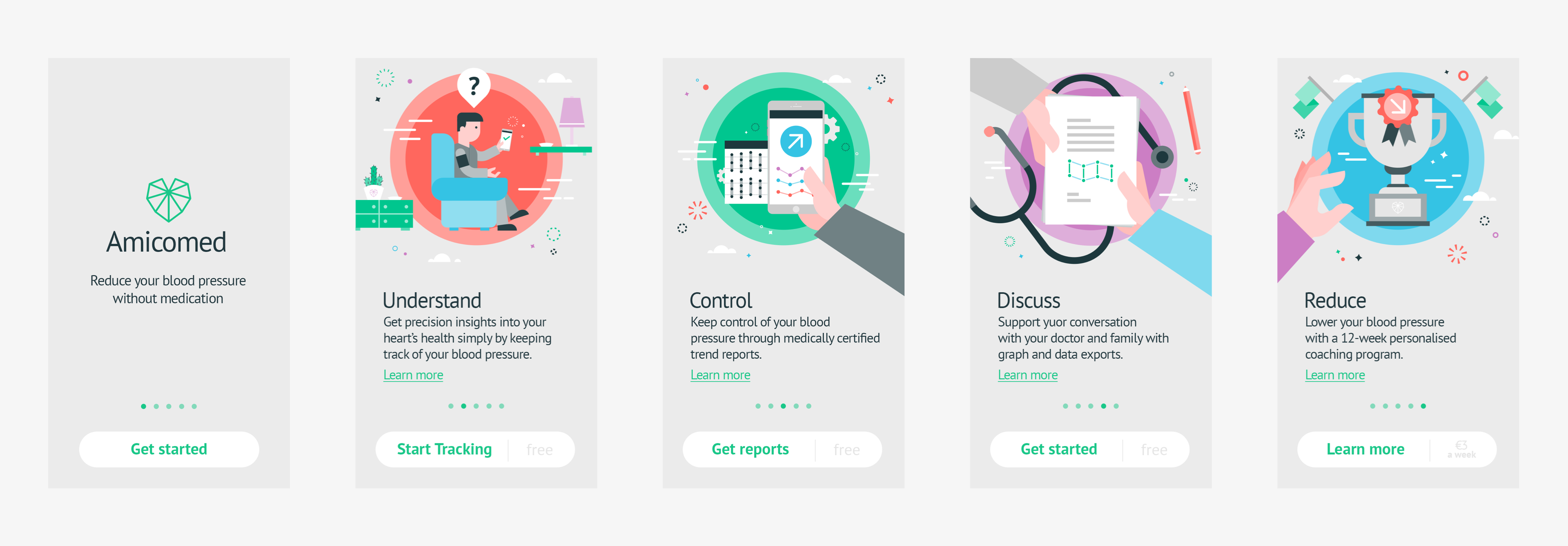
The startup, with Italian founders and based in Switzerland, is focused on medication-free hypertension treatment . The app combines digital, innovative monitoring – fully automatic, personalized, and scientifically-proven – with tangible actions for a complete lifestyle change.
Based on a 3-month program – created by cardiologists, nutritionists, personal trainers, and biomedical engeneers – the user is given weekly goals, and guided in diet, physical activities, and blood-pressure measuring (3x per day).
MY CONTRIBUTION
I joined the design team after the research phase, participating in the first UI sketches. I delivered detail-screens regarding main features and important flows. I provided assets for developers, helped the team with presentations, namely related to the visual side.
ONBOARDING
Introducing the main functionalities
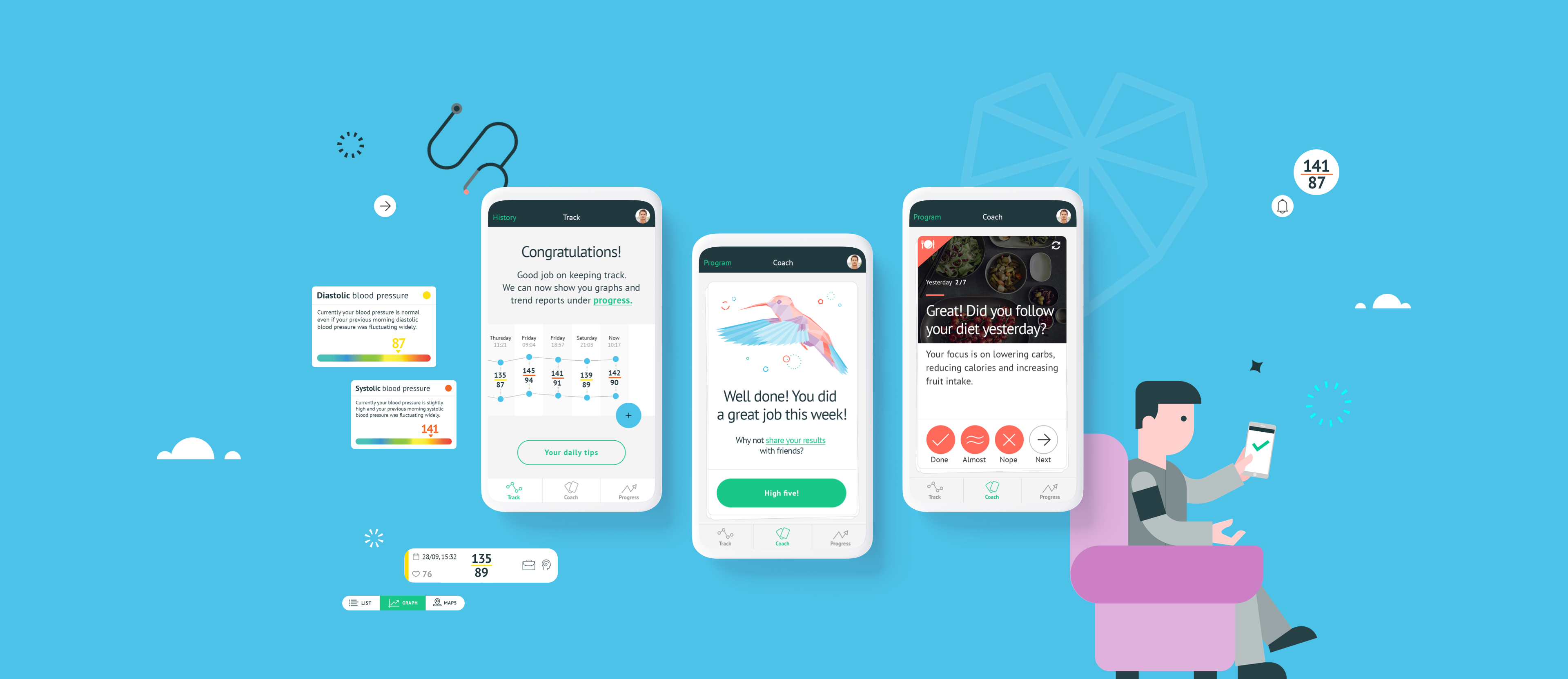
On their first use, the user will discover key features through an illustrated onboarding. Throughout the app, we utilized cartoonish illustrations to create a more playful look and feel for users who are, by definition, stressed.
"TRACK" SECTION
Let's measure throughout the day!
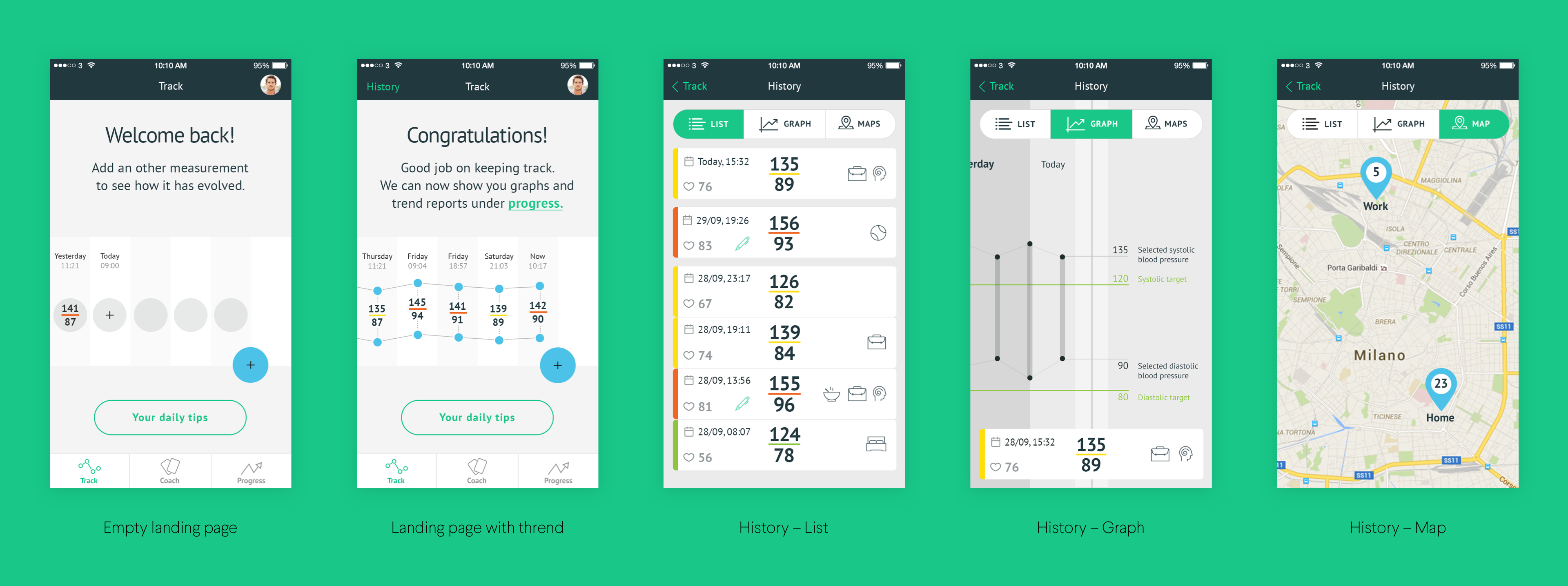
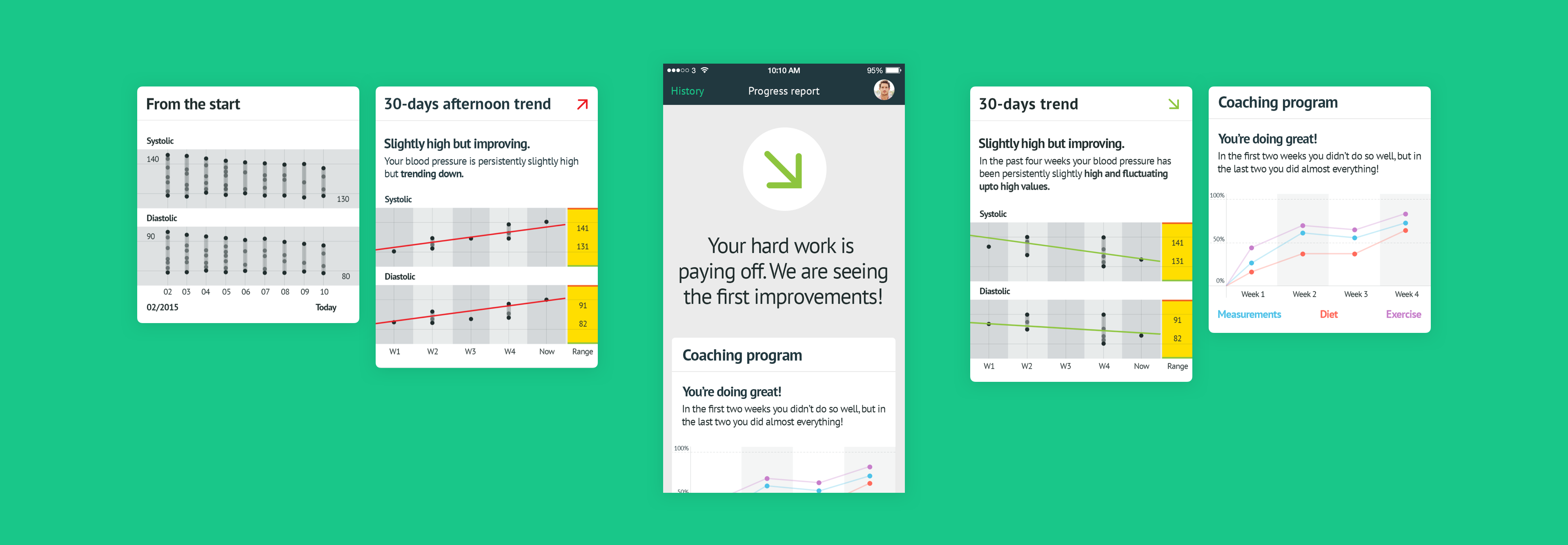
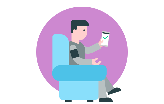
The user lands on the first tab: the tracking section. He can add as many measuraments as he wants – doctors suggest at least 3 measuraments per day. After the user logs five assessments, the app will reveal a trend explained on the "History" page, which can be analyzed from multiple views.
MEASURAMENT
Easy peasy tracking
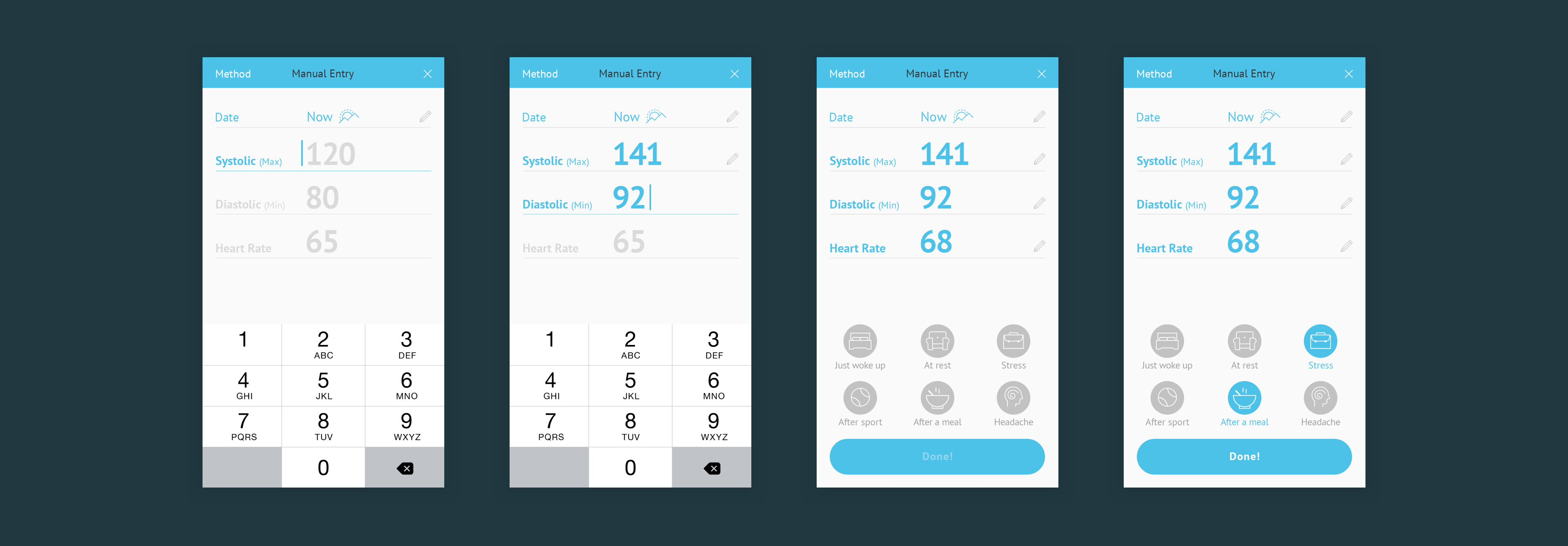
To add a measurament, the user taps the "+" button on the landing page, and a guided flow will help him to fill in the data – the more details the user adds, the more accurate the doctor's advice will be.
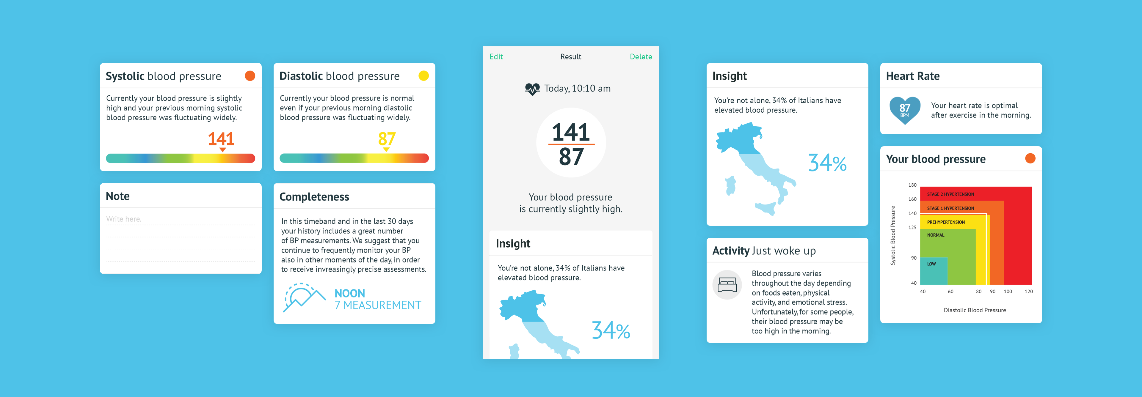
Measurement result
After each measurament, the user will see a "Result" page, with meaningful and uplifting insights to help him understand his disease. The user will better grasp his results, notice fluctuations in pressure, and even get helpful statistics.
THE PROGRAM
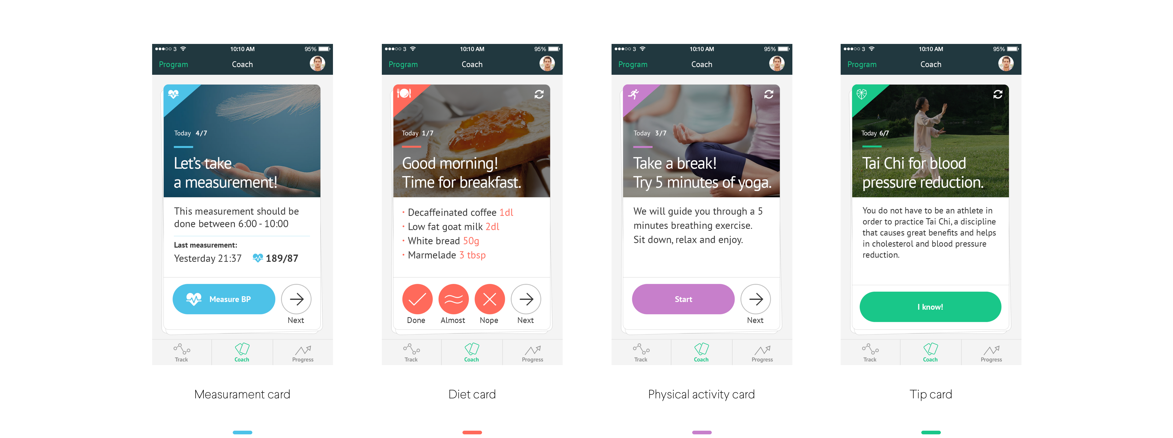
How the coach lowers blood pressure
The digital coach will guide users through the entire experience, providing a detailed program for blood pressure tracking, diet (all meals), physical activity, and general health tips. We decided to go with a card carousel for visualizing all these different tasks, making them recognizible by color: light blue for blood pressure, coral for diet, light purple for physical activity and teal for tips.
In order to track all the activities, the app will prompt different task cards based on the time of day: for example, if it's early morning, the user should measure his blood pressure, and then follow the recipe for breakfast.
"TANGRAM" GAME
Let's give "aha" moments to the users
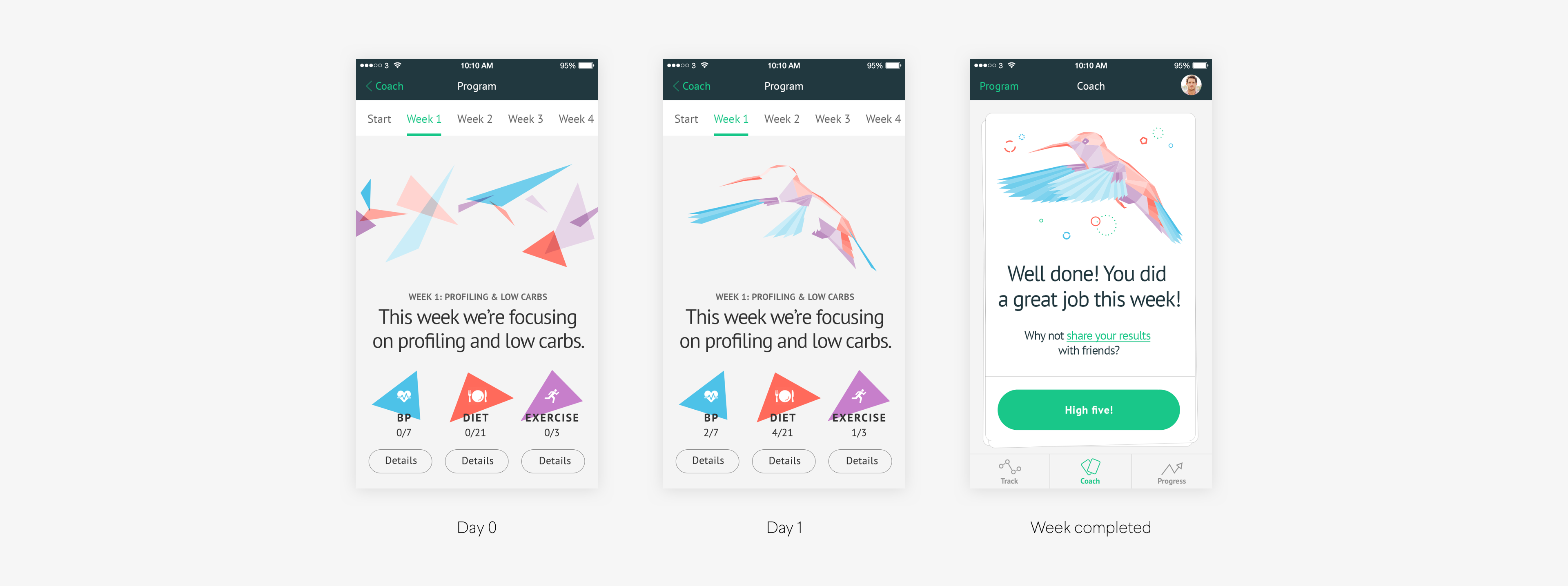
Starting a new lifestyle is hard, so we wanted to add some satisfaction to boost moral. The solution: gamification. Every week, if the user completes their tasks, they earn pieces of "tangrams". At the end of a successful week, an animal is revealed. If a week is unfinished, they will see only random shapes.
PROGRESS
A deeper health analysis
The user can access a premium section, the "progress" tab, discovering deeper and more specific information related to his health and high-blood pressure condition.
Credits
Final thoughts
DESIGN
Thomas Sutton, Chief Designer Officer
Oskar Göransson, Senior Visual Designer
Alec Momont, Interaction Designer
SPECIAL THANKS
Giorgio Baresi, Creative Director
Steven Boulton, Senior Visual Designer
They say "you never forget the first time." I couldn't agree more. I was frequently delighted with everyday learnings and revelations. Tons of designers decide against including their first projects in their portfolio, while I strongly prefer to show all my entire work history.
Every project I work on increases my knowledge and skill, and Amicomed specifically, marked the beginning of my visual designer profession. I'm only sorry the app wasn't developed exactly as we designed, but I'm a "glass half-full" kinda woman.
Wanna see more?
Stove CookFood & Groceries, App
AirpenHealthcare, App
GoMobility, App
TabasReal Estate, Website
GrowBitEducation, App
Banco BPMFinance, App
WeBankFinance, App
GeneraliInsurance, Website
BPERFinance, App
Developers ItaliaPublic Services, Website
Docs ItaliaPublic Services, Website
Domicilio DigitalePublic Services, Website
Carrier PigeonNews & Information, App
Axa ItaliaInsurance, Website
DacadooHealthcare, Mobile App
BancoPostaFinance, App
Poste ItalianePostal Services, Website
AmicomedHealthcare, App
Buddy,
thanks for
scrolling
📬 WORK INQUIRIES
Got a project or an idea? Don't be shy, drop me a line, and let's make something cool!
📎 LINKS
© 2015–2022 Stefania Pizzichi
Special thanks to Aqquadro, Chobu, Shelby Morrison | Typeface Larsseit
Made with Semplice | Built with blood, sweat, and tears 🙌
