
Docs Italia
Making public projects effective and transparent
YEAR + TIMELINE
2018 /
4 weeks
CLIENT
Digital Team of
the Italian Government
TOPIC
Public Services,
Public Administration
MY ROLE
UX/UI design,
Illustrations
TEAM
Team lead,
Developer
OUTPUT
Responsive website,
Asset for devs
¶ Kick-off
For the "Digital Team of Italian Governement", I worked on "Docs Italia", which is considered Developers Italia's sibling.
What does it mean? As "Developers Italia" is a platform for developers who code Italian digital services, "Docs Italia" is a public repository for Public Administrations to publish technical and administrative documents – citizens have the ability to read and comment on them – following the philosophy of Open Government.
The project was driven by the concrete need to make public projects more effective. It introduced instruments that can help hundreds of thousands of people – both technicians and administrative staff – be able to find everything they need in an interactive format, open to comments, and easy to consult.
So, what kinds of documents does "Docs Italia" contain? These documents are related to all digital transformation projects, like: national registry, citizen digital identification, Public Administrations' online payment system, guidelines for data management, digital administration codes, etc.
MY CONTRIBUTION
After an initial briefing, I receveid high-level wireframes from the project lead. My job consisted of transforming them into final screens/flows, noting every detail and preparing them for delivery.
On the visual side, the only requirement was to use the Italian UI Kit, with the goal of maintaining consistency across different projects related to the "Digital Team of the Italian Government".
VISUAL IDENTITY
Respecting the "Italia UI kit"
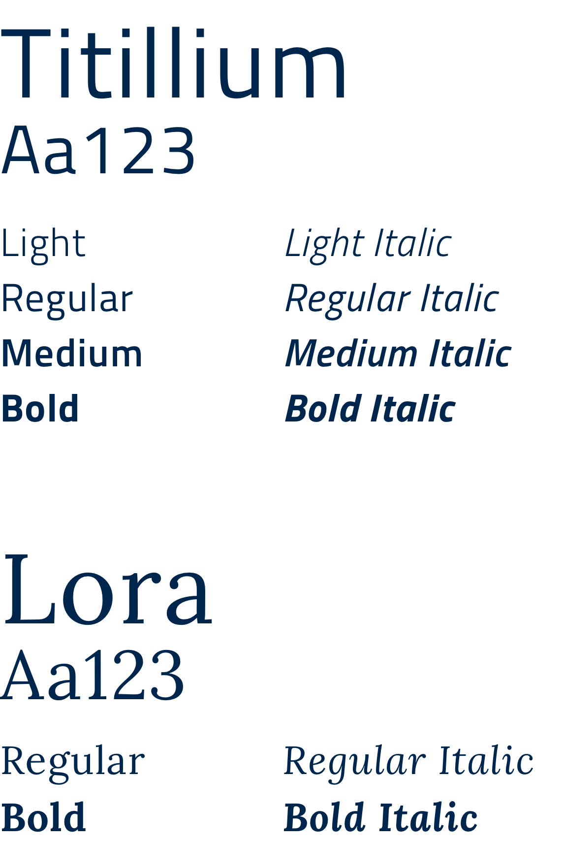
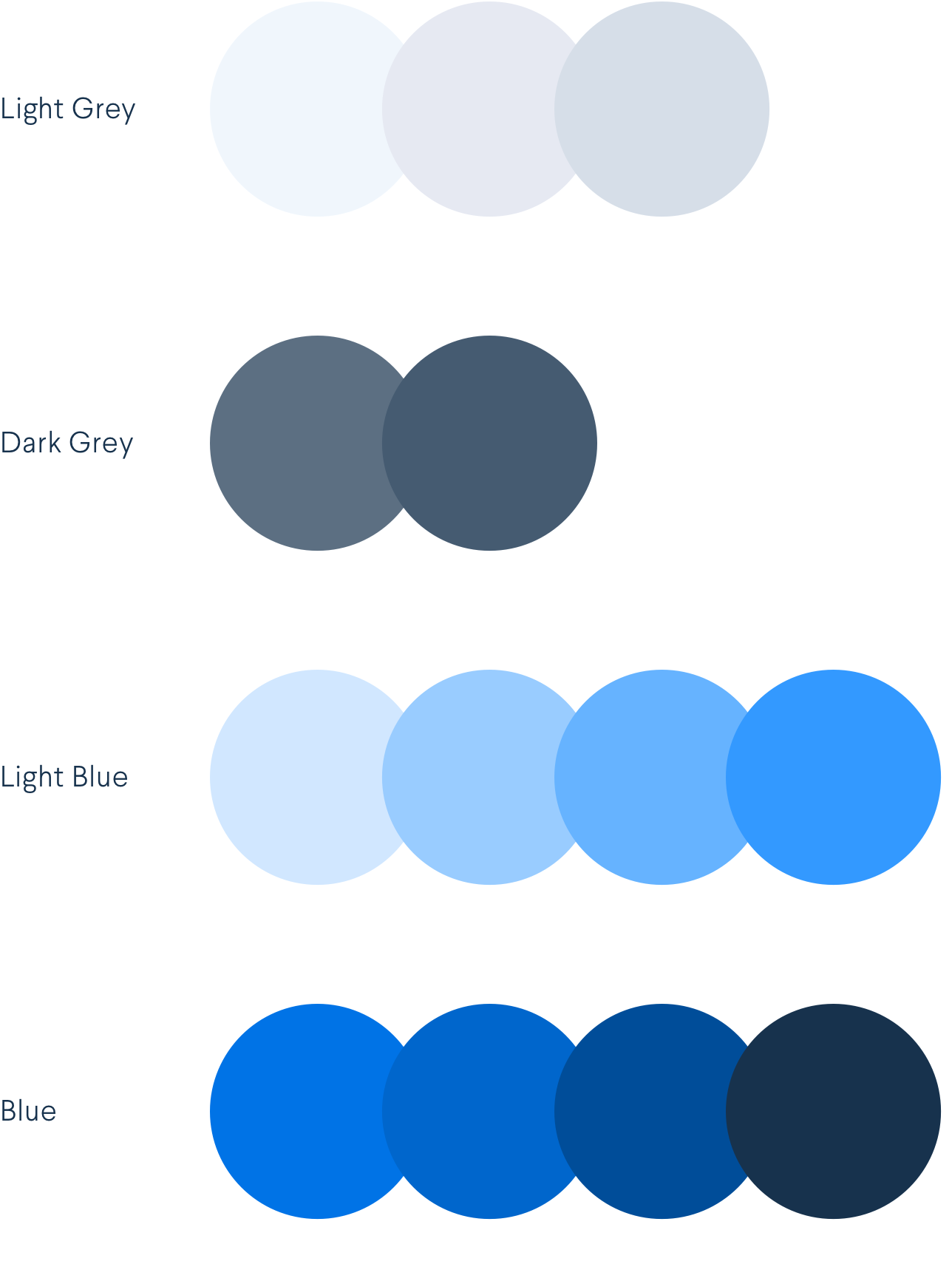
Typography, color palette, and grid system follow the guidelines described by the "Italia UI kit", which I helped the team define as well. The blue tones are a key presence throughout the website, but – in order to differentiate "Docs Italia" from "Developer Italia" – I mainly used lighter tones of blue for illustrations and backgrounds. The typography is based on "Titillium" for titles, and "Lora" for bodycopy. The grid system used is based on Bootstrap's.
TYPOGRAPHY
COLOR PALETTE
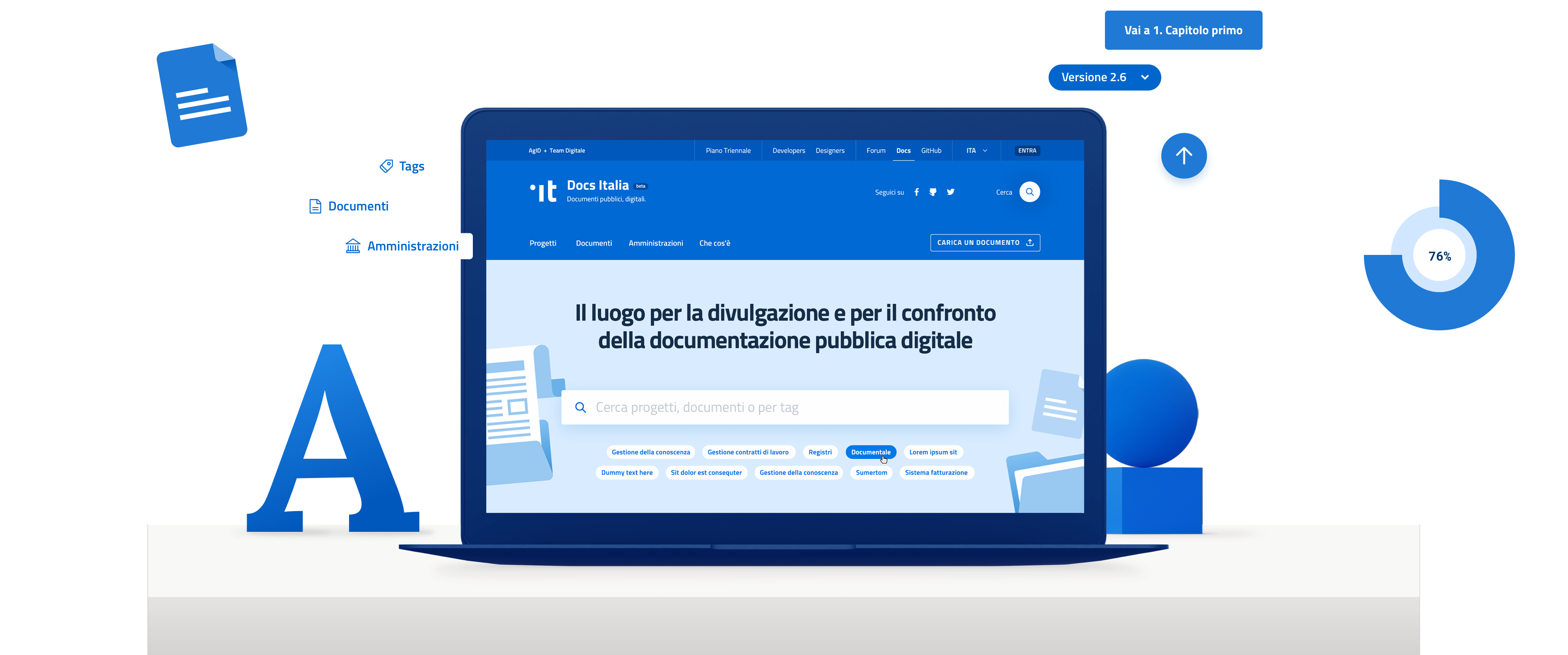
LANDING PAGE
He who seeks finds
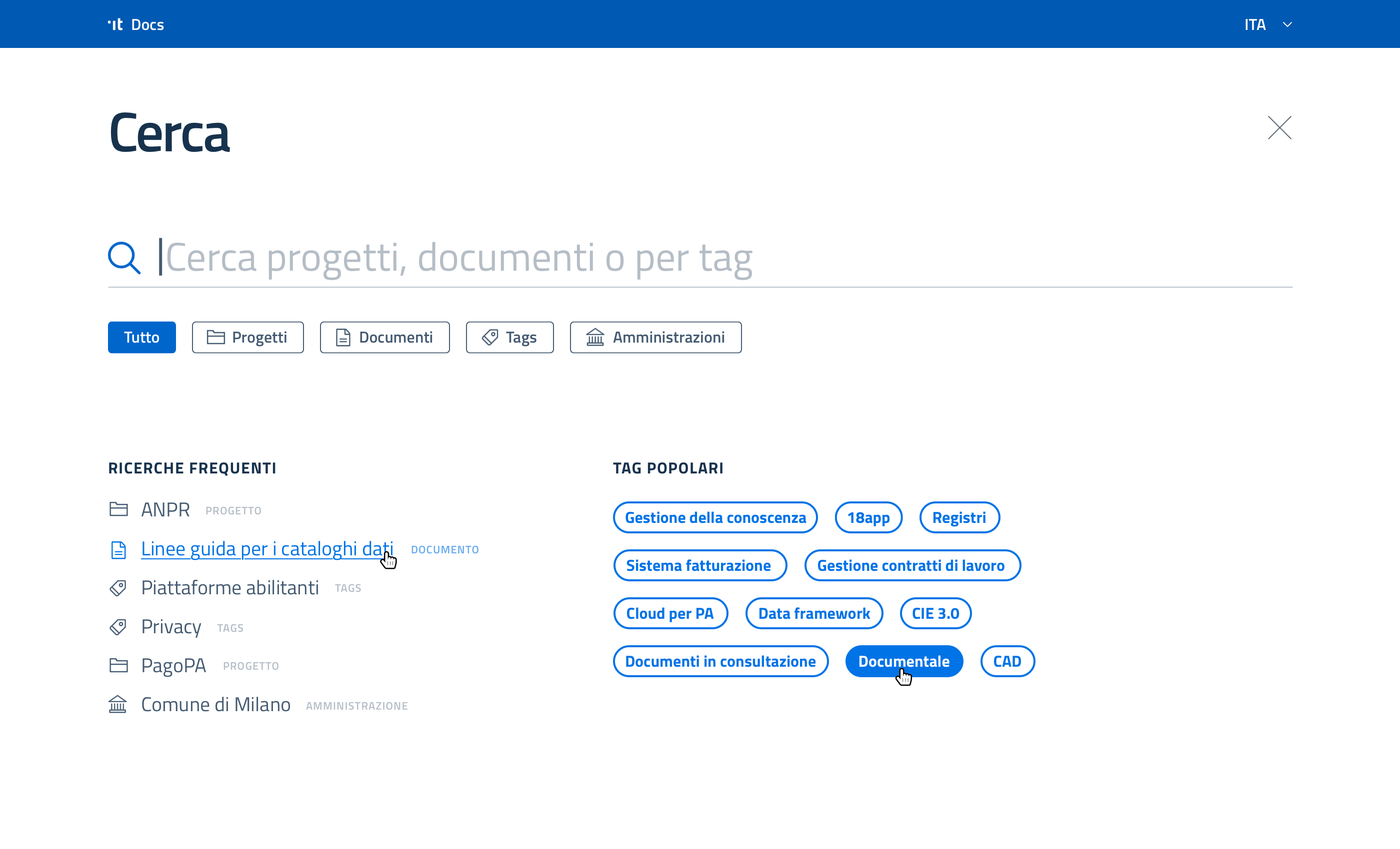
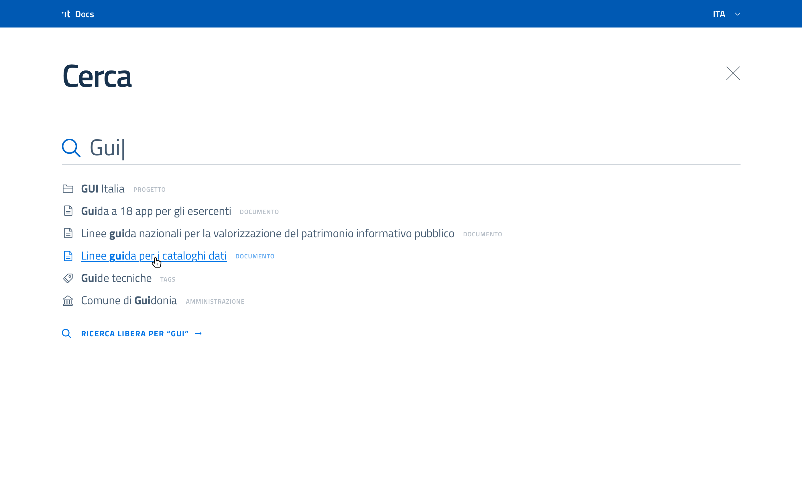
On the landing page, the search area is highlighted and prominent with suggested popular tags below to speed up the search. The following sections are based on quick links to important documents and newly released ones.
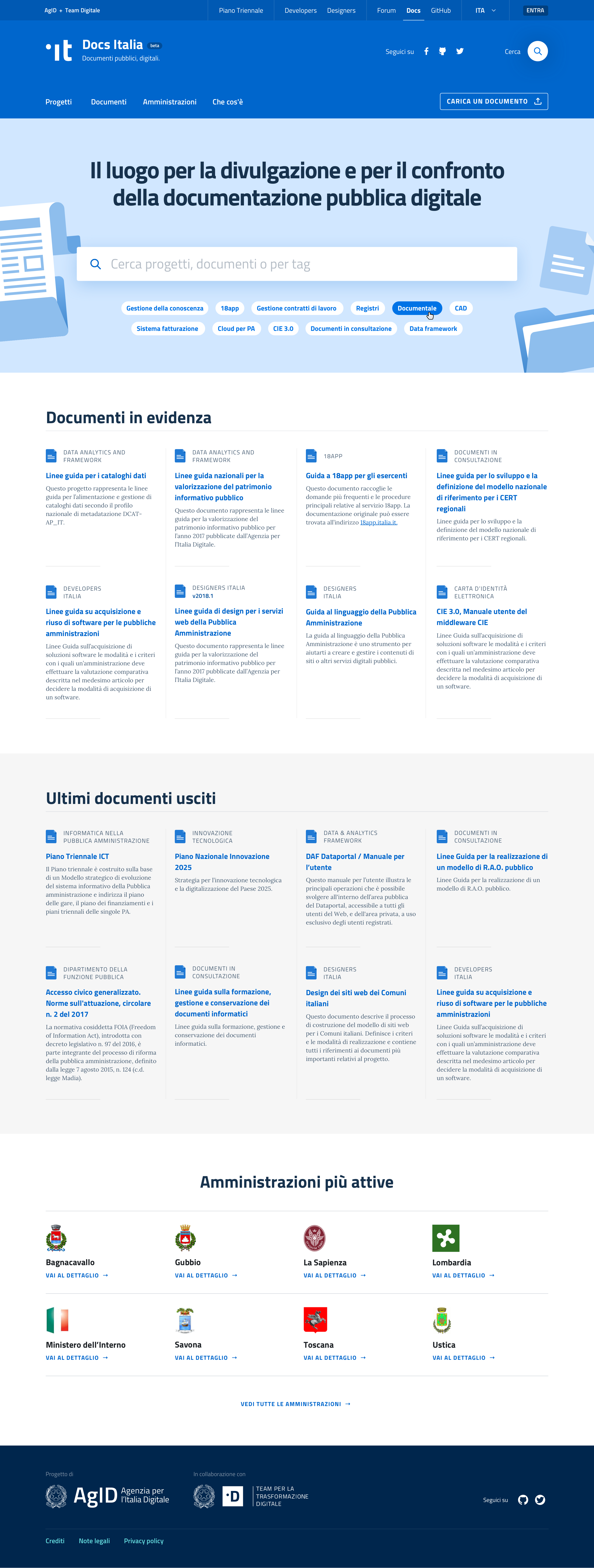
Search section
Within such a huge repository – as "Docs Italia" intends to be –, the search flow is extremly important. In performing a search, users have the option to directly search keywords or to simply select (and filter) content by main topics, frequent searches, or popular tags.
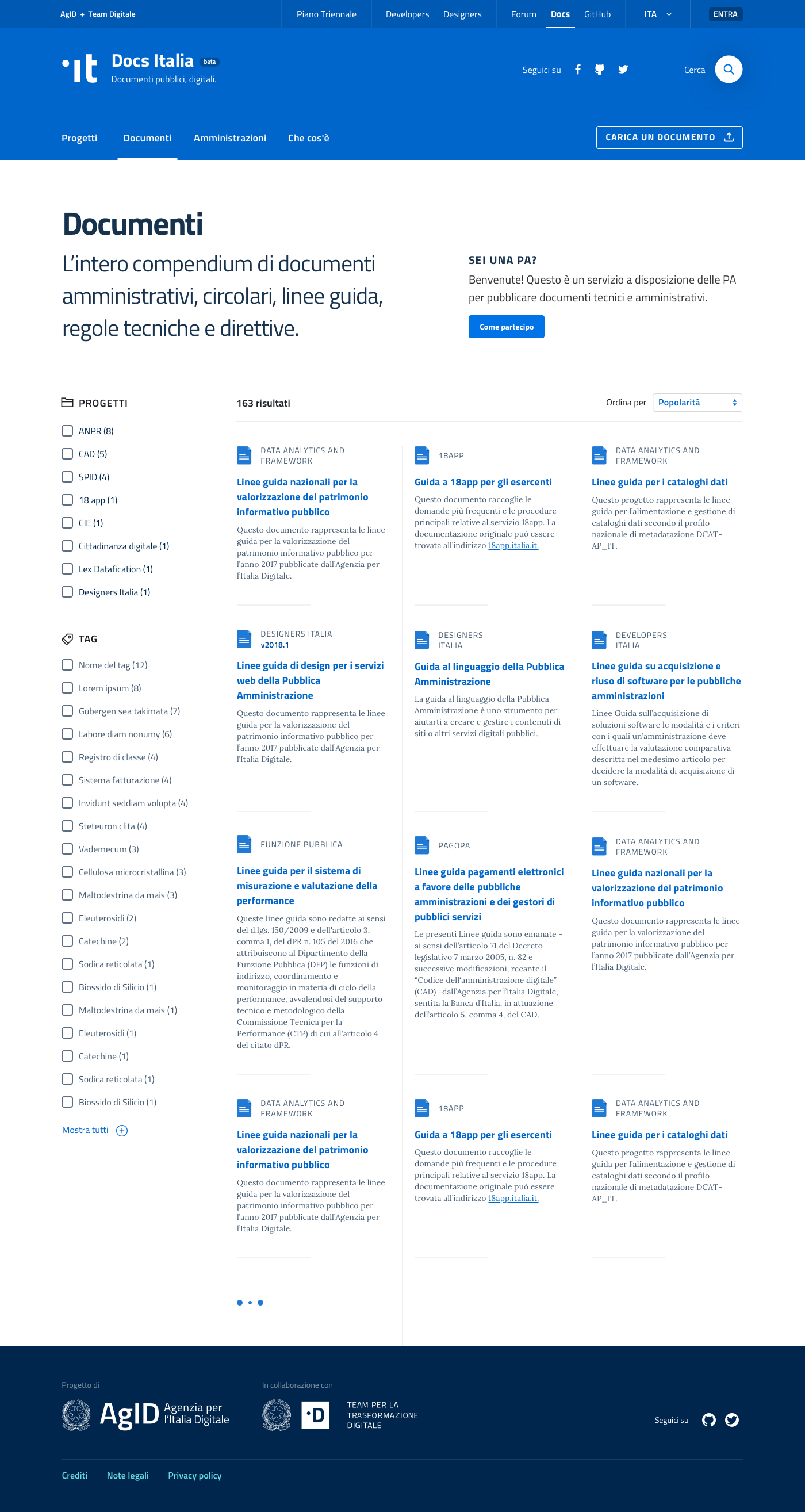
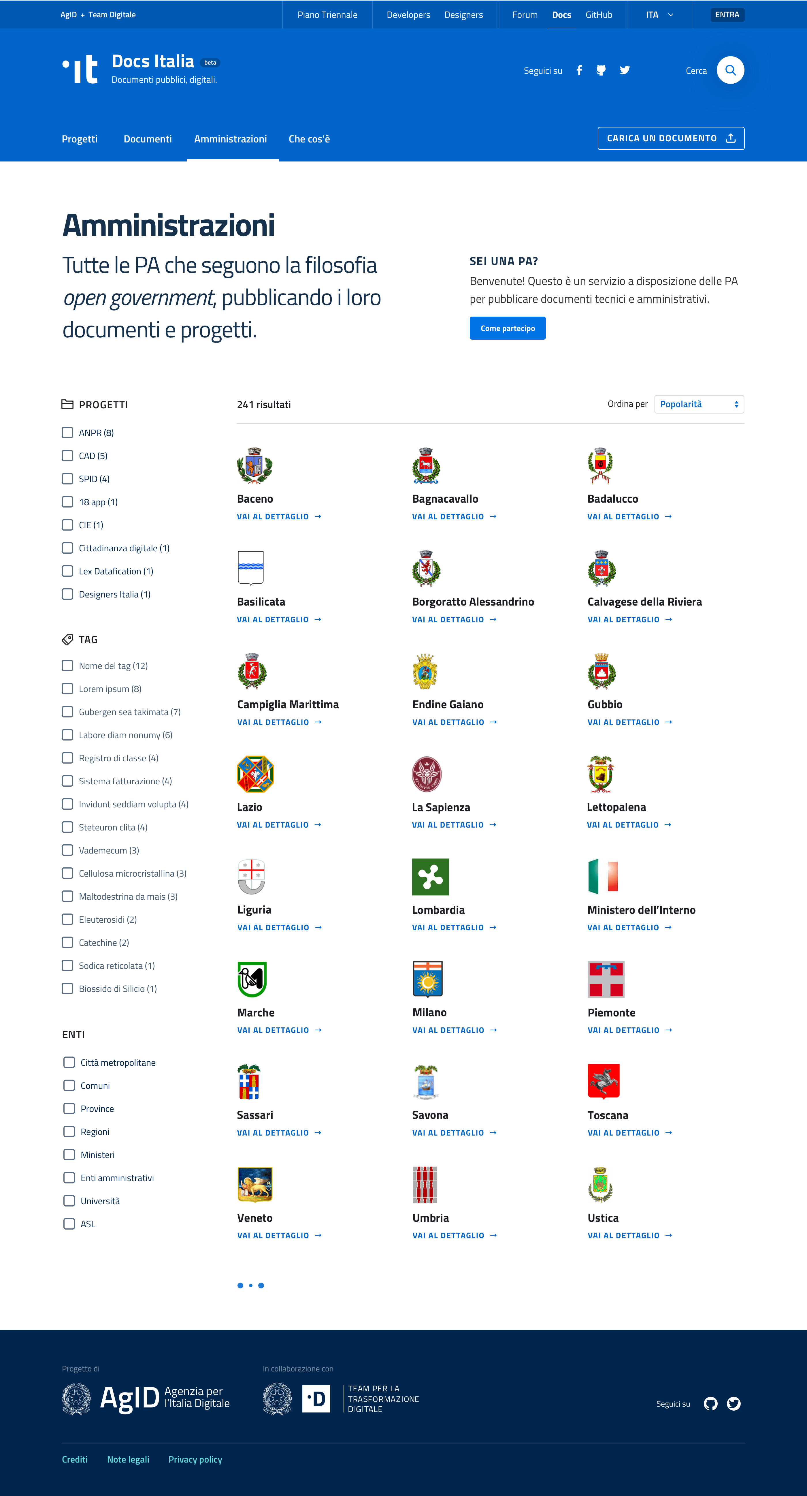
MAIN SECTIONS
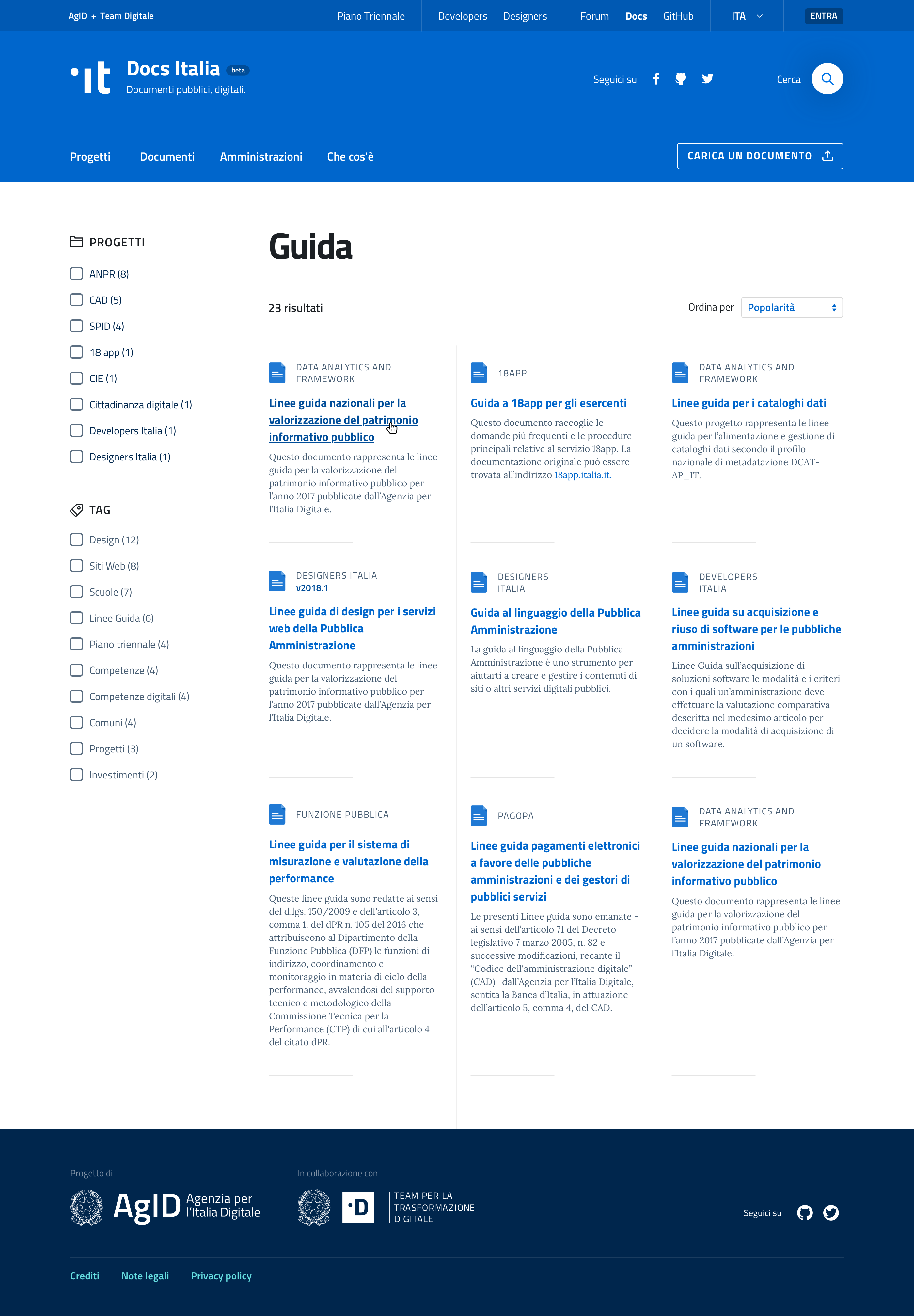
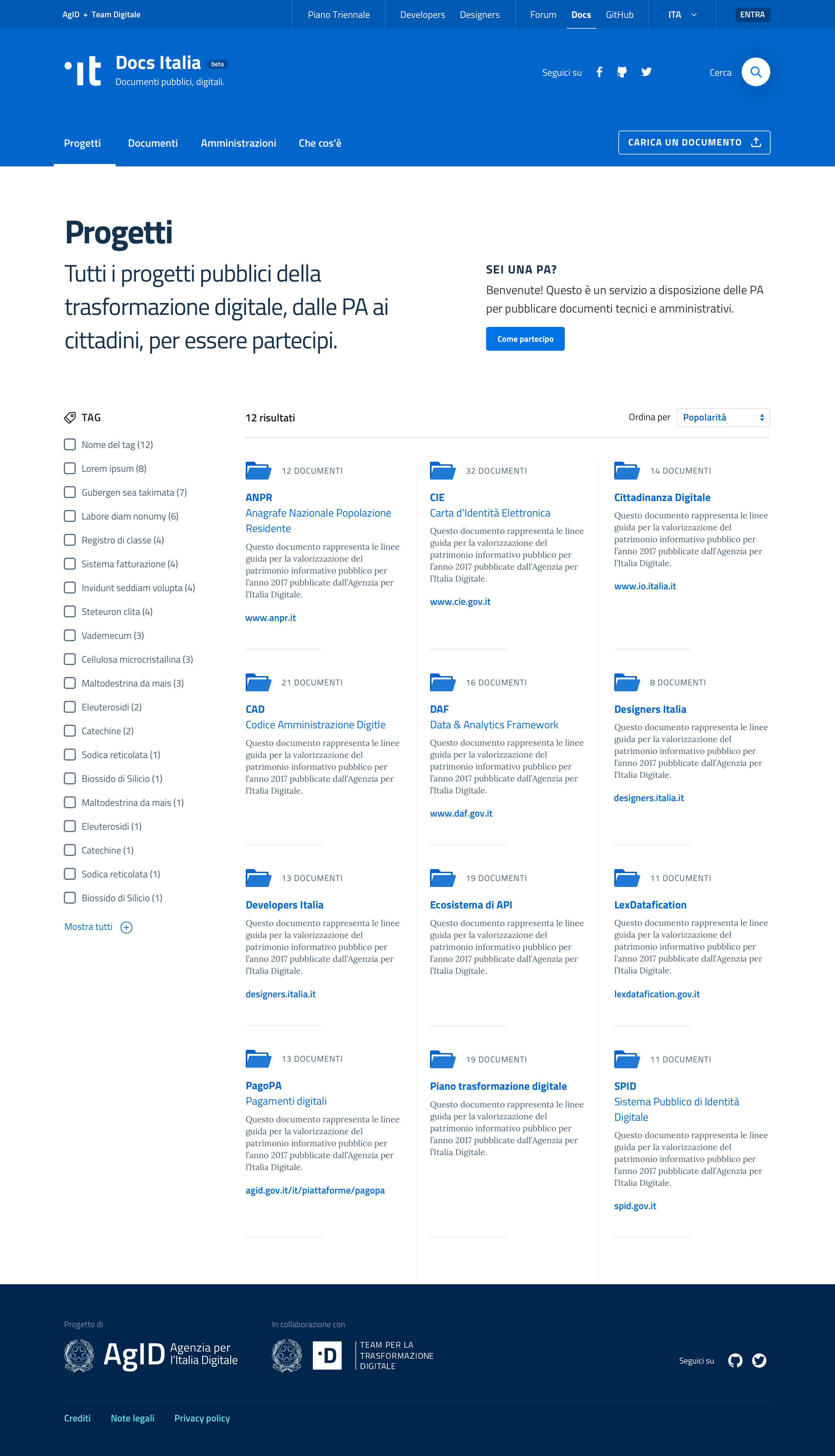
Projects, Documents, and Public Administrations
The three main sections – Projects, Documents, Administrations – follow the same structure: for ease of use, all content is filtered automatically into one of these three sections. Each page also has further filtering options through a side menu.
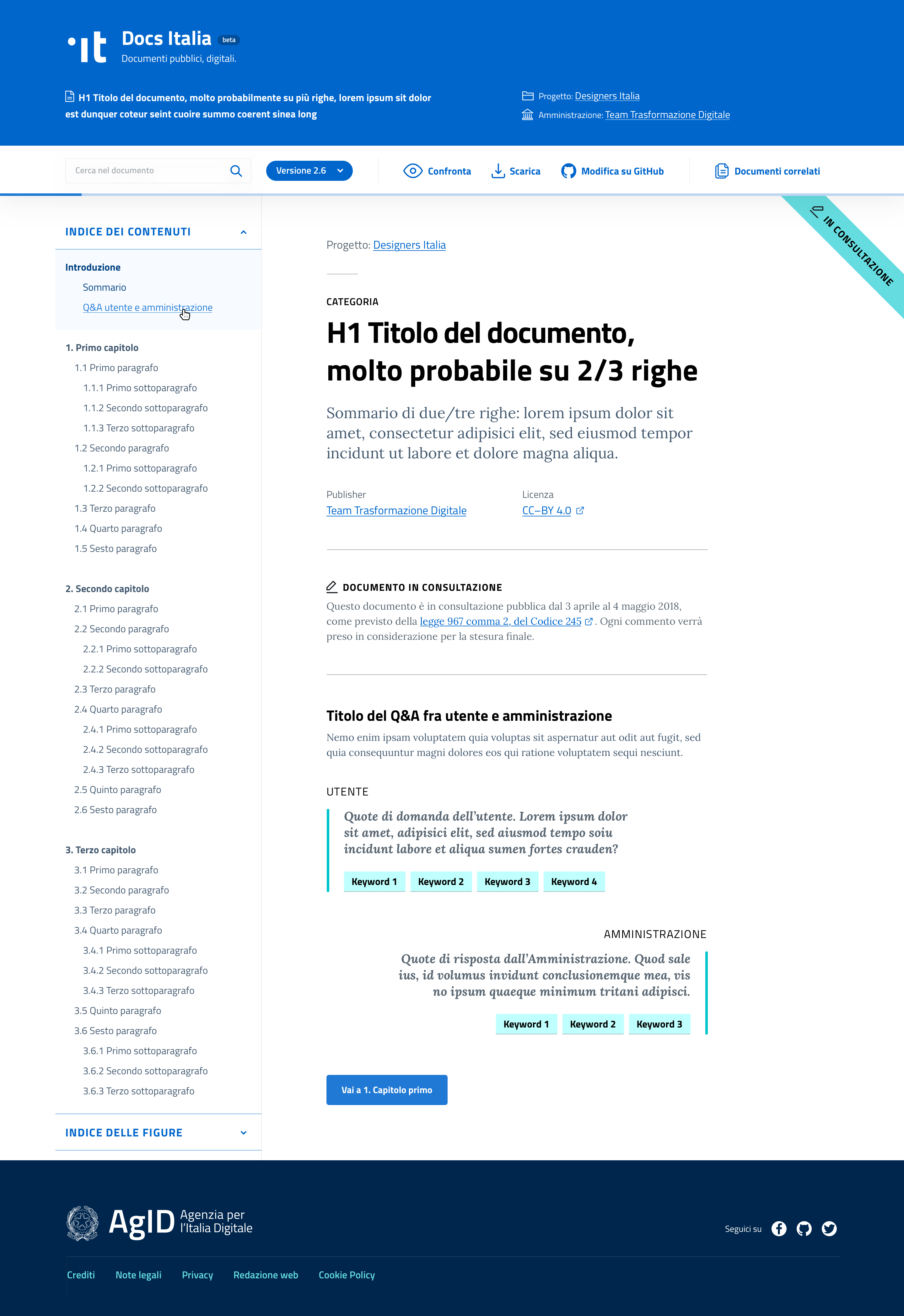
HEART OF THE SERVICE
Navigation and components of complex documents
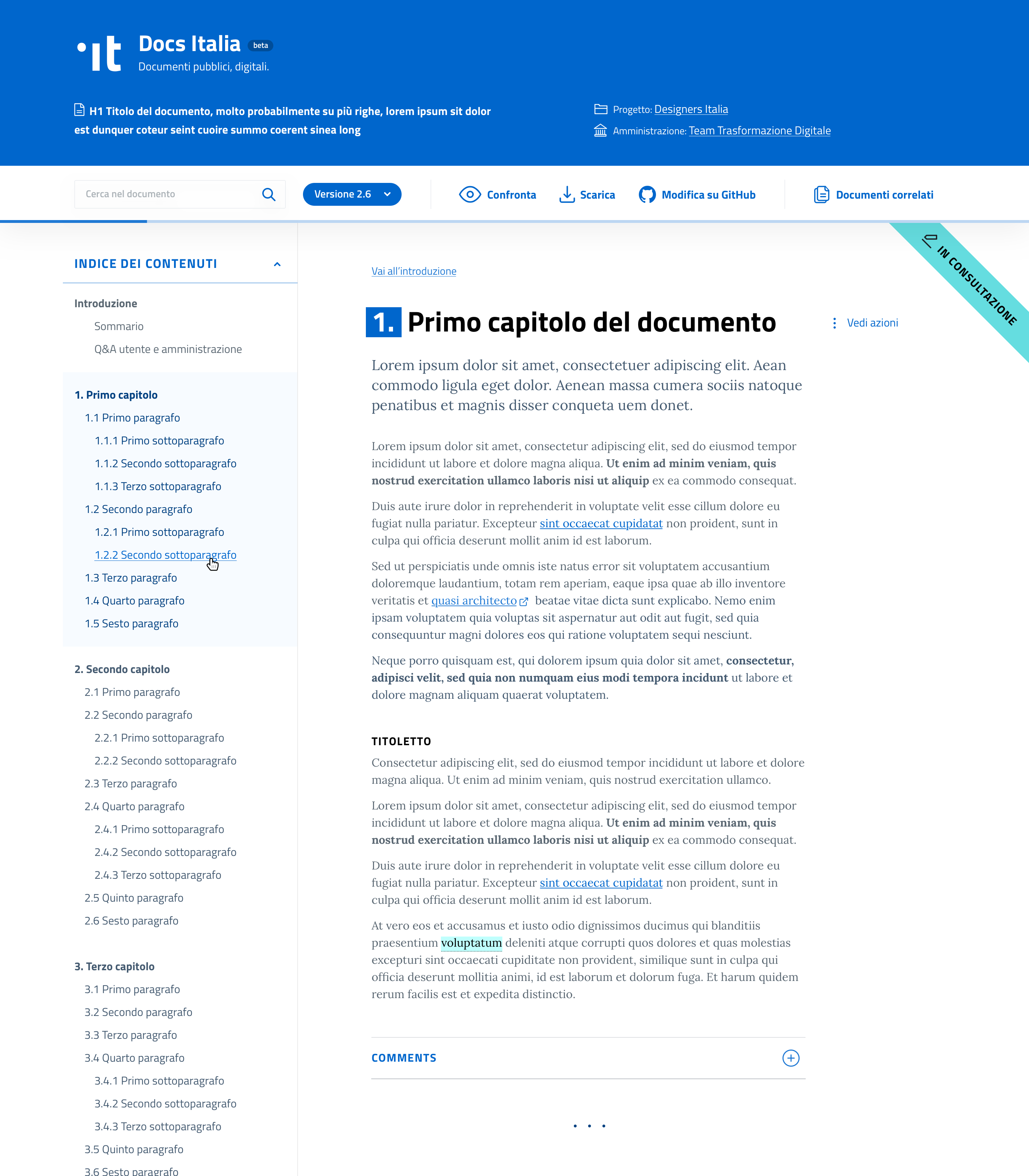
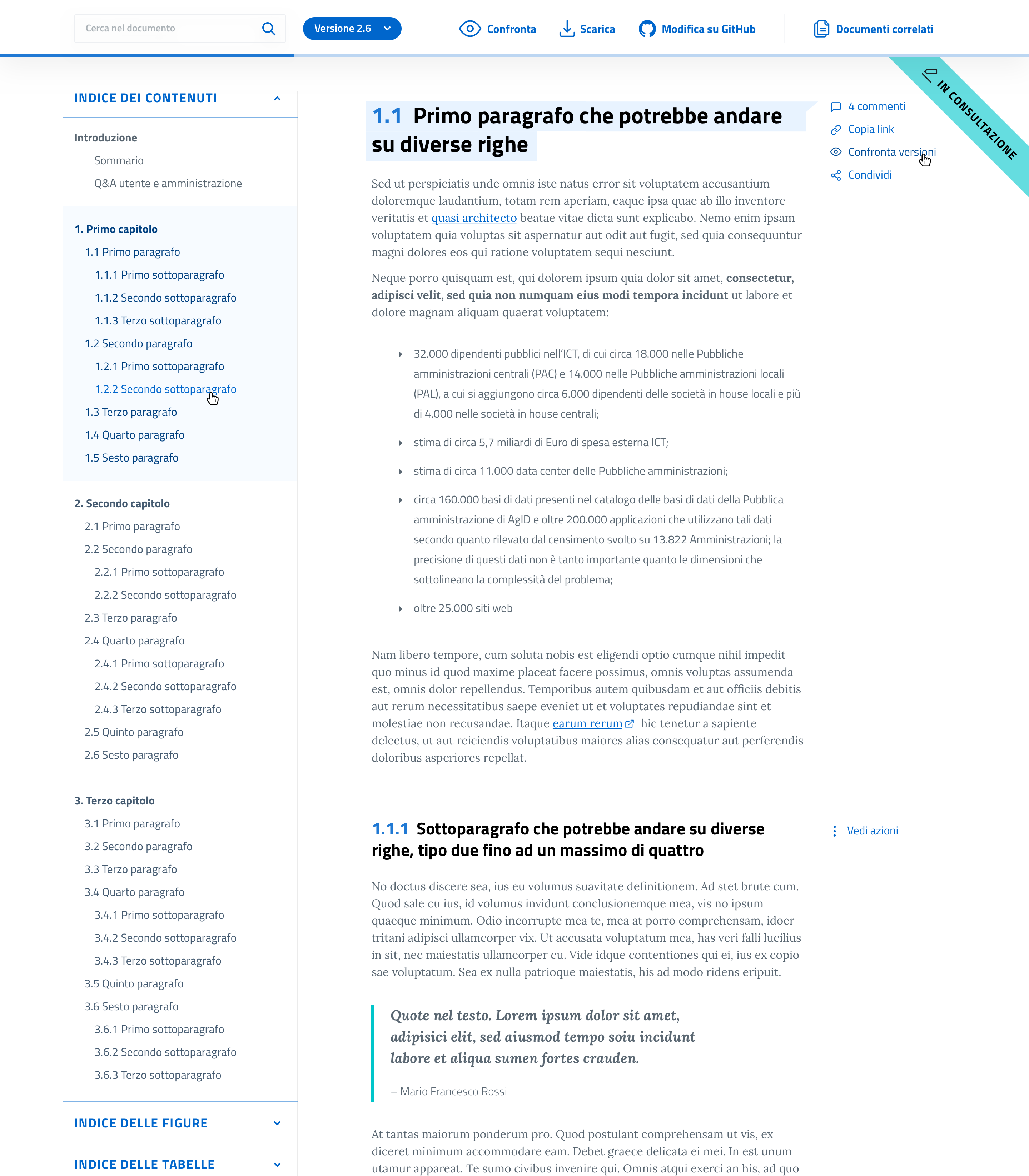
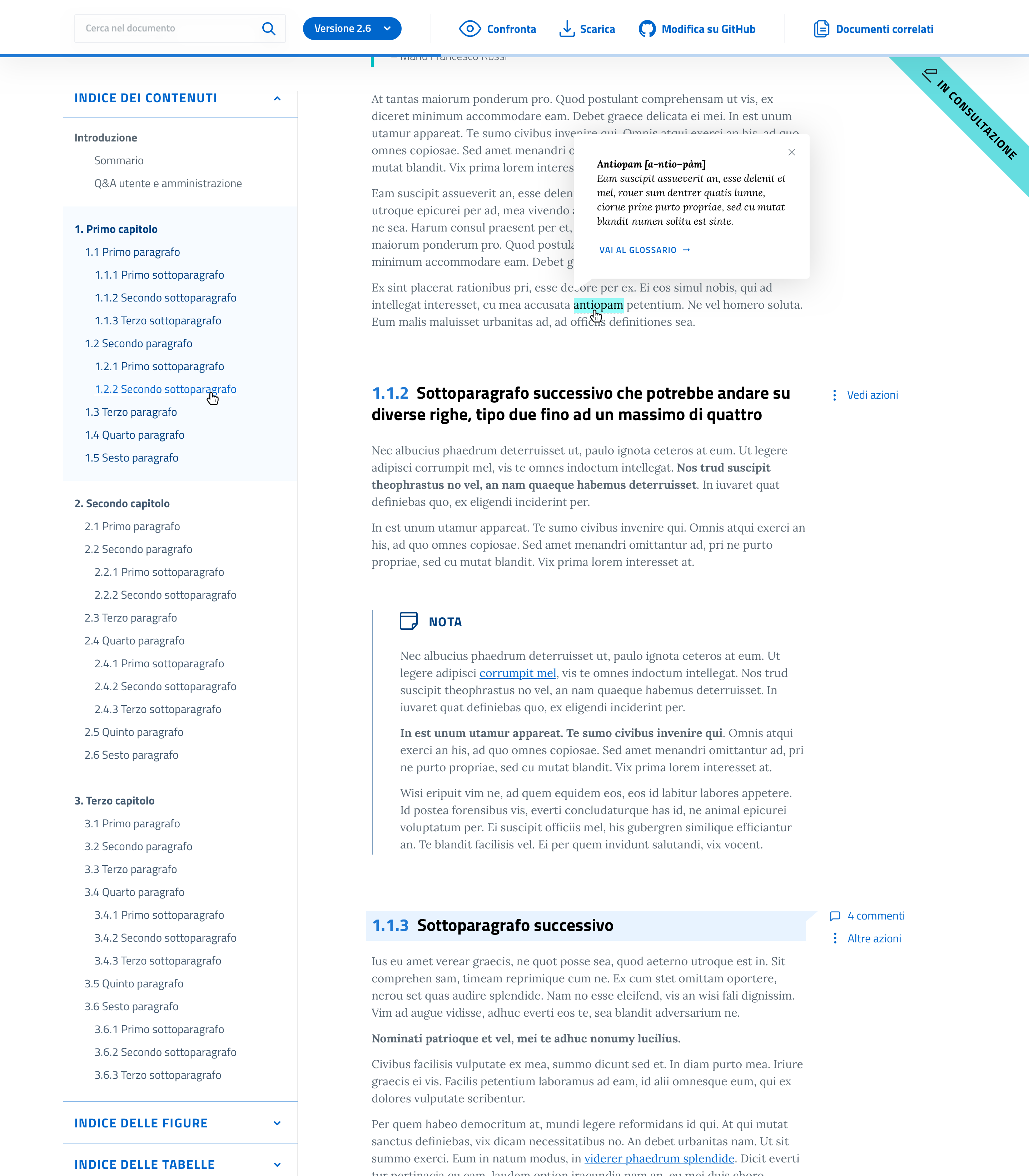
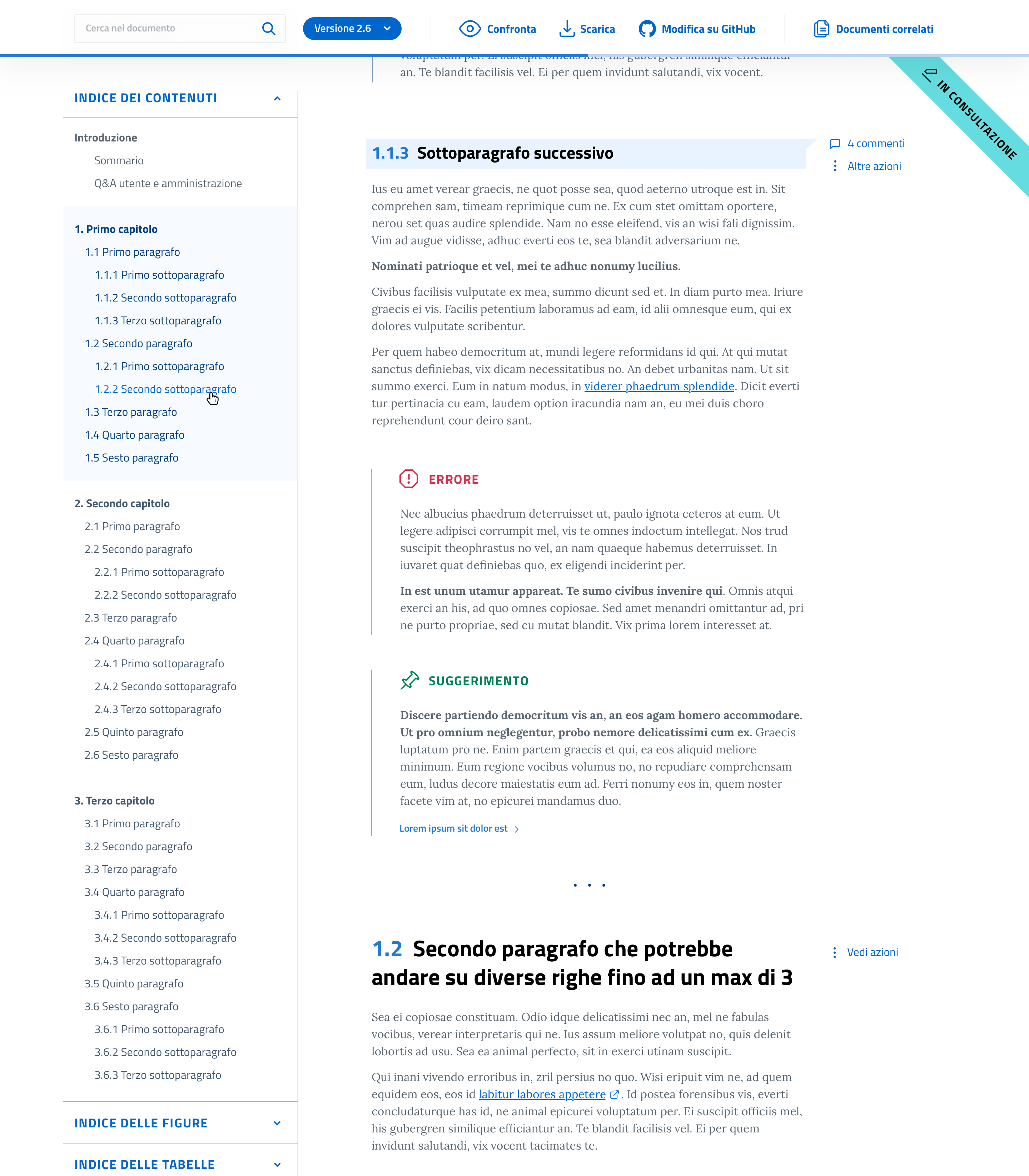
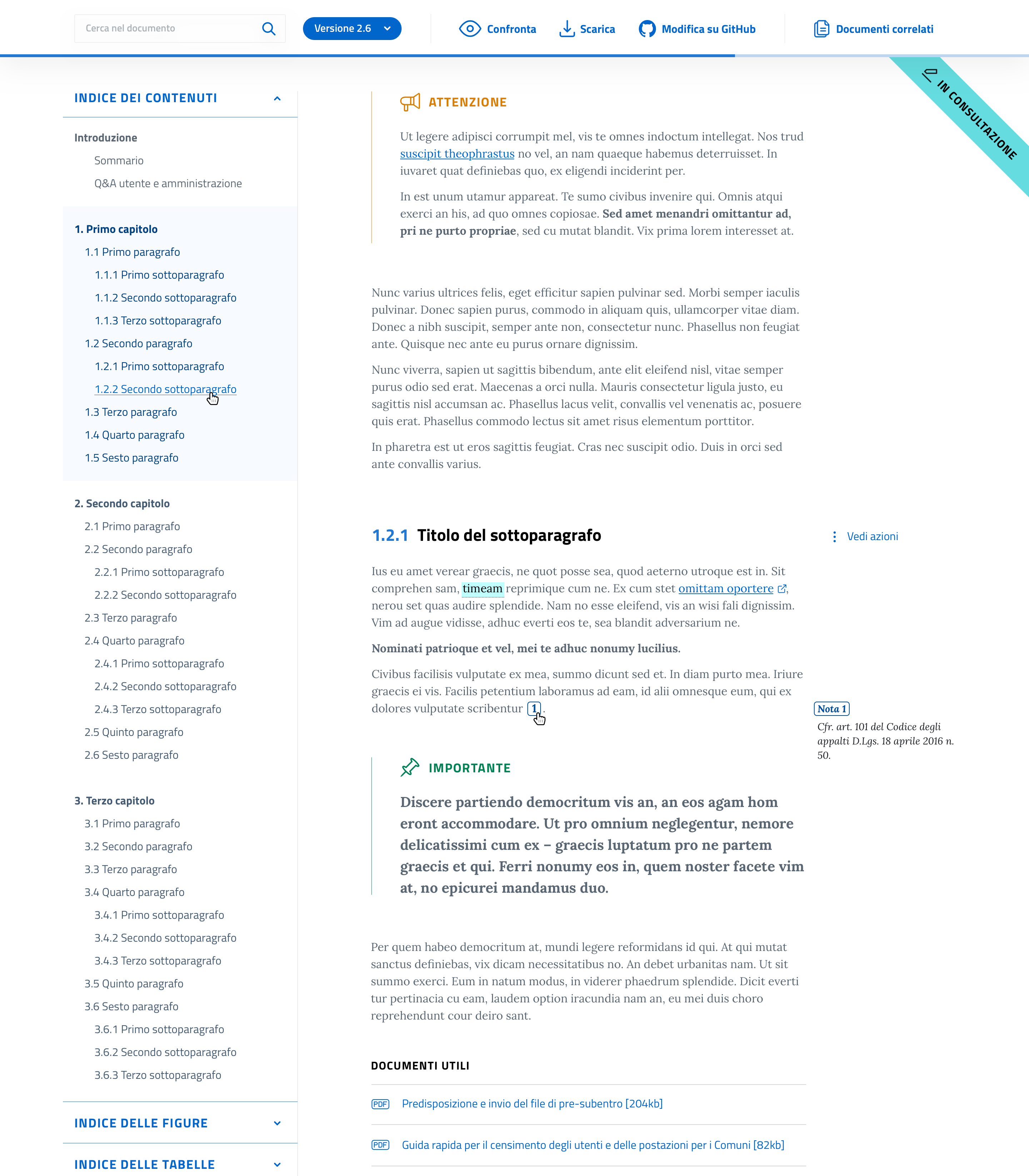
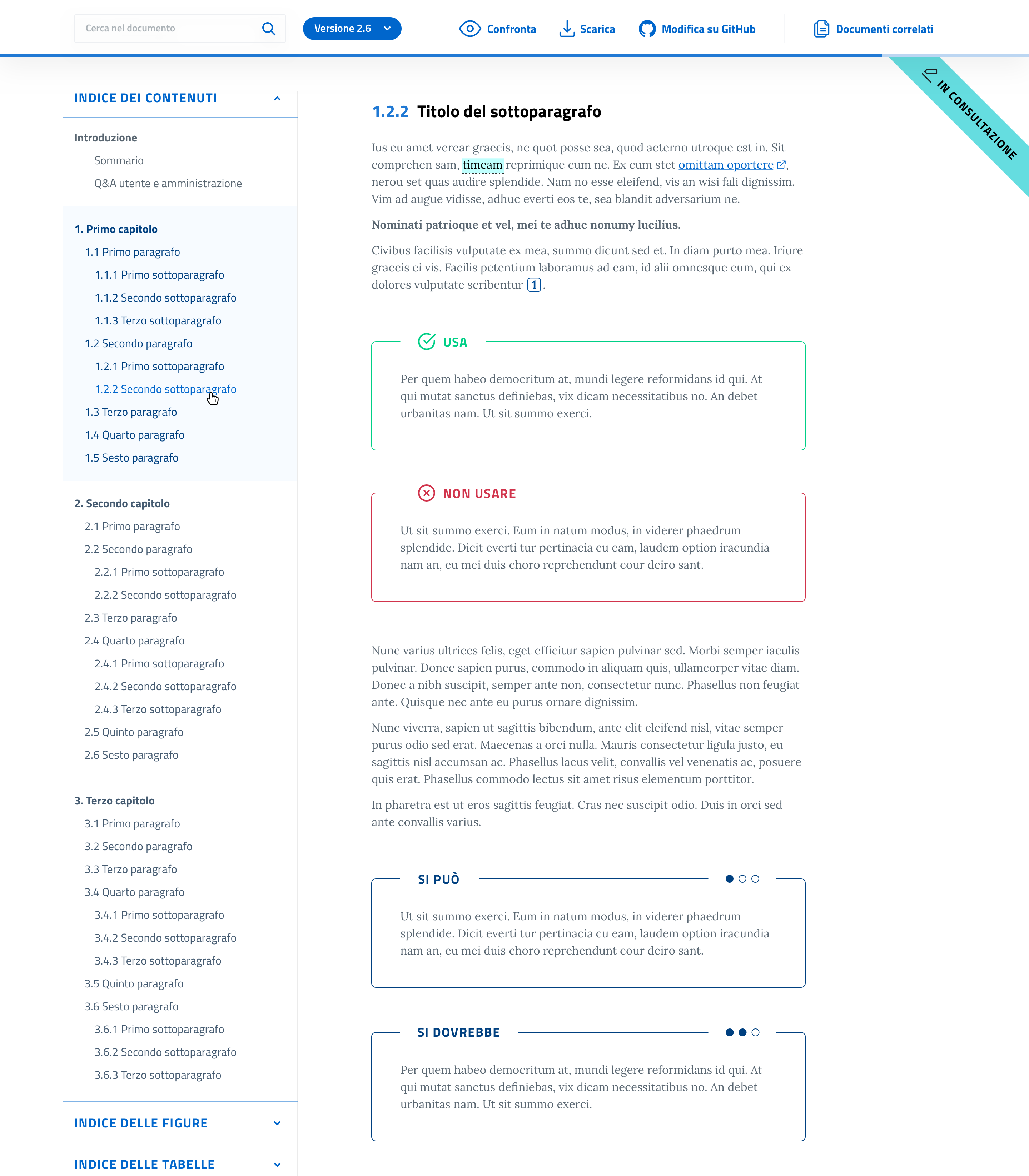
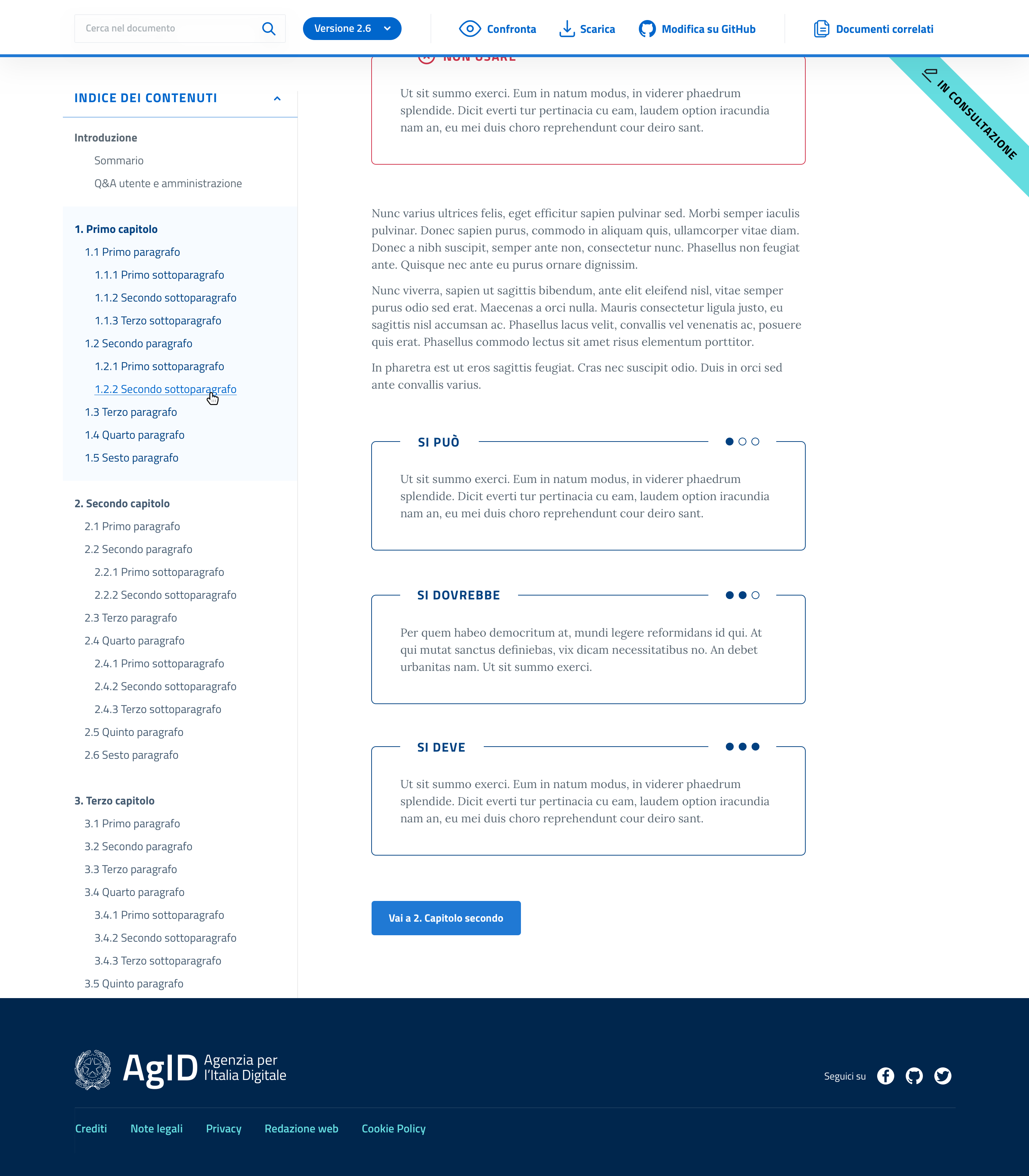
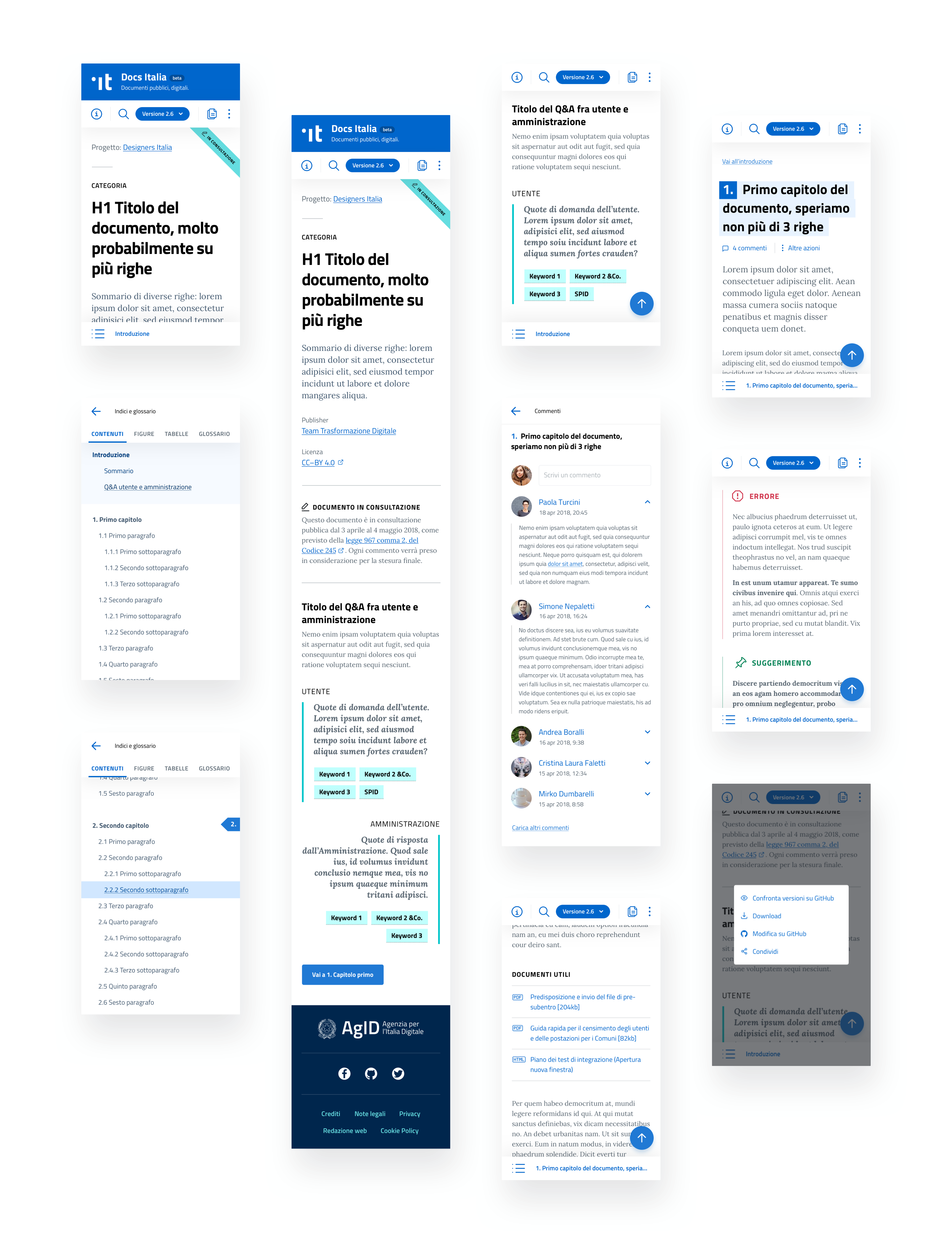
Documents are the heart of "Docs Italia", as the name implies. These documents, which can be technical, guidelines, or administrative, are generally very long and quite complex to handle.
In order to manage all this complexity, we studied a way to navigate the document utilizing a side menu on the left containing the content index, which includes the entire summary (chapters and paragraphs). Also, there is an images/tables index, and a glossary to collect all the bureaucratic jargon. While, all the principle functions remain in the fixed main toolbar – search, versions and comparisons, correlate documents, GitHub source, etc.
Document intro
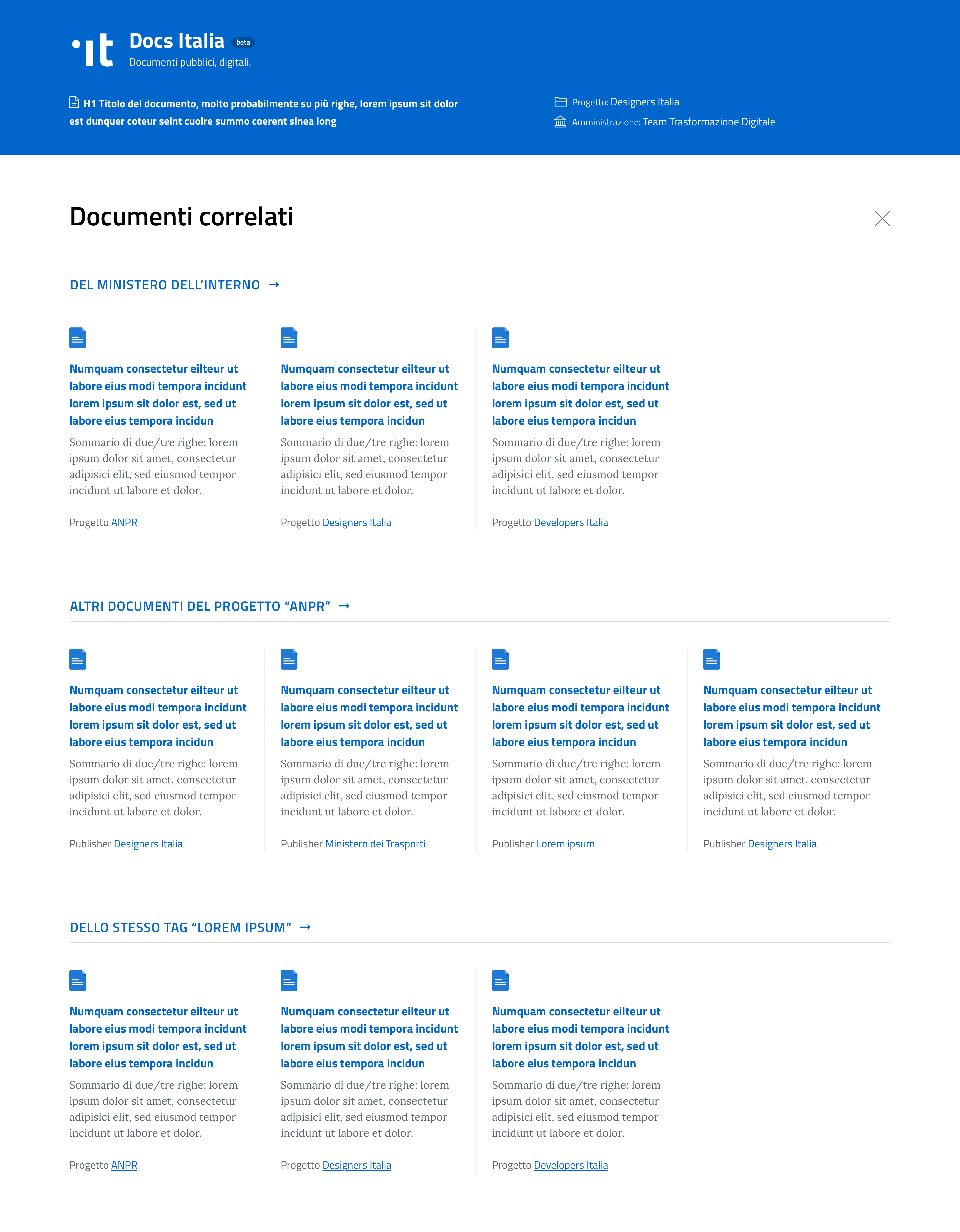
Correlate documents – Modal
Within each document, there are many components that we defined by going deeper into the project. Let's start with the essential function of comments: each chapter and paragraph title can be commented on. "Docs Italia" encourages the production of comments, which, in turn, encourages collaboration and contribution of external points of view.
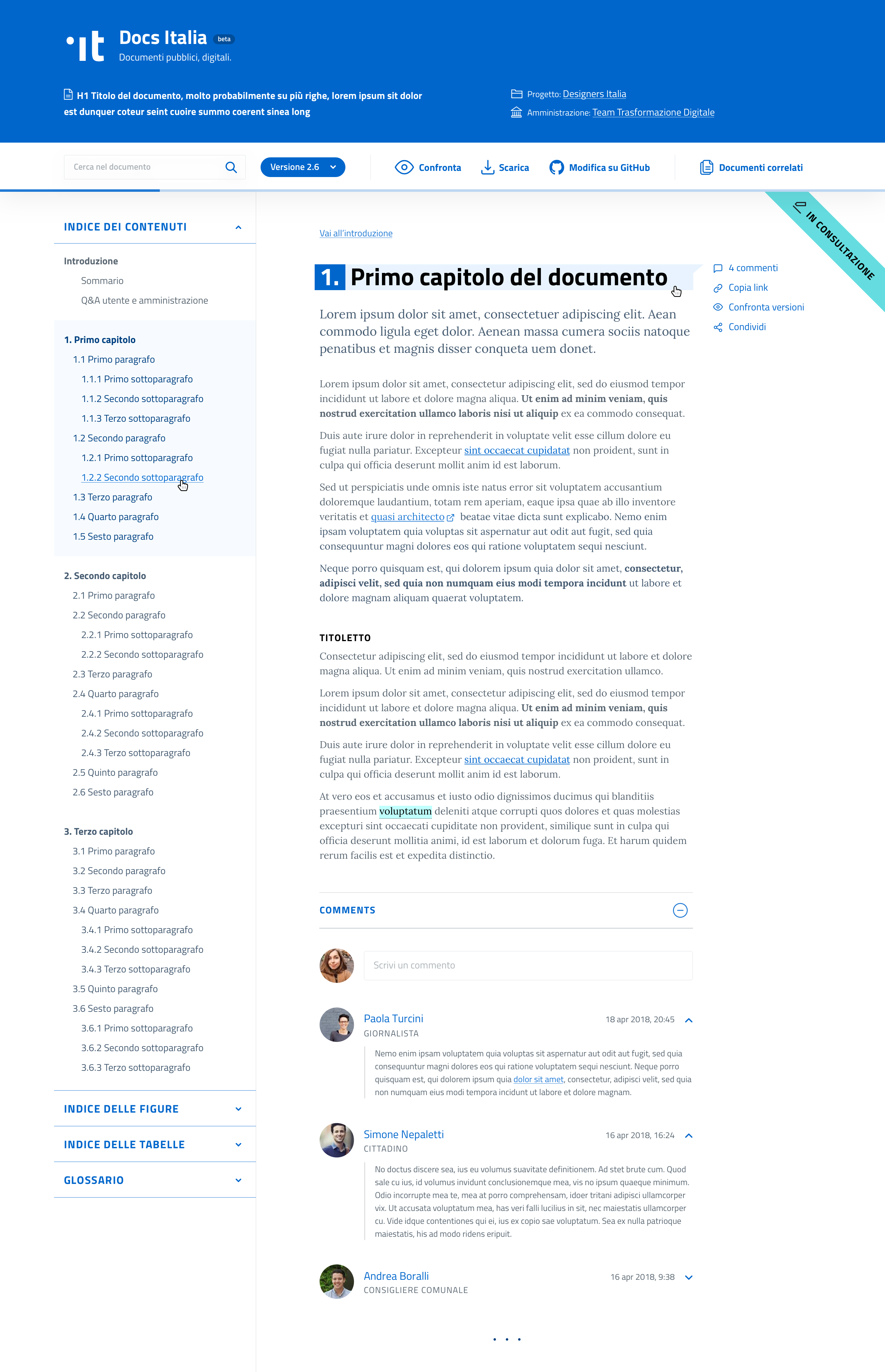
To correctly display each writing module – quotes, tables, snipped codes, list-items, links, external links, interactive vocabularies, notes, suggestions, errors, etc – that such complex documents may require, we listed as many cases as we could think of.
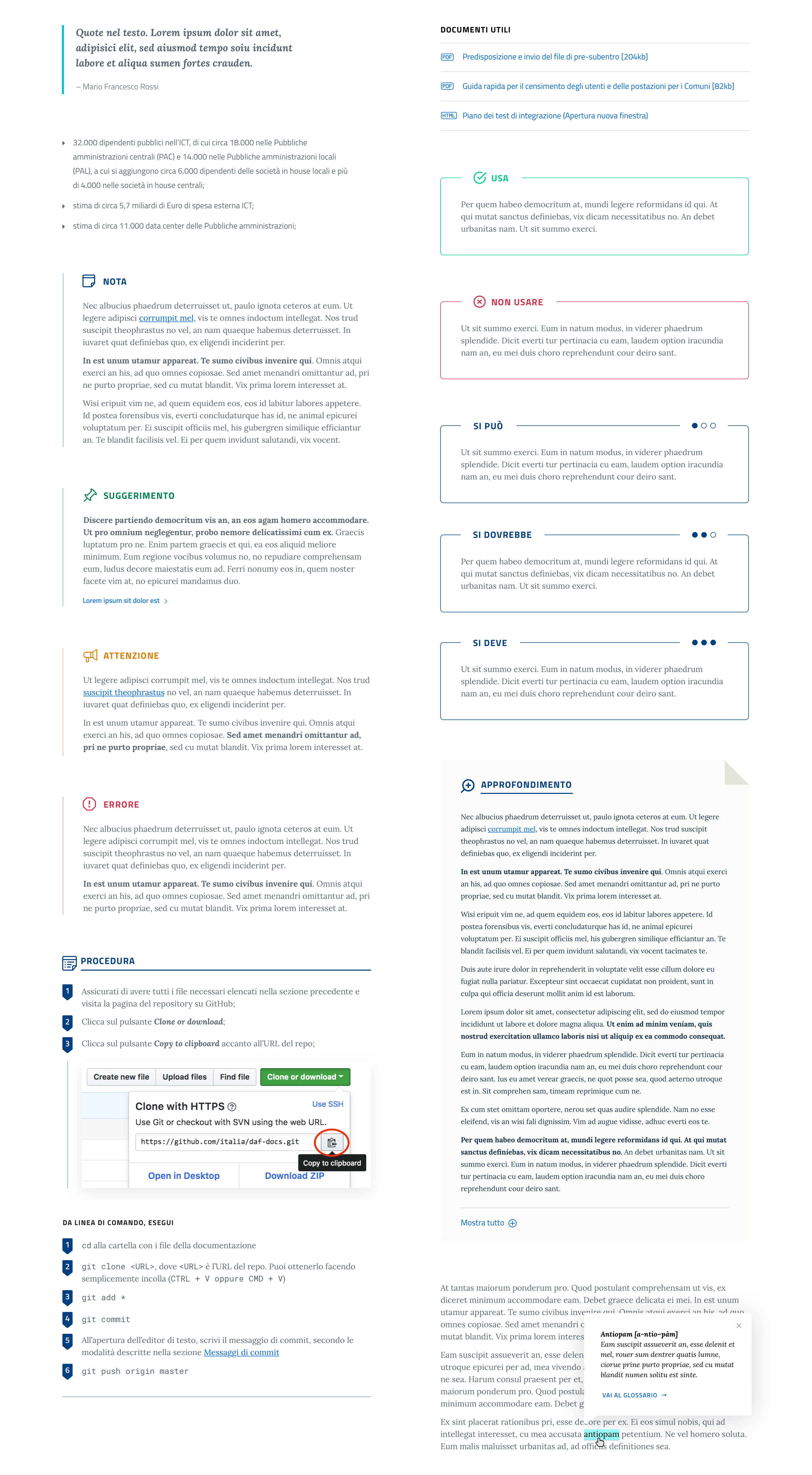
In this way the writer will have the freedom to make certain specifications within the document - while the users can learn and easily recognize said components.
The final layout is composed of a header, a left-side navigation menu, with the main content in the middle (6 columns of 12), and on the right there are options for possible interactive elements (share, comment, copy link, note, etc).
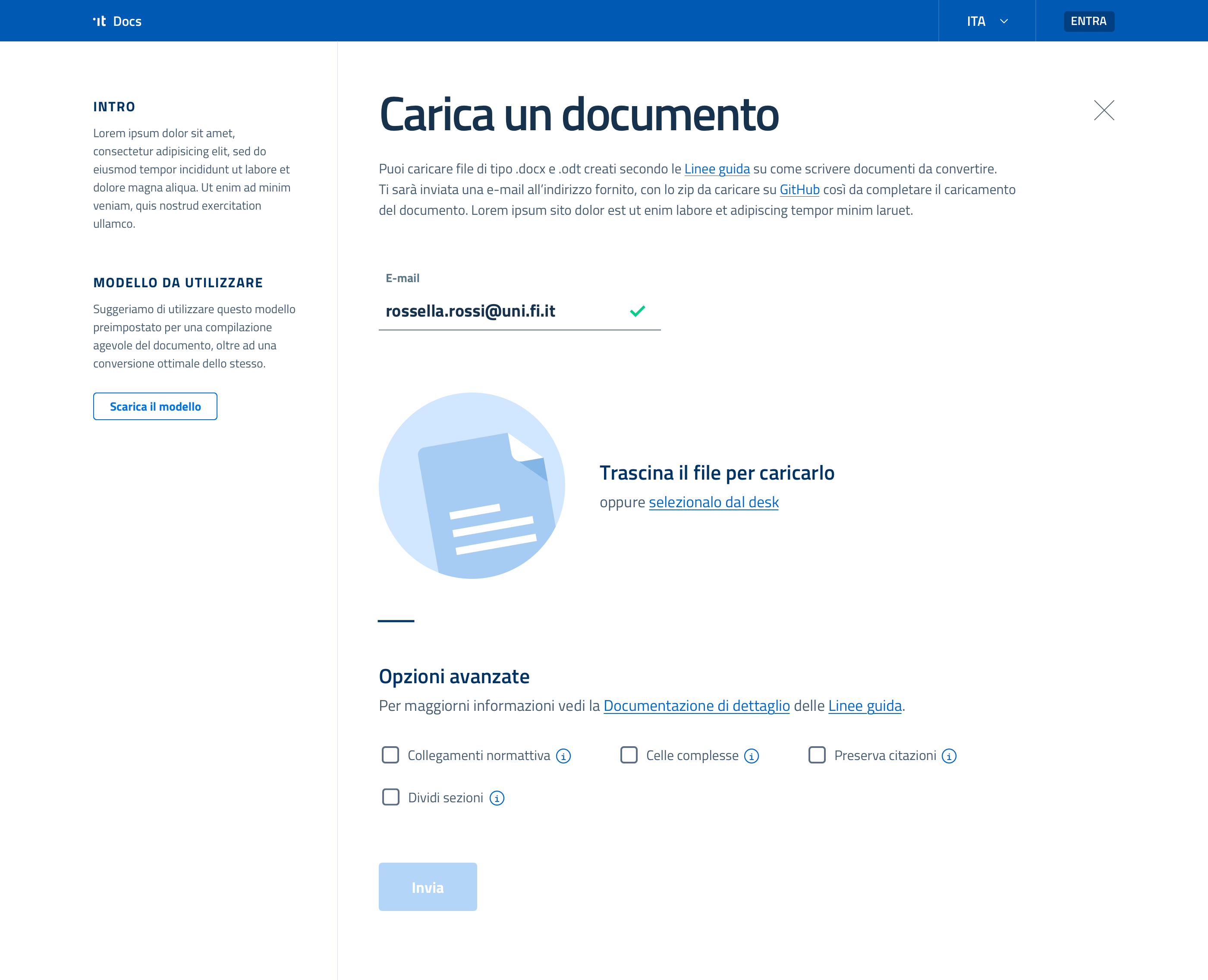
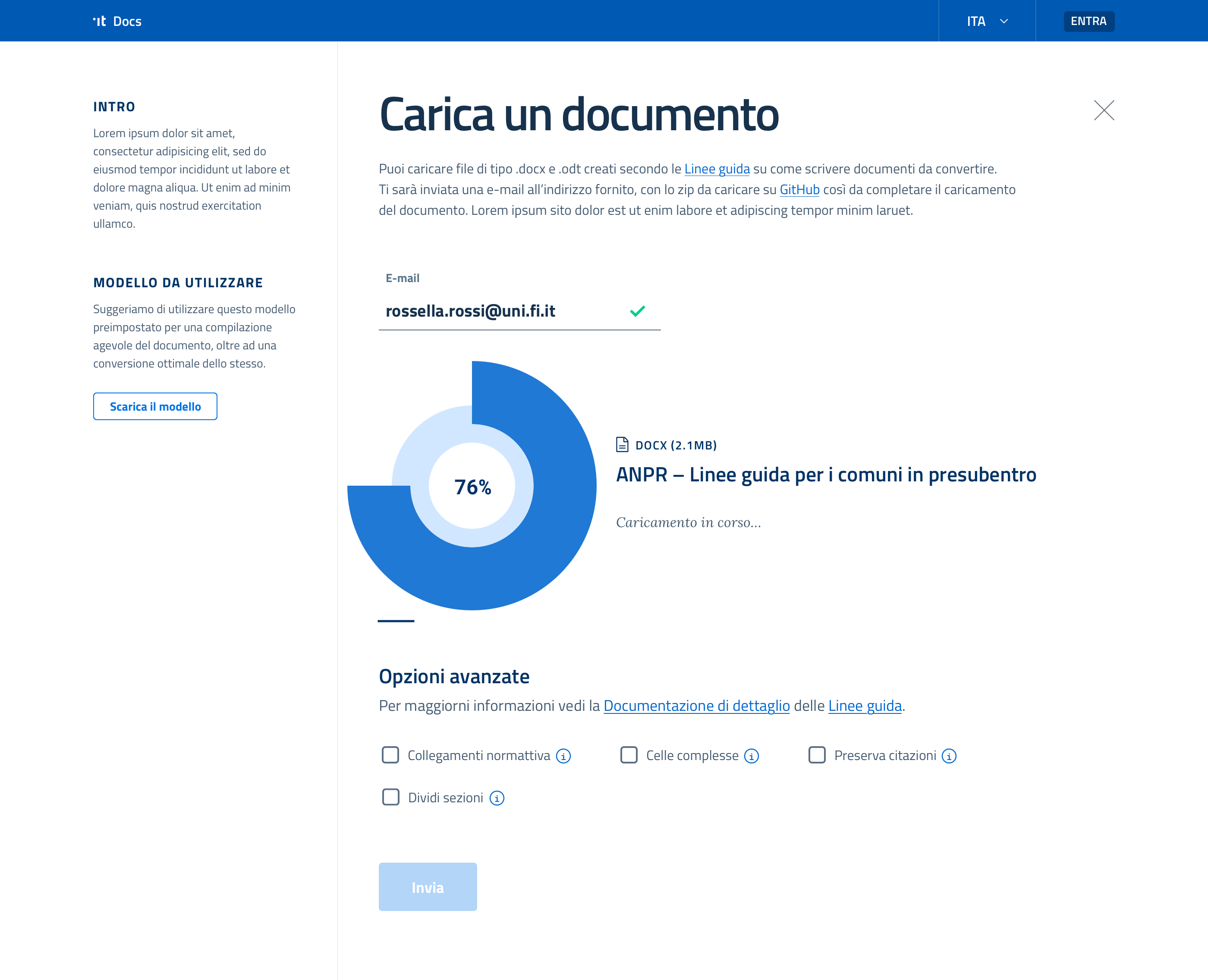
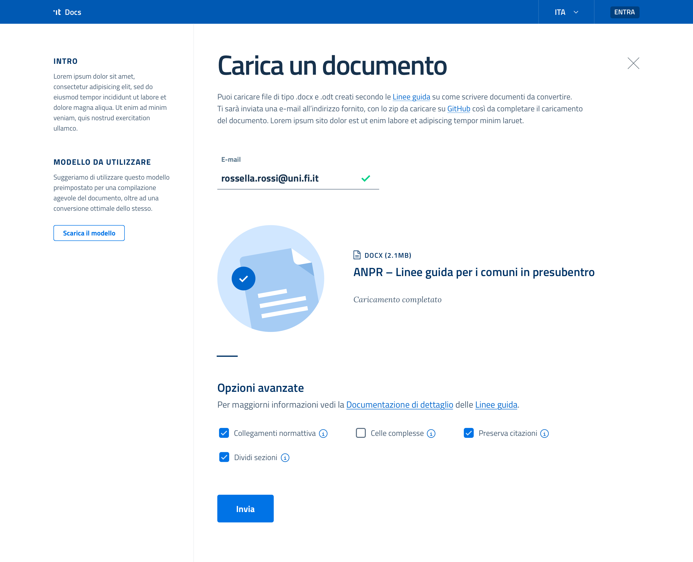
UPLOAD A DOCUMENT
How Public Administrations can partecipate
A big call-to-action, "Upload a document", in the landing page header prompts all Public Administrations to join the 'Open Government' philosophy. Clicking on it, the PAs will land on a fullscreen modal, where in just one step they can upload the doc.
MOBILE
Responsive behaviors
The most important templates were translated for mobile breakpoint, in order to check how components would work on smaller screens.
Credits
Final thoughts
DESIGN & DEVELOPMENT
Lorenzo Fabbri, Team Lead
Vito Falco, Front-end Developer
SPECIAL THANKS
Alessandro Ranellucci, Developer Relations
Giovanni Bajo, Developer Relations
Francesco Zaia, Front-end Lead
Daniela De Blasis, Visual Designer
Throughout this project I was faced with new and interesting topics for the first time: document navigation and layout. This entailed creating an editorial typograhy structure (6 levels of hierarchy), making an ad hoc secondary navigation (top bar and side menu), crafting precise editorial components, and ensuring that everything was mobile-friendly.
I really enjoyed how Lorenzo Fabbri – content designer and project leader, a man of extraordinary knowledge – guided me. I couldn't wait to design something digital and editorial.
Wanna see more?
Stove CookFood & Groceries, App
AirpenHealthcare, App
GoMobility, App
TabasReal Estate, Website

GrowBitEducation, App

Banco BPMFinance, App
WeBankFinance, App

GeneraliInsurance, Website
BPERFinance, App
Developers ItaliaPublic Services, Website
Docs ItaliaPublic Services, Website
Domicilio DigitalePublic Services, Website
Carrier PigeonNews & Information, App
Axa ItaliaInsurance, Website
DacadooHealthcare, Mobile App
BancoPostaFinance, App
Poste ItalianePostal Services, Website
AmicomedHealthcare, App
Buddy,
thanks for
scrolling
📬 WORK INQUIRIES
Got a project or an idea? Don't be shy, drop me a line, and let's make something cool!
📎 LINKS
© 2015–2022 Stefania Pizzichi
Special thanks to Aqquadro, Chobu, Shelby Morrison | Typeface Larsseit
Made with Semplice | Built with blood, sweat, and tears 🙌
