
Dacadoo
A holistic Health Score to promote lifestyle changes
YEAR + TIMELINE
2017 /
4 months
AGENCY
Frog design,
Munich studio
TOPIC
Healthcare, Insurance, Tracking, Fitness, Diet
MY ROLE
Visual direction,
UI design
TEAM
Project lead,
UX designer (2)
OUTPUT
Mobile app, DLS,
Prototype
¶ Kick-off
For the first time, I experienced working with a truly diverse team outside my home country. I followed this project from the Frog Munich office, enjoying some bits of Baverian culture.
So, what was the project about? Dacadoo, a Swiss-based startup, develops technical solutions for digital health engagement and health-risk quantification. They partner with insurance companies, as well as corporate health service providers, to motivate users to start and maintain healthy lifestyle habits. The request was to redesign their mobile app, given that their preposition resonated with B2B clients, while the app however struggled with actually getting people to engage with the platform.
Considering the complex nature of the topic, and the multitude of features we had to handle, mainly focusing on establishing trust, as to be seen as a health partner worth long-term engagement.
MY CONTRIBUTION
Starting the project from the research phase, I helped prepare materials and interview users. During the design phase, I was in charge of UI design, taking care of every particular within each screen we detailed, and building the entire visual language system. Lastly, I provided internal documentation to the main stakeholders.
INTRO & APPROACH
Small steps toward users' self-realization
During the research phase, we focused on defining a more specific target audience and catering our design to their particular lifestyles, behaviours, and needs. The goal was to create a level of engagement that would set Dacadoo up to become a leading platform provider in the healthcare industry, specifically for 40-60 year-olds, whose risk of health problems is higher.
So, how does our solution help people take the first step toward improving their lifestyle?
Who the users are
By easing the user through an assessment phase, the app learns about the user in-depth and provides more accurate content.
Daily steps
By applying a baby-step approach to behavioral changes, the app encourages slow-building habits that stick.
Always actionable
By utilizing daily action steps, the app offers users a clearly defined and actionable goal with every launch.
ONLINESS STATEMENT
Dacadoo is the life coach for 40-60 year-olds — helping them to live a healthier life by easing them into new habits through personalised assessment & goal setting, and continuous positive feedback.
UI DIRECTION
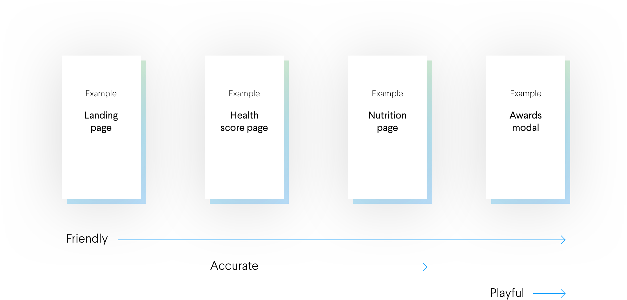
Being friendly and positive, but damn accurate!
For the general Dacadoo look & feel, our goal was to be: A. positive and optimistic to invite users, B. simple and clean to effectively communicate important matters, C. friendly and human to engage users, and D. credible and accurate to gain users' trust with their health.

Simple and clean
through big titles, colourful calls-to-action and light backgrounds.

Friendly and human
through round shapes, illustrations and moments of celebration.
Credible and accurate
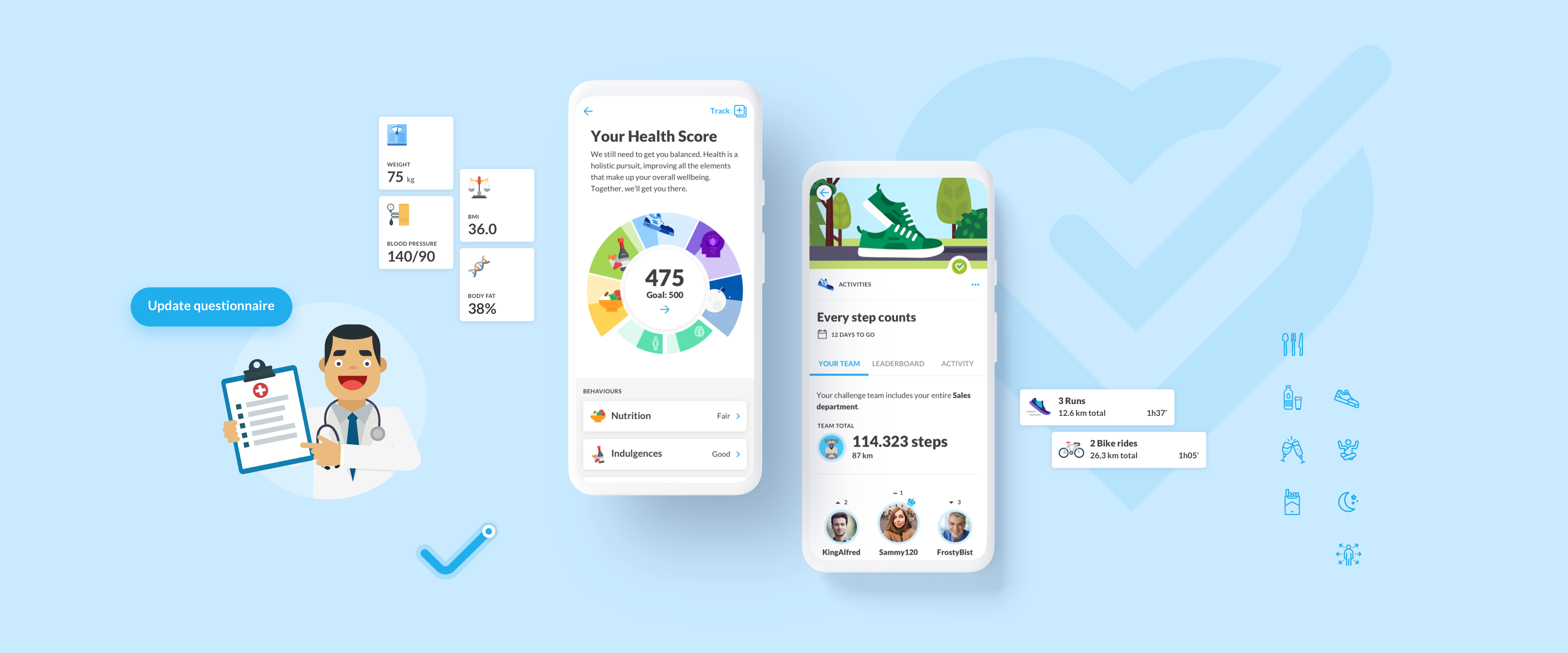
through the use of numbers and select data visualisations.
What dictates an appropriate tone of communication
Throughout the app, the user will experience different layers of communication: the content's nature and purpose will dictate the tone of voice, while maintaining an overall friendly touch. Delving deeper, the user will notice the UI tone matches the content and intent of said level — more technical for data visualization, more playful for moments of achievement.
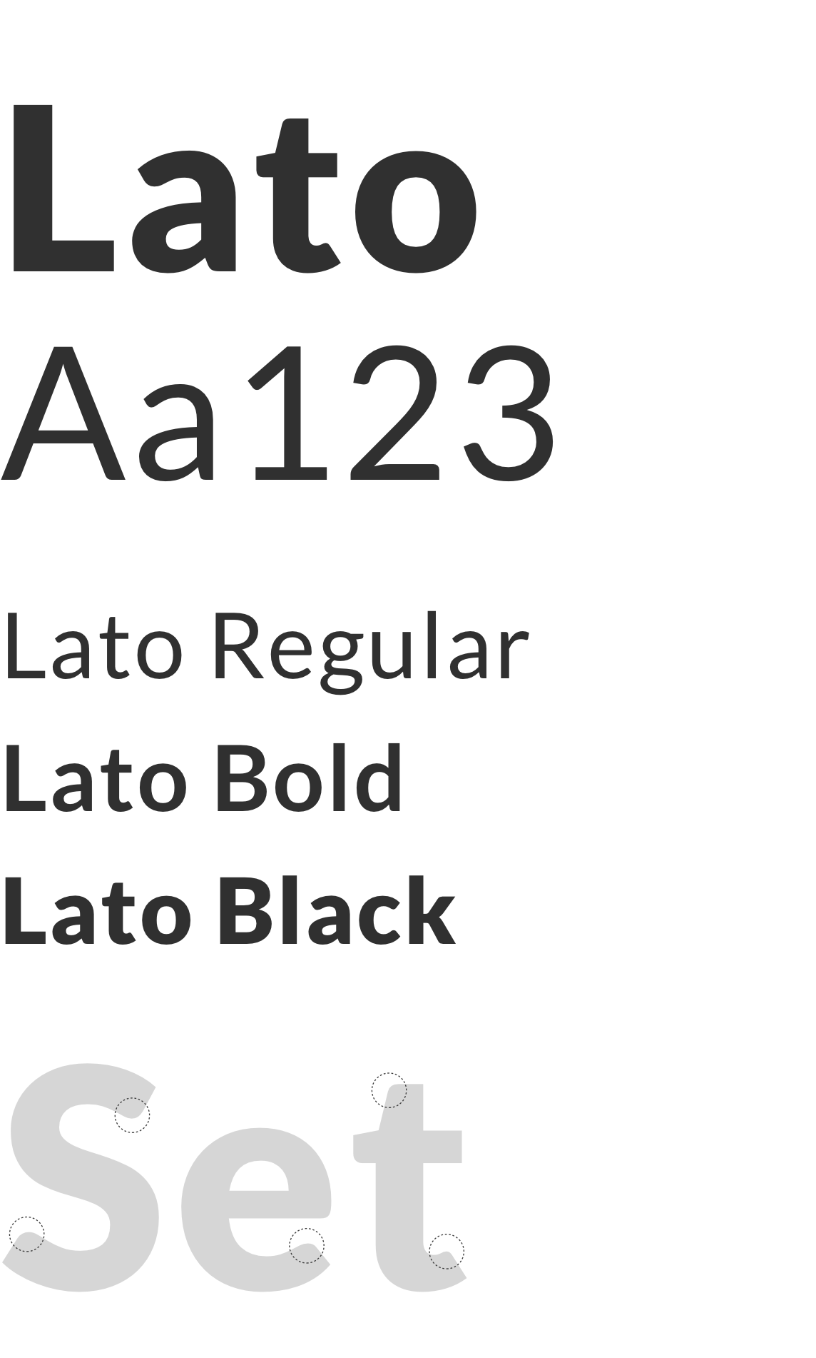
Typography
I chose Lato font-family for three reasons: A. the semi-rounded details of the letters gives Lato a feeling of warmth, while the strong structure provides stability and seriousness, B. the font supports more than 150 languages, and C. it's a Google font, free and thoroughly tested in digital projects.
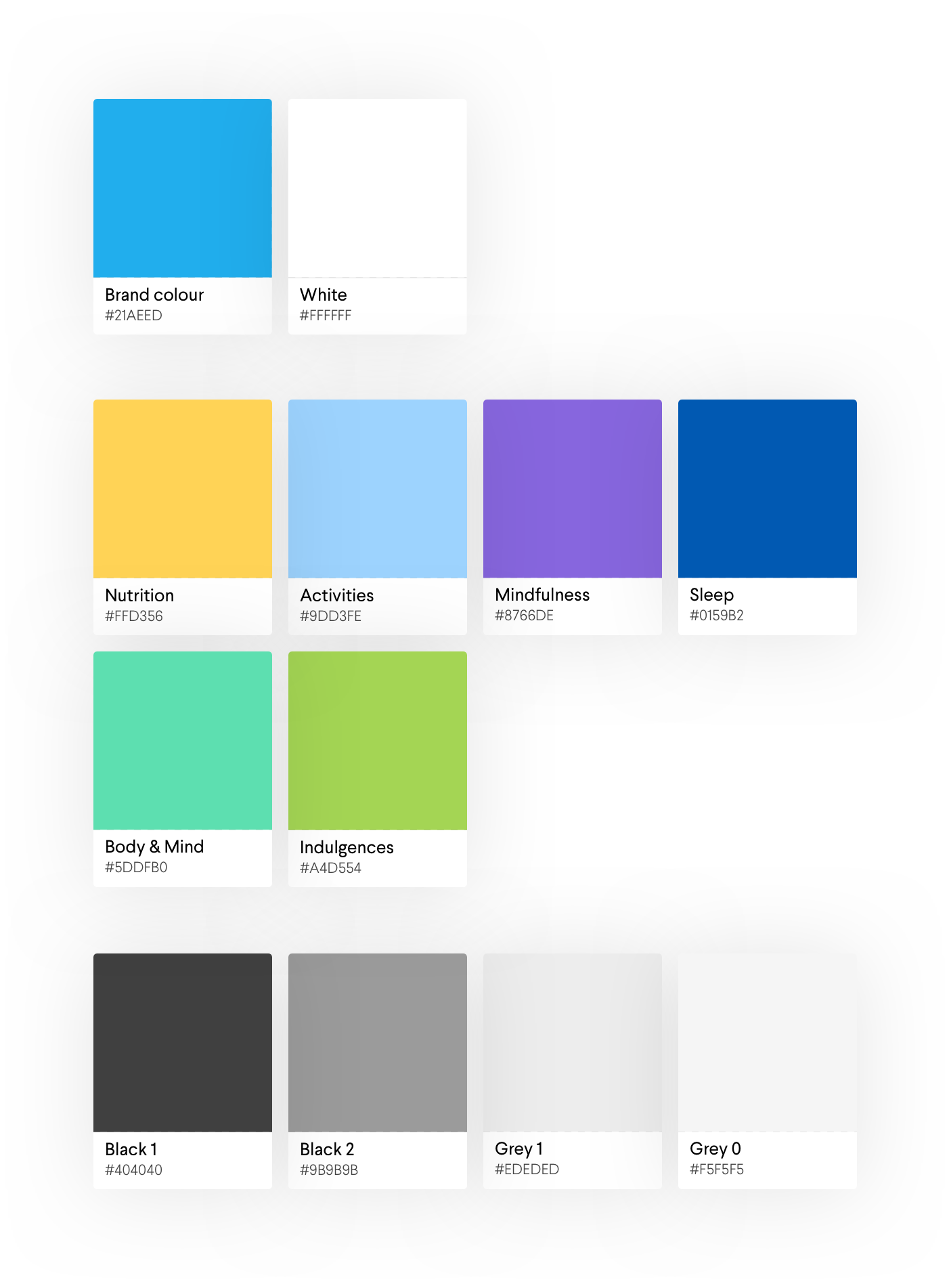
Color palette
There will be three different colour palettes, divided by functionality: A. actionable components (buttons, links, functionable icons), B. Health Score representation (an entire app section), and C. secondary UI elements (texts, backgrounds, lines, icons, etc).
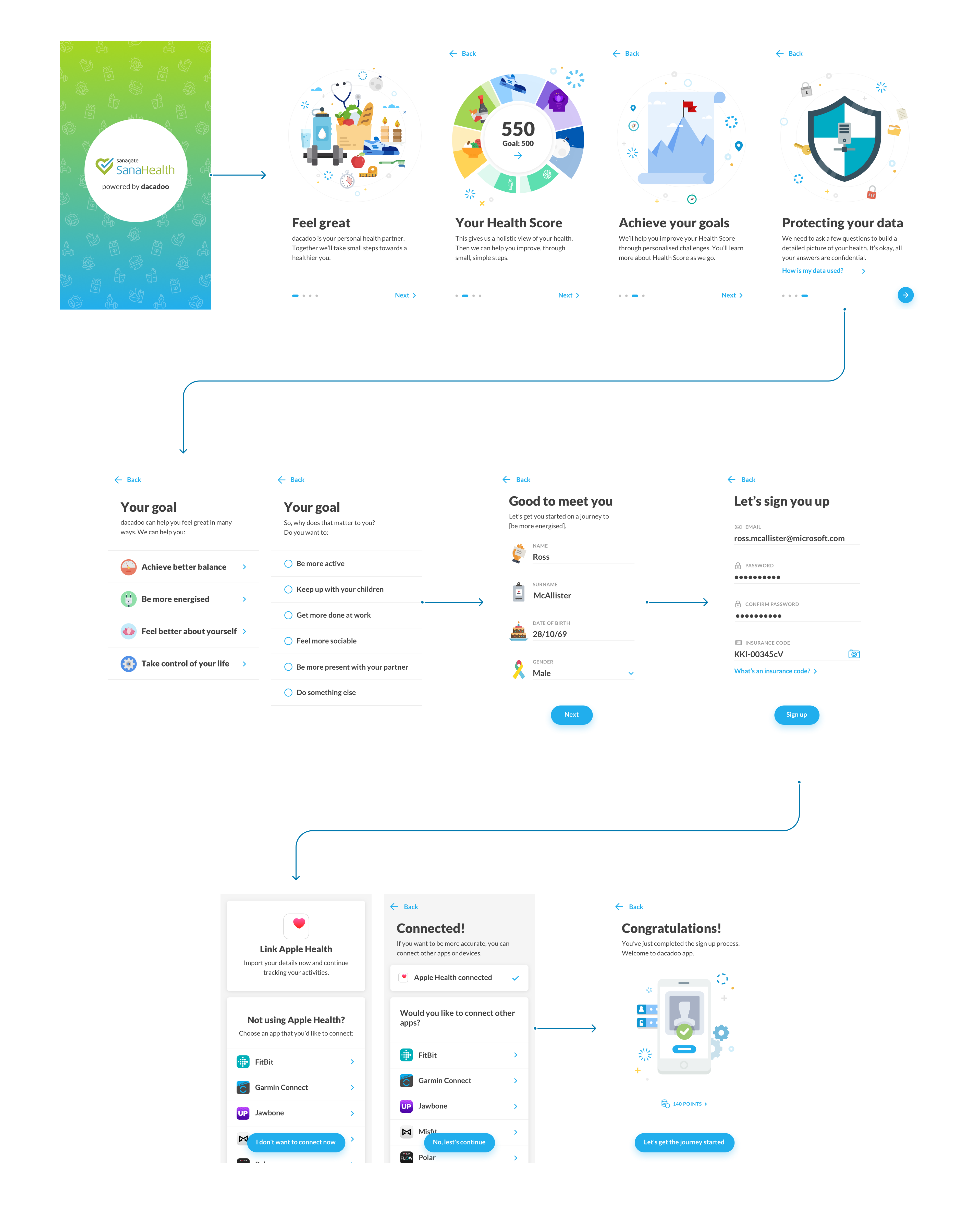
ONBOARDING
A fast, fun, educational introduction
We decided to use onboarding to educate the user about the app's core function. It triggers the first self-reflection moment for the users to consider their health goals.
HEALTH ASSESSMENT
Self discovery through awareness
To get an accurate overview of users' health, we opted to gradually know them through a series of 3-day learning evaluation for each Health Score component – nutrition, indulgences, activity, mindfulness, and sleep. This gamification would lead the user to an increase in awareness.
Questionnaire UX model
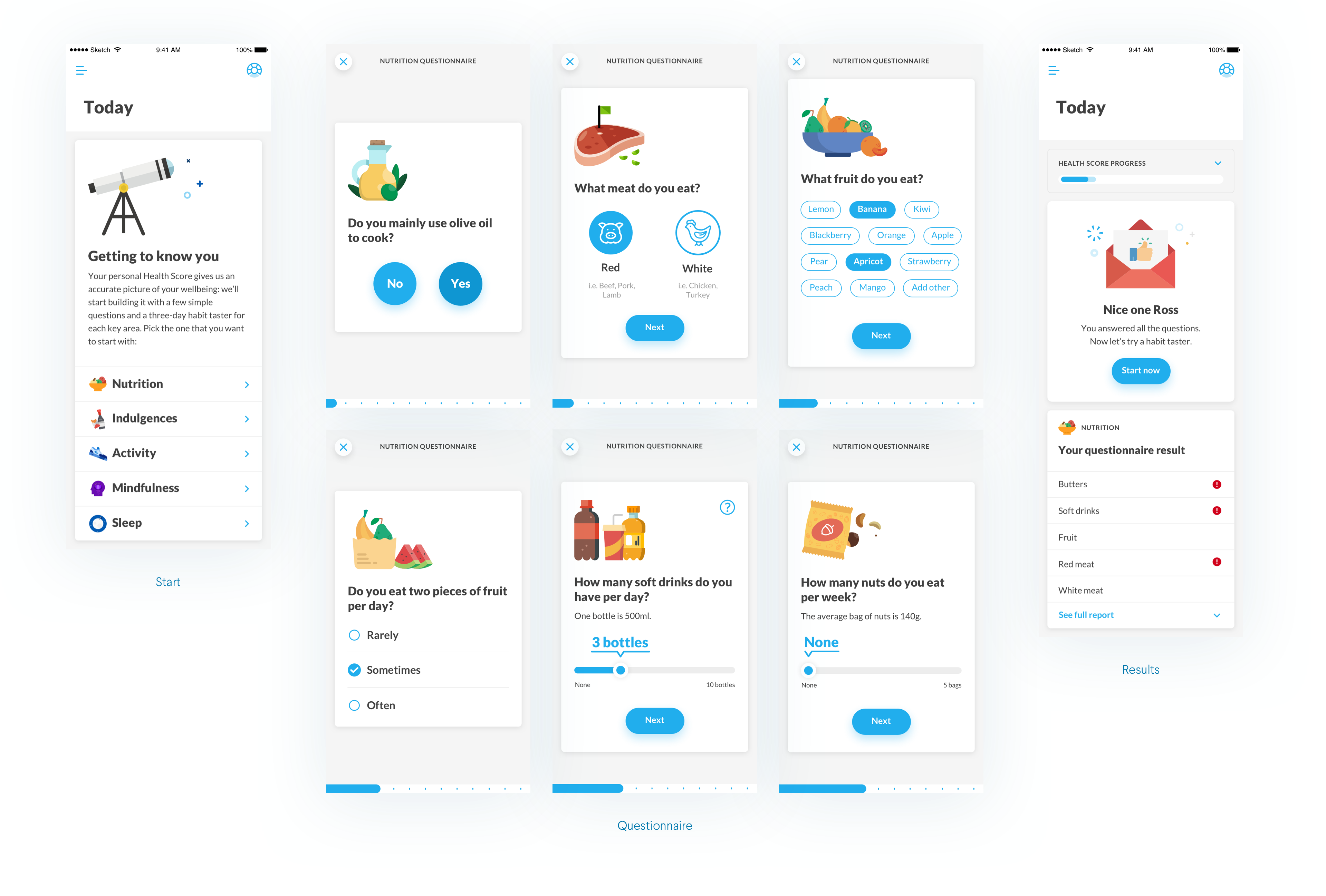
3-day mini challenge related to the topic
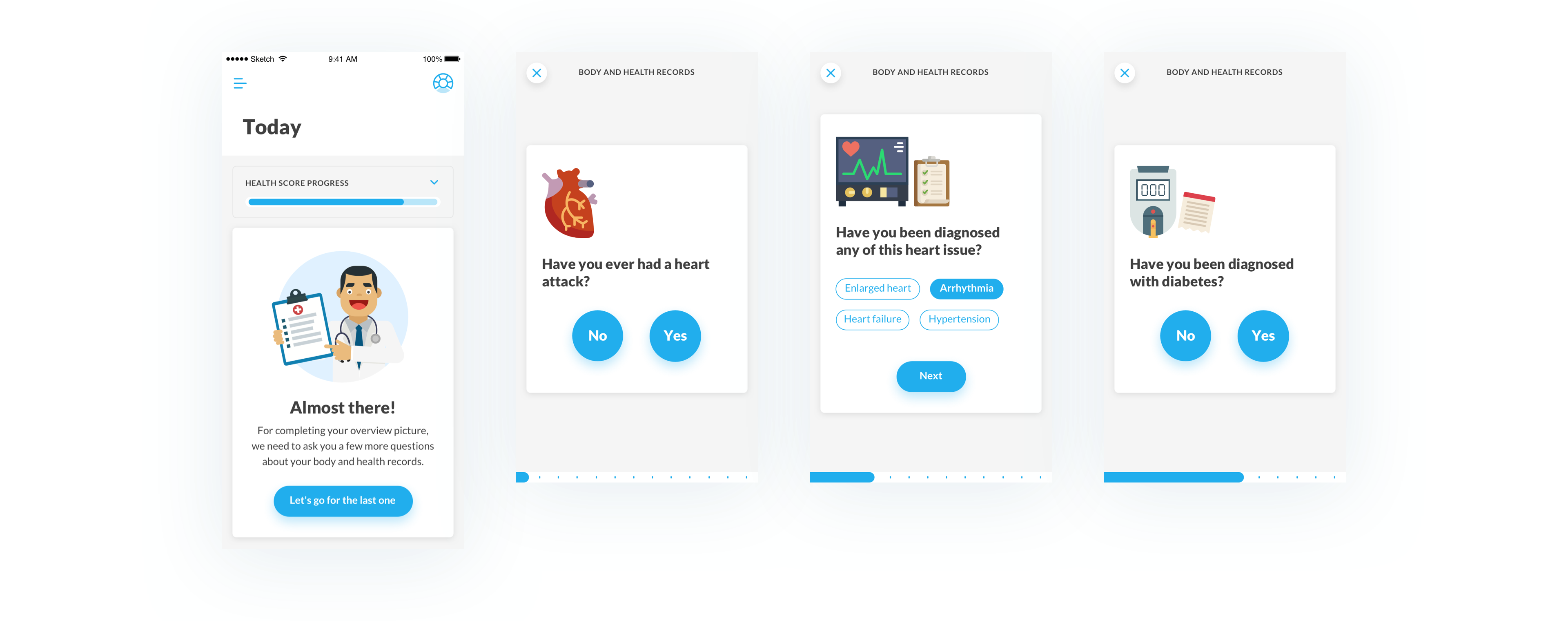
Physical health questionnaire
Lastly, the body assessment, which weighs heavily on the final Health Score. This would prevent, for example, someone with diabetes being advised to limit sugar.
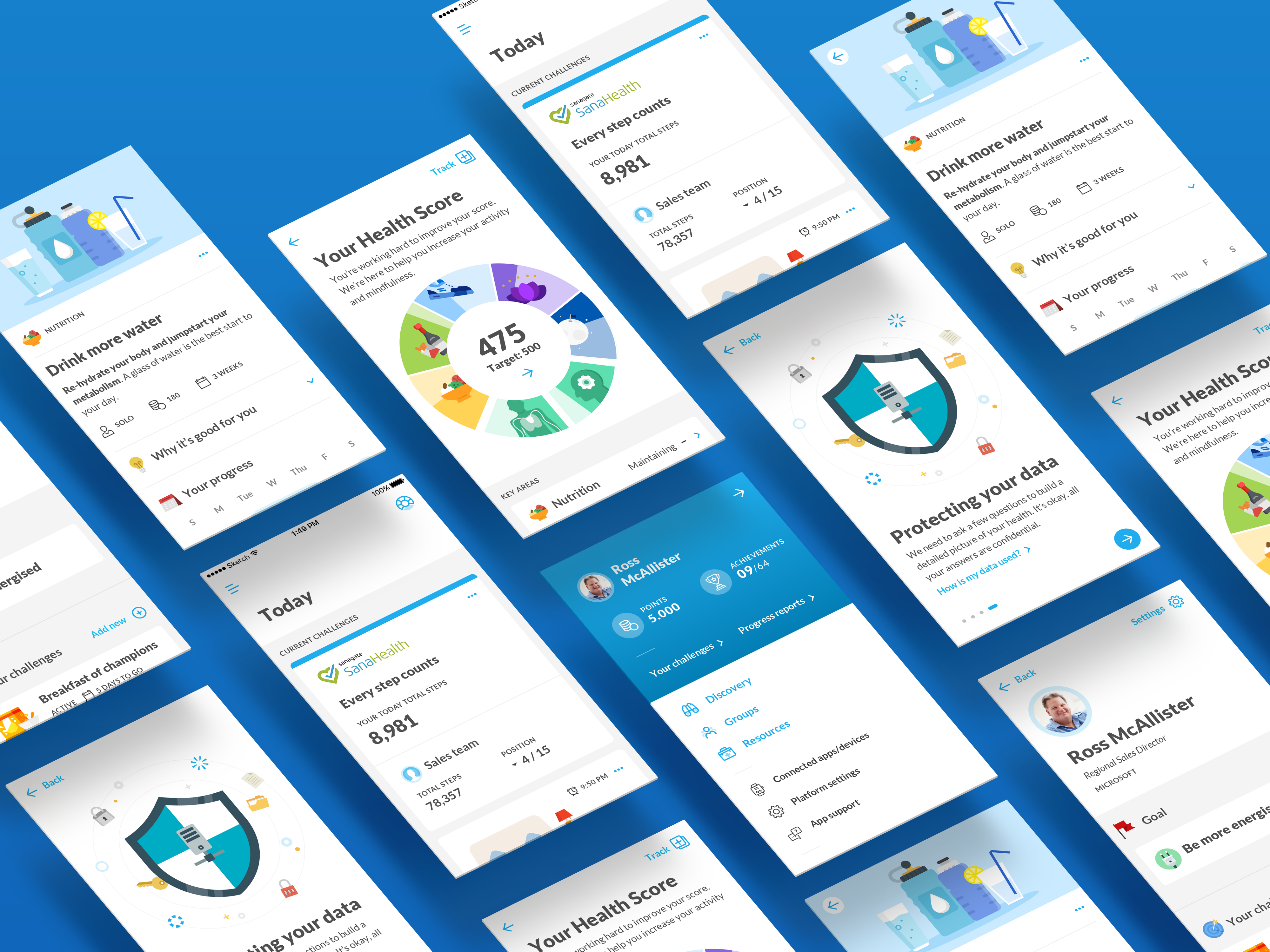
HEALTH SCORE REVEAL
It comes down to splitting hairs!
By requiring the user to complete all assessments, the final Health Score is significantly more credible, emphasizing its holistic nature.
Behaviors vs. States
Health is a holistic pursuit comprised of both your genetic factors and your daily behavioral choices. While there isn't much we can do about our genes, it's our behaviors that make the difference – and that's where Dacadoo comes in.

Nutrition
All food and drink consumed
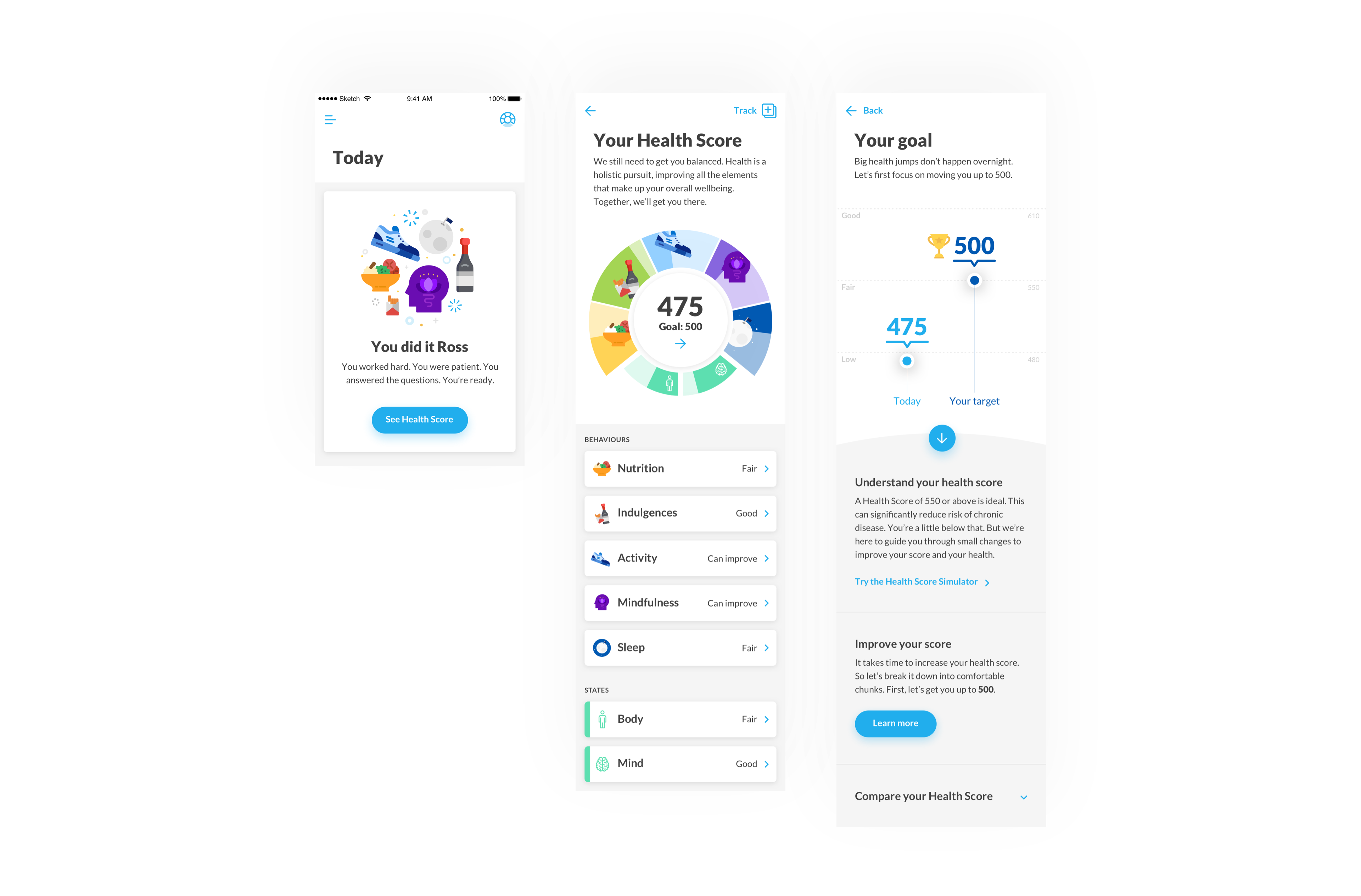
Indulgences
Caffeine, nicotine, alcohol consumed
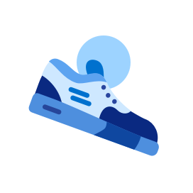
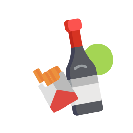
Activity
Any kind of physical activity done

Mindfulness
The practice of being fully present, aware

Sleep
Any kind of activity related to sleep and rest
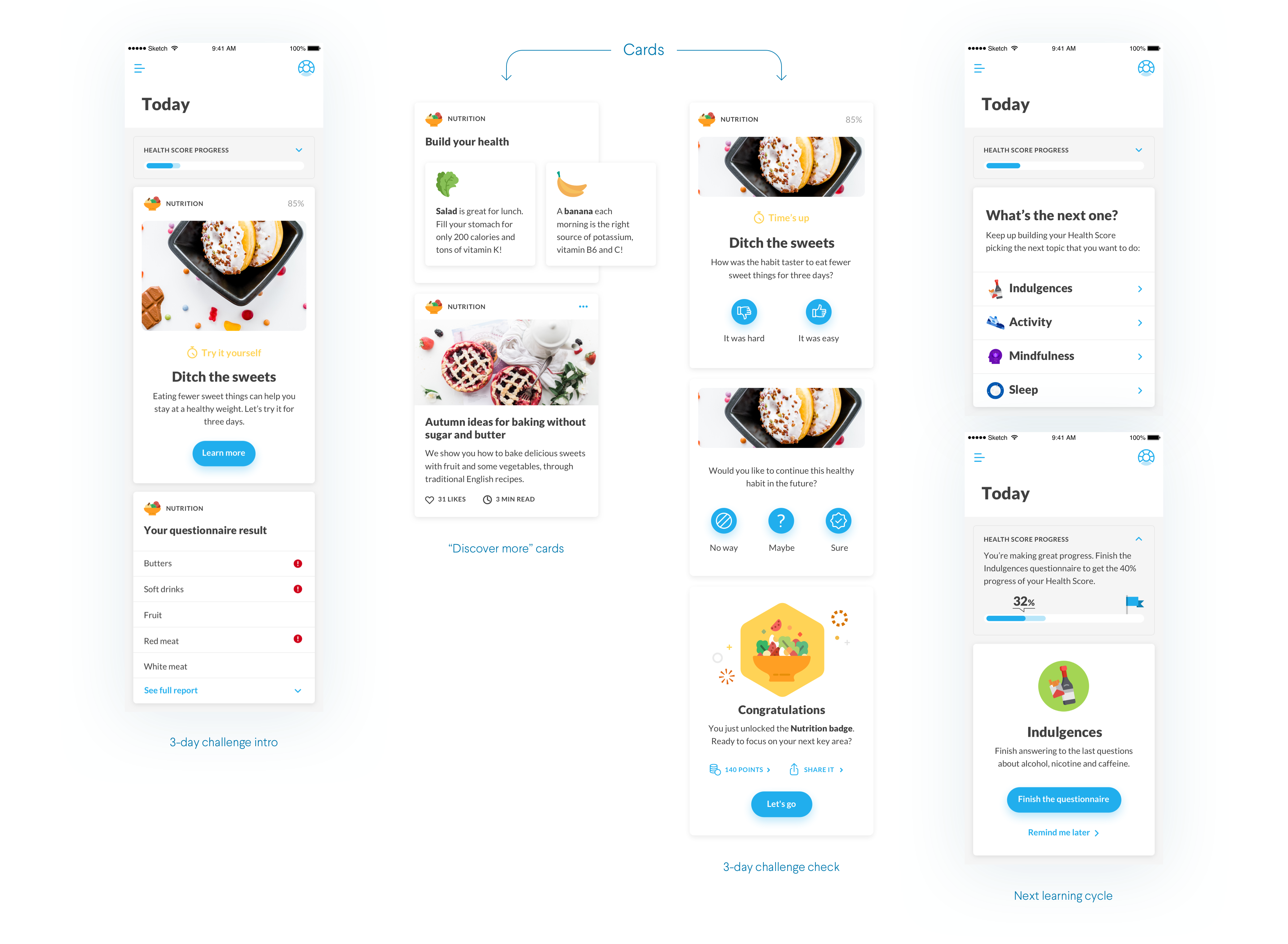
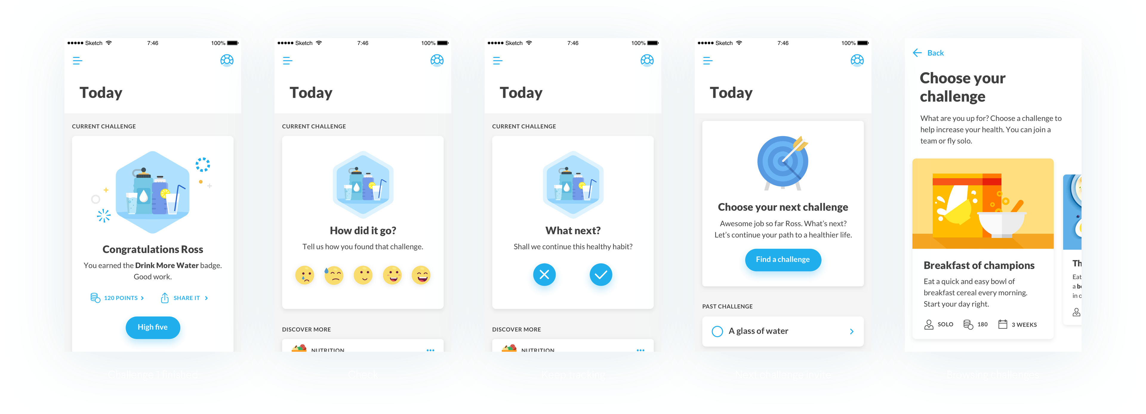
'TODAY' SCREEN
Staying focused on what's relevant
The Today screen is where the user is engaged most with the app and is guided through their journey. The goal is to keep the focus only on what’s relevant in that moment, providing tailored “next steps”, just like a real coach would do.
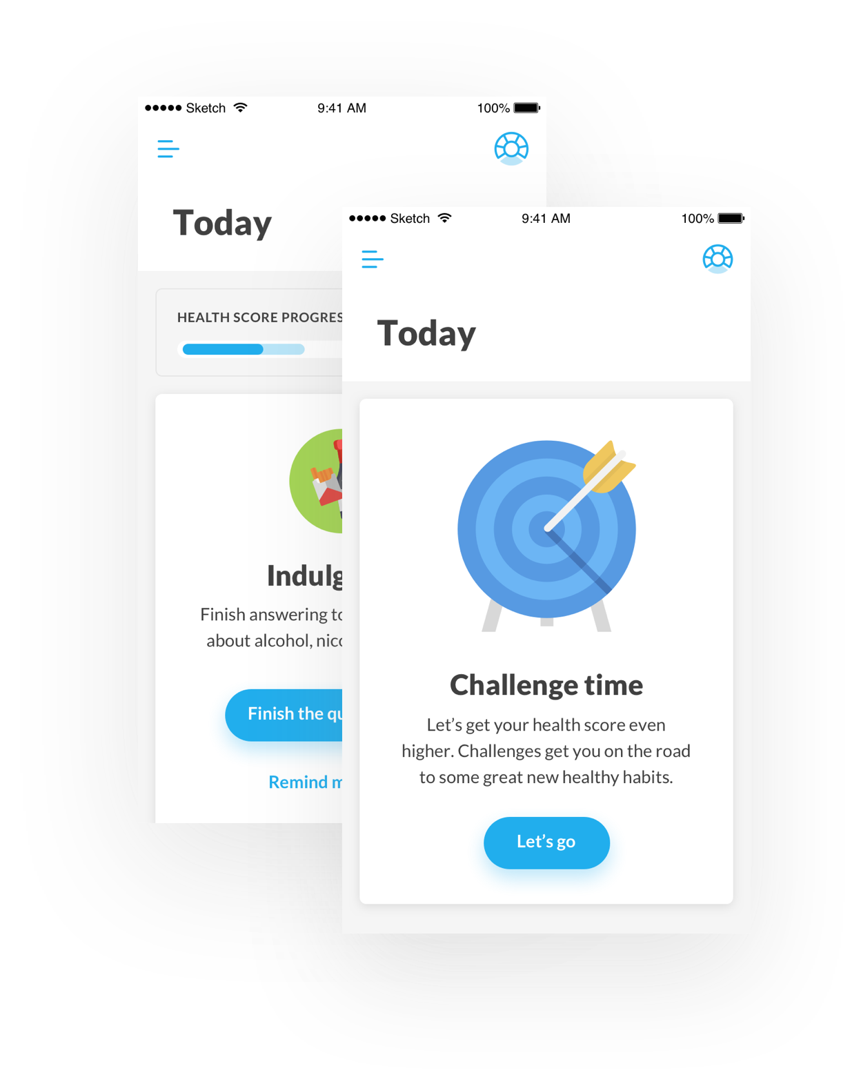
What’s next
Guide the user through the principal steps of the journey: assessment phase, Health Score reveal, challenge phase.
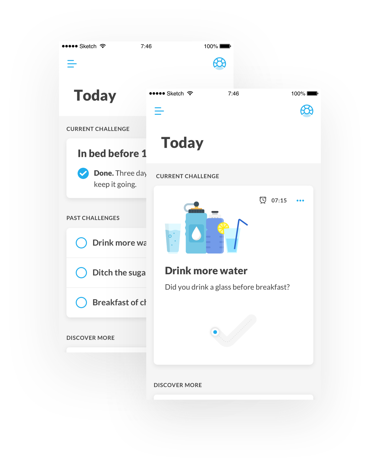
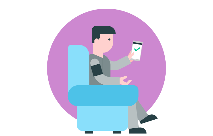
Challenge check-in
The daily check-in is the highlight of the Today Screen, giving users a sense of accomplishment by reviewing and completing challenges.
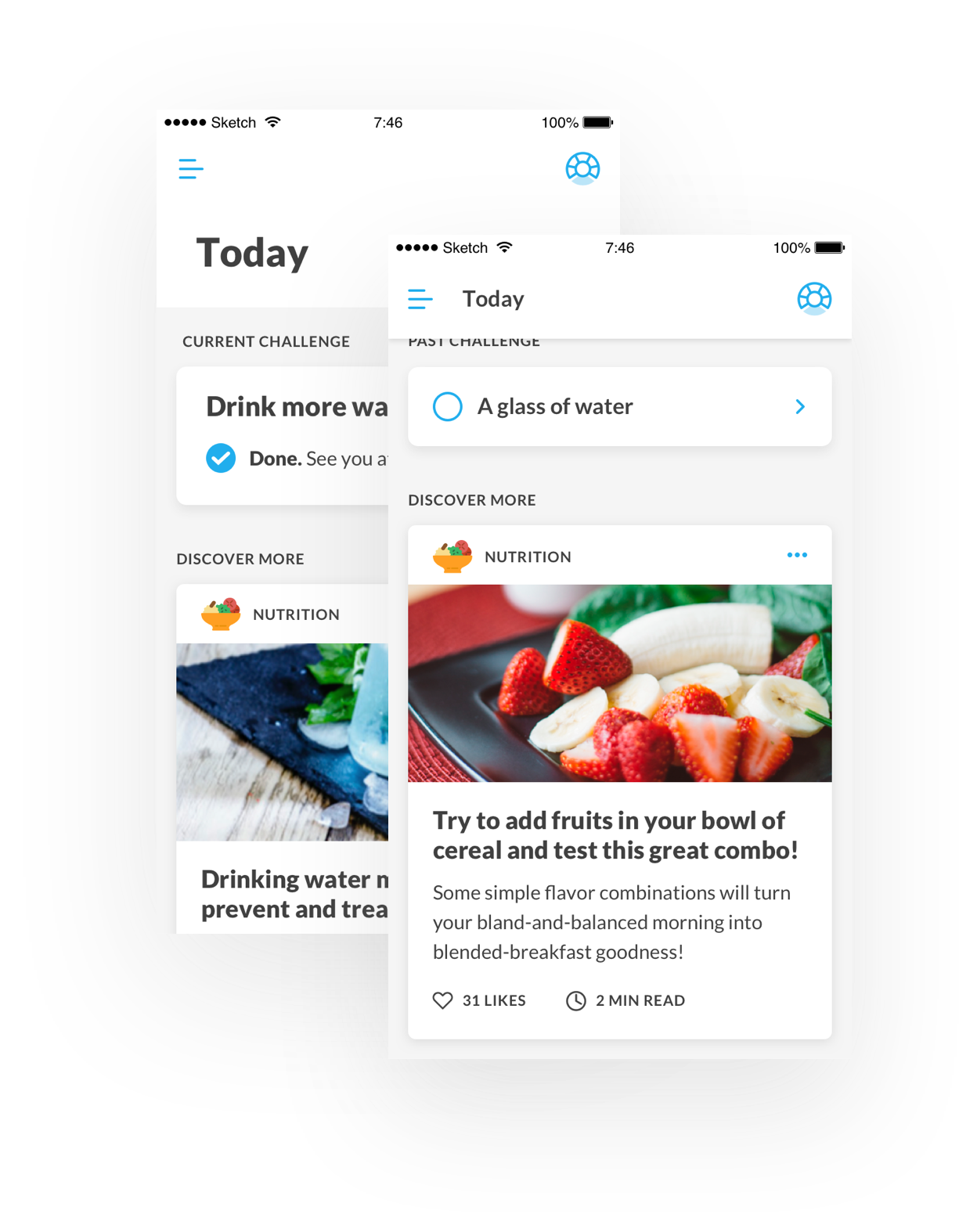
Recommendations
Articles, media, factoids. Relevant content users may be interested in which could help them with their behavioural changes.
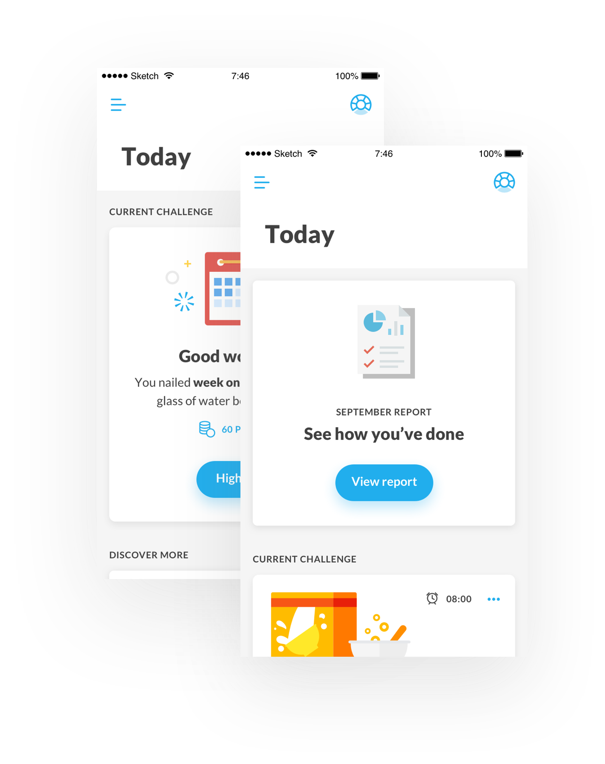
Feedback
Help the user know themself by providing feedback on their progress and areas of improvement.
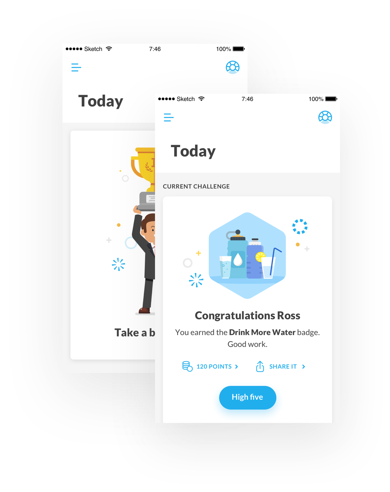
Celebration
Reward the user on every important step in their journey. Improvements and milestones will be celebrated here.
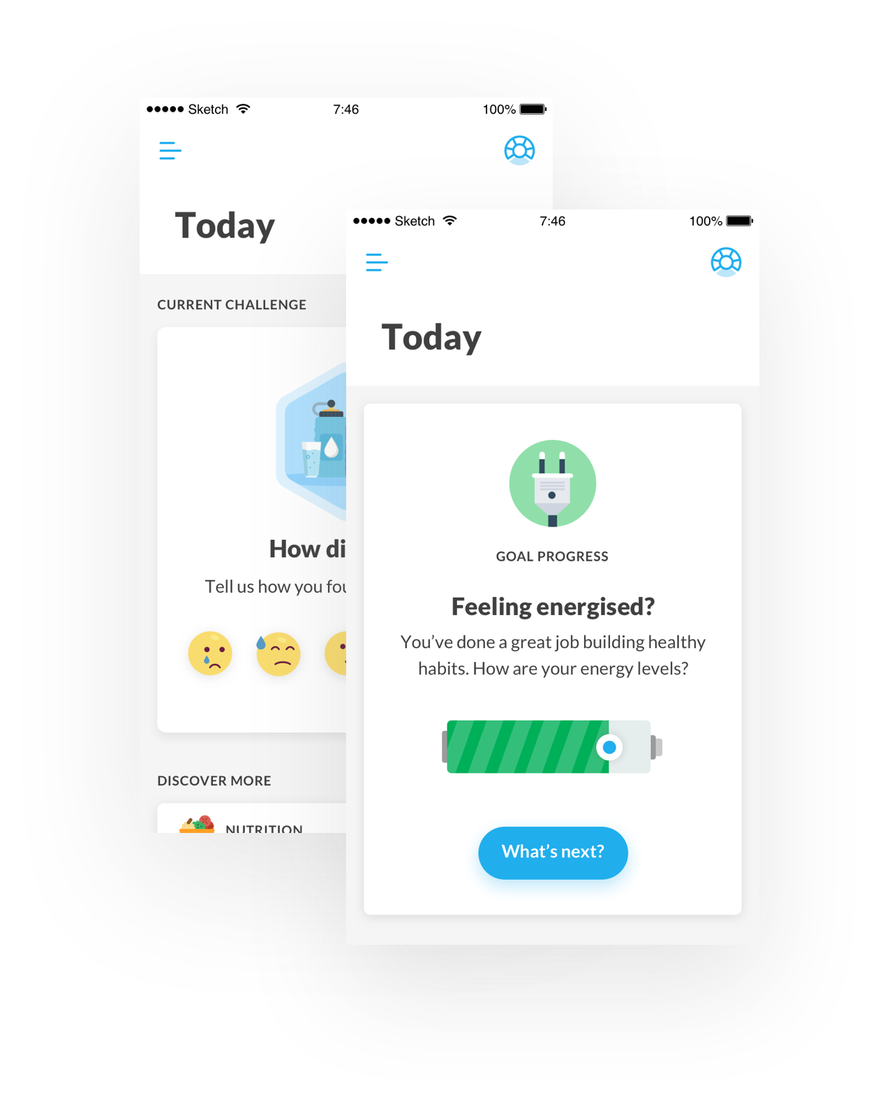
Emotional check-in
At specific moments (e.g. end of challenge) a short 2-3 step questionnaire will be provided to assess the user's feelings.
INDIVIDUAL CHALLENGE
Building new healthy habits: small changes at a time
Each challenge lasts 3 weeks – research has shown that this is the minimum length of time required to establish a new habit. Types of challenges will vary across the different health components and each one will be clear, achievable, and easily trackable. The difficulty level should also be tailored to the user to increase their feeling of self-efficacy.
Starting a challenge
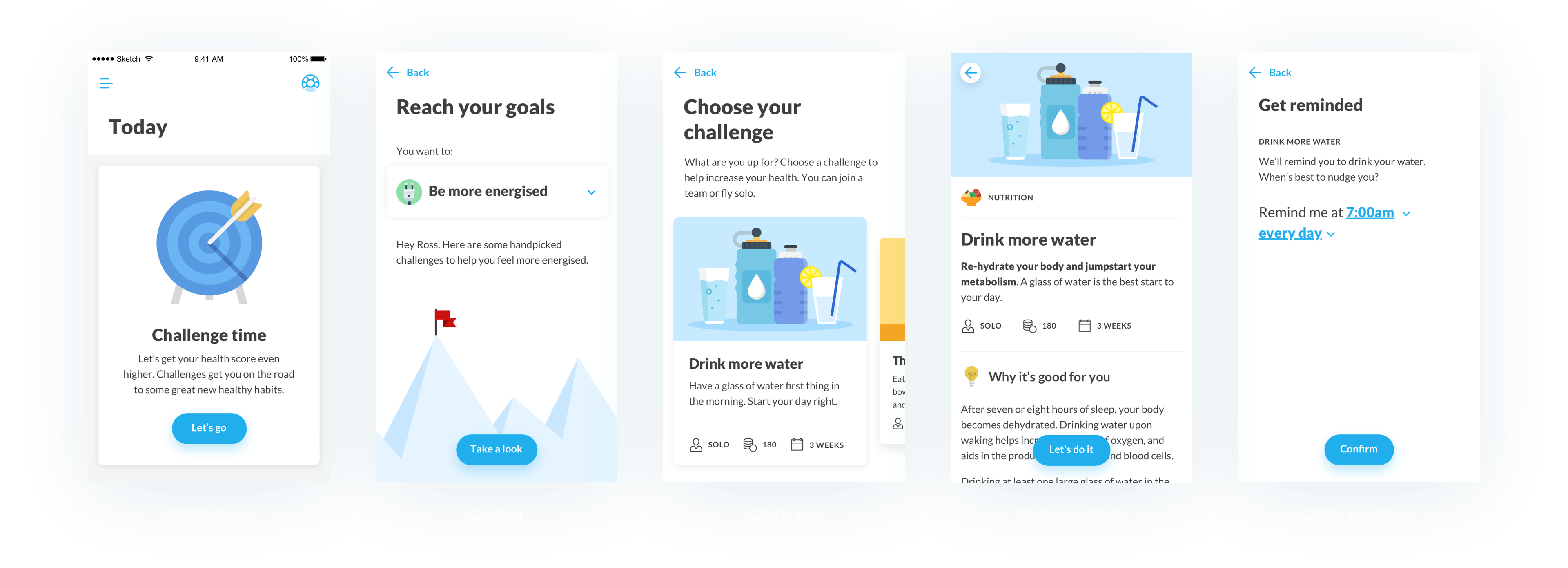
Dacadoo's signature moment: an easy and satisfying check
We decided to add a subtle, brandable, micro-interaction that gives users a moment of delight and gratification: the daily check-off. Making progress is very important for users, so a gesture-based interaction will prompt the user to check in daily, while also giving Dacadoo another branding moment.
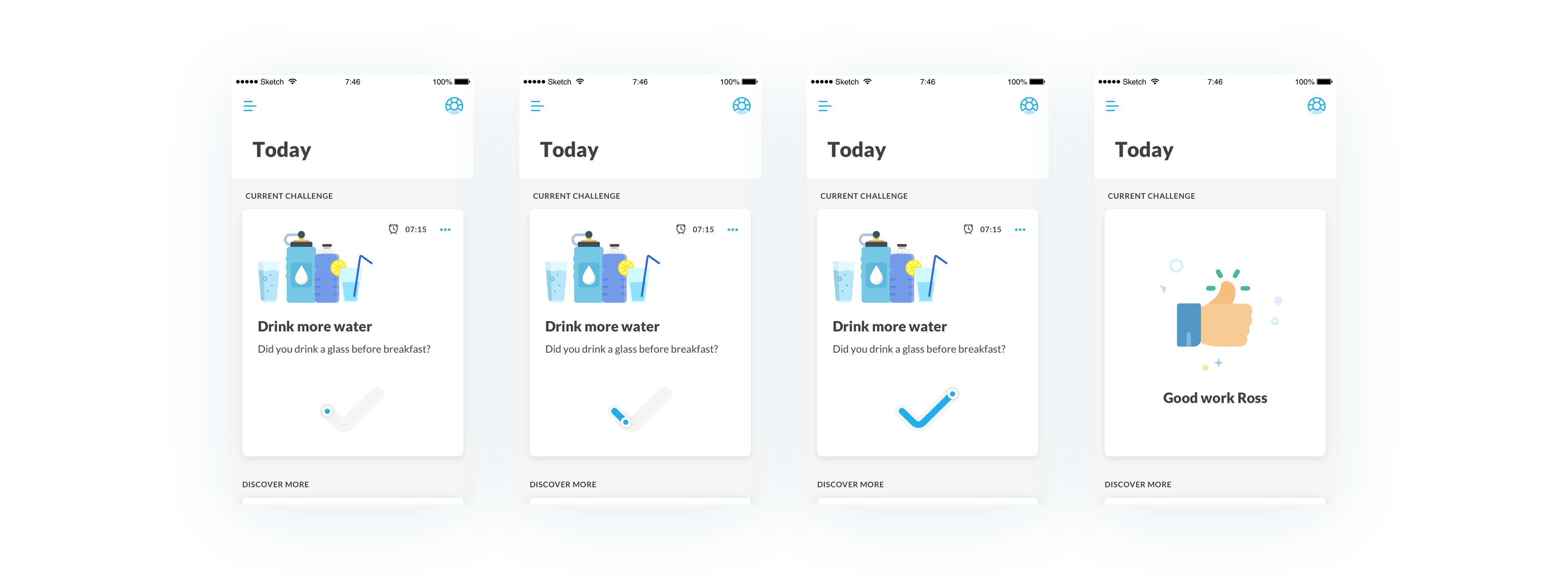
Checking the challenge's completion and starting a new one
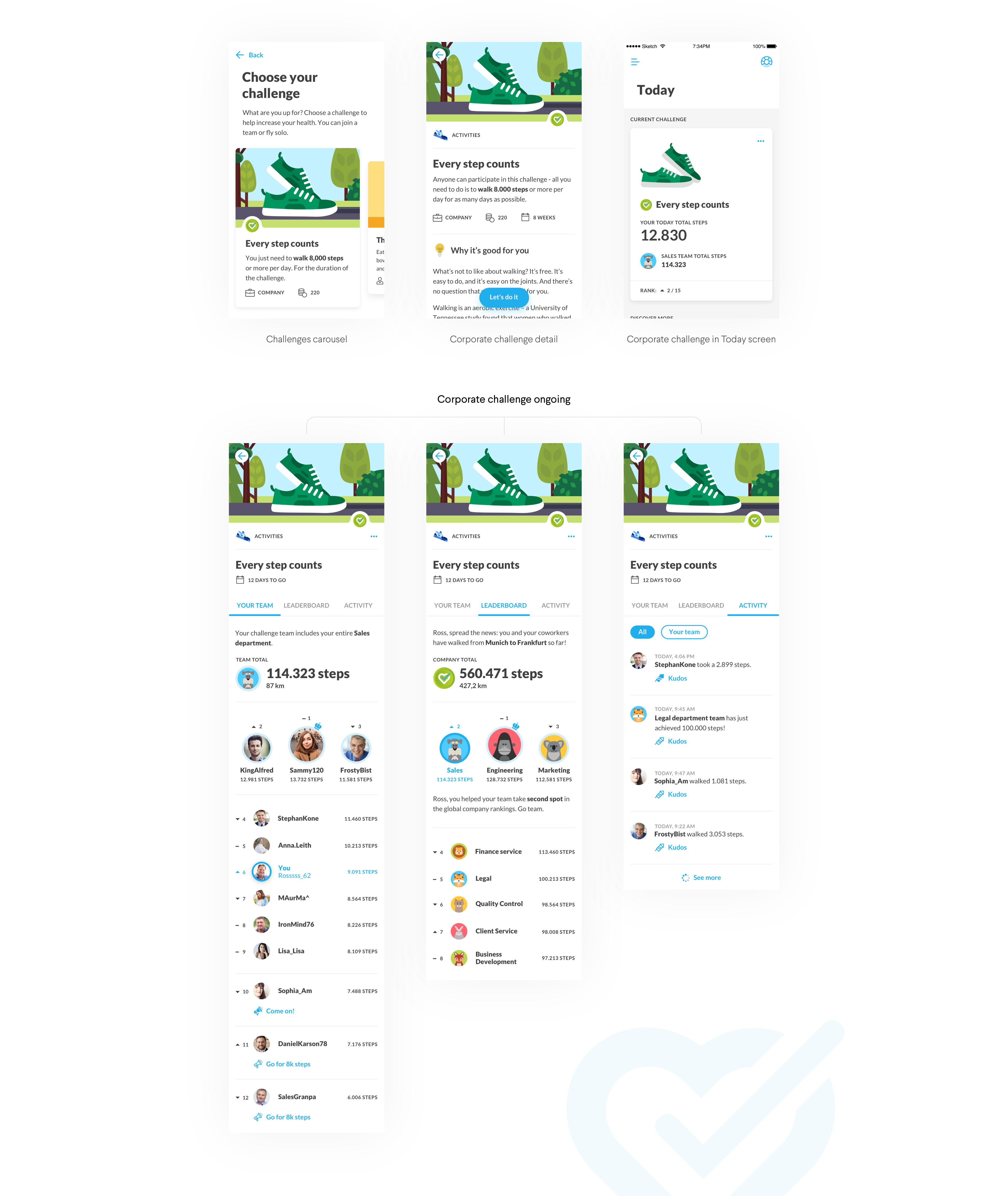
CORPORATE CHALLENGE
Let's boost healthy engagement within the company!
Given Dacadoo's potential to be a corporate health service provider, we also reshaped corporate challenges following the same principles previously explained. For larger companies, we recommend dividing employees into subsets to ensure everyone feels included.
Credits
Final thoughts
DESIGN
Thomas Sutton, Executive Creative Director
Seisho Manabe, Team Lead
Kim Gladow, Senior Interaction Designer
Aris Dotti, Interaction Designer
Paul Anglin, Copywriter
SPECIAL THANKS
Kalle Buschmann, Creative Director
Jens Hofmeister, Business Development Director
Antoine Vierling, Project Manager
Gosh, I remember vividly how nervous I was working on my first project in a new city, communicating in English (not my native language!) with foreigners from around the world: Japanese, American, Swiss, English, Dutch, and more!
The project itself was also quite complicated: an app to track every aspect of our health, complete with a complex score and explanations, challenges, corporate options, etc. All of this in just one digital product! It was a struggle in the beginning, finding middle ground on such demanding project with so many voices, but in the end we pulled off something everyone was proud of and conquered the client's heart.
Wanna see more?
Stove CookFood & Groceries, App
AirpenHealthcare, App
GoMobility, App
TabasReal Estate, Website
GrowBitEducation, App
Banco BPMFinance, App
WeBankFinance, App
GeneraliInsurance, Website
BPERFinance, App
Developers ItaliaPublic Services, Website
Docs ItaliaPublic Services, Website
Domicilio DigitalePublic Services, Website
Carrier PigeonNews & Information, App
Axa ItaliaInsurance, Website
DacadooHealthcare, Mobile App
BancoPostaFinance, App
Poste ItalianePostal Services, Website
AmicomedHealthcare, App
Buddy,
thanks for
scrolling
📬 WORK INQUIRIES
Got a project or an idea? Don't be shy, drop me a line, and let's make something cool!
📎 LINKS
© 2015–2022 Stefania Pizzichi
Special thanks to Aqquadro, Chobu, Shelby Morrison | Typeface Larsseit
Made with Semplice | Built with blood, sweat, and tears 🙌
