
Poste Italiane
Let the digital transformation begin!
YEAR + TIMELINE
2016 /
1 year
AGENCY
Frog design,
Milan studio
TOPIC
Delivery, Logistics, Insurance, Finance, Payments
MY ROLE
UI design, Prototype,
Documentation
TEAM
Project lead,
UX designer (3),
UI designer (2)
OUTPUT
Responsive website,
Prototype, DLS, Guidelines
¶ Kick-off
While I was finishing my internship – gosh, it was the beginning of 2016 – I started working on one of the most important projects I would contribute to (in terms of visibility and project length): redesigning the Poste Italiane's website. This project was one of the main pillar points of the company's digital transformation process.
Let's proceed in order: who is Poste Italiane? Poste Italiane is today the largest logistics operator in Italy and is a leading player in financial, insurance, and payment services. Founded in 1863, Poste Italiane has a network of more than 12,800 post offices, a workforce of 126 thousand, total financial assets of €536 billion, and 35 million customers. Poste Italiane has been becoming an integral part of Italy’s economic, social, and productive fabric. So, in a nutshell, quite an important client for Frog design, who supported the company with over two years of collaboration.
MY CONTRIBUTION
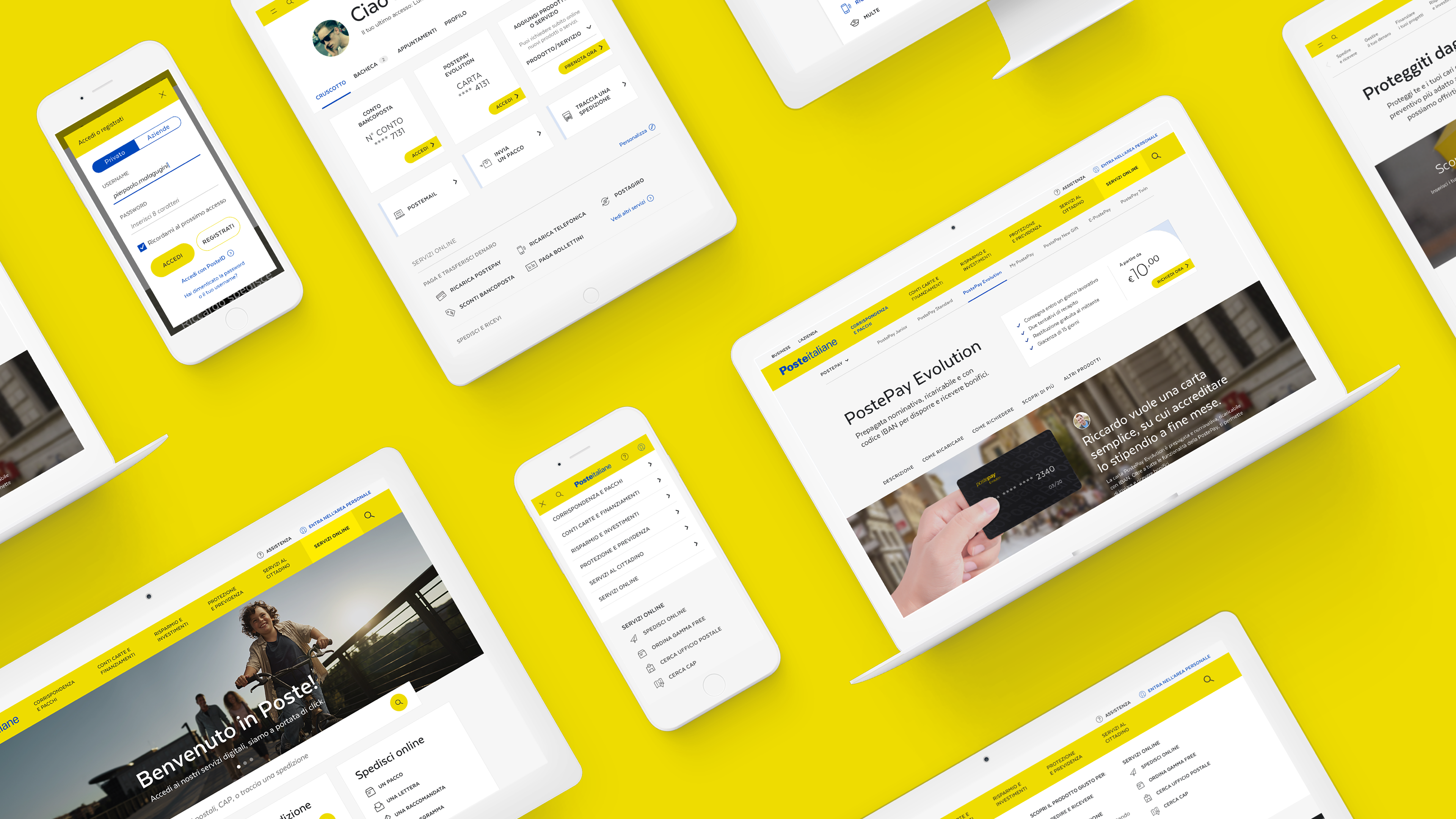
I joined the team almost four months after its inception: the research phase had already been completed, and most of the wireframes were ready to be visually translated. I mainly designed the desktop version of the website, crafting all the main templates and flows, describing visual choices in documentation, providing specifications through guidelines, and finally detailing the whole design language system.
EXPERIENCE PILLARS
New digital presence with a user-centered approach
The team crafted the site, combining a functional and user-friendly experience with emotional, unified, and distinct brand communication. Proactivity, clarity, and guidance became mandatory aspects for every UX and UI choice.

EASIER
A crystal-clear experience guides users, keeping every action manageable and effective, while trimming old bureaucracy.

FASTER
Lightening-fast performance means every task is easy and quick. Such complex tech is hidden behind a lightweight interface.

NICER
An approachable interface that retains Poste Italiane's public institution feel, while also capturing its welcoming atmosphere.
VISUAL PILLARS
Providing a quick answer to the main user's needs
We opted for a visual language that would enhance the experience pillars and the brand's values and identity: simple, cozy, and minimal.

CONSUMER LANGUAGE
We tried to keep the visual language extremely simple, with the aim of being easily utilized by Poste Italiane's entire audience, from teens to the elderly, and everyone in between.

BRAND COLORS EMPOWERED
The brand's easily recognized primary colors, yellow and blue, are difficult to overlook (for better or for worse). The main calls-to-actions are in yellow, ready to capure users' attention.
UI STRUCTURE
Big prominent CTAs, card utilization, fullscreen image-divided sections, and alternating color backgrounds, all contribute to an accessible and familiar experience.
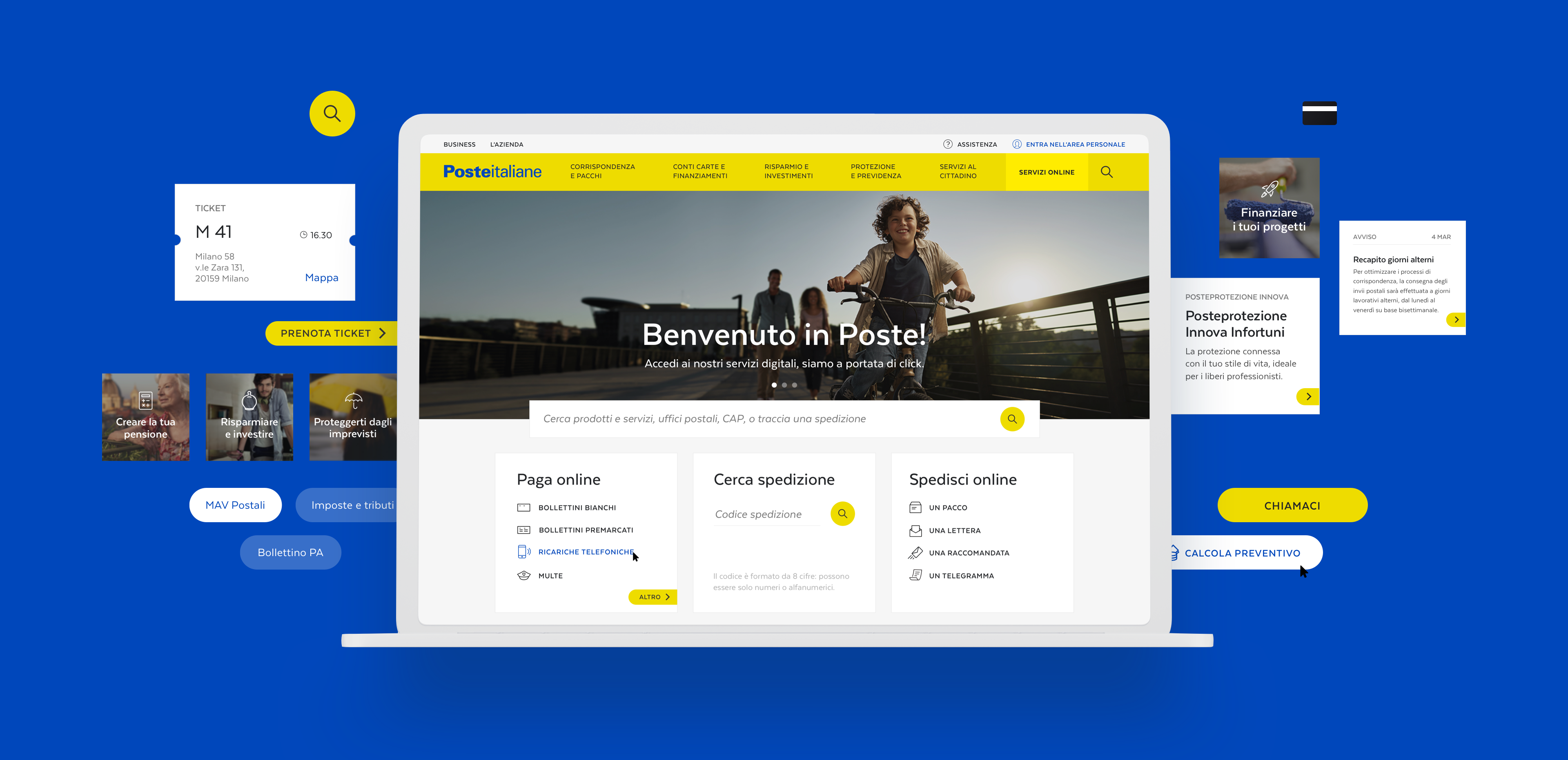
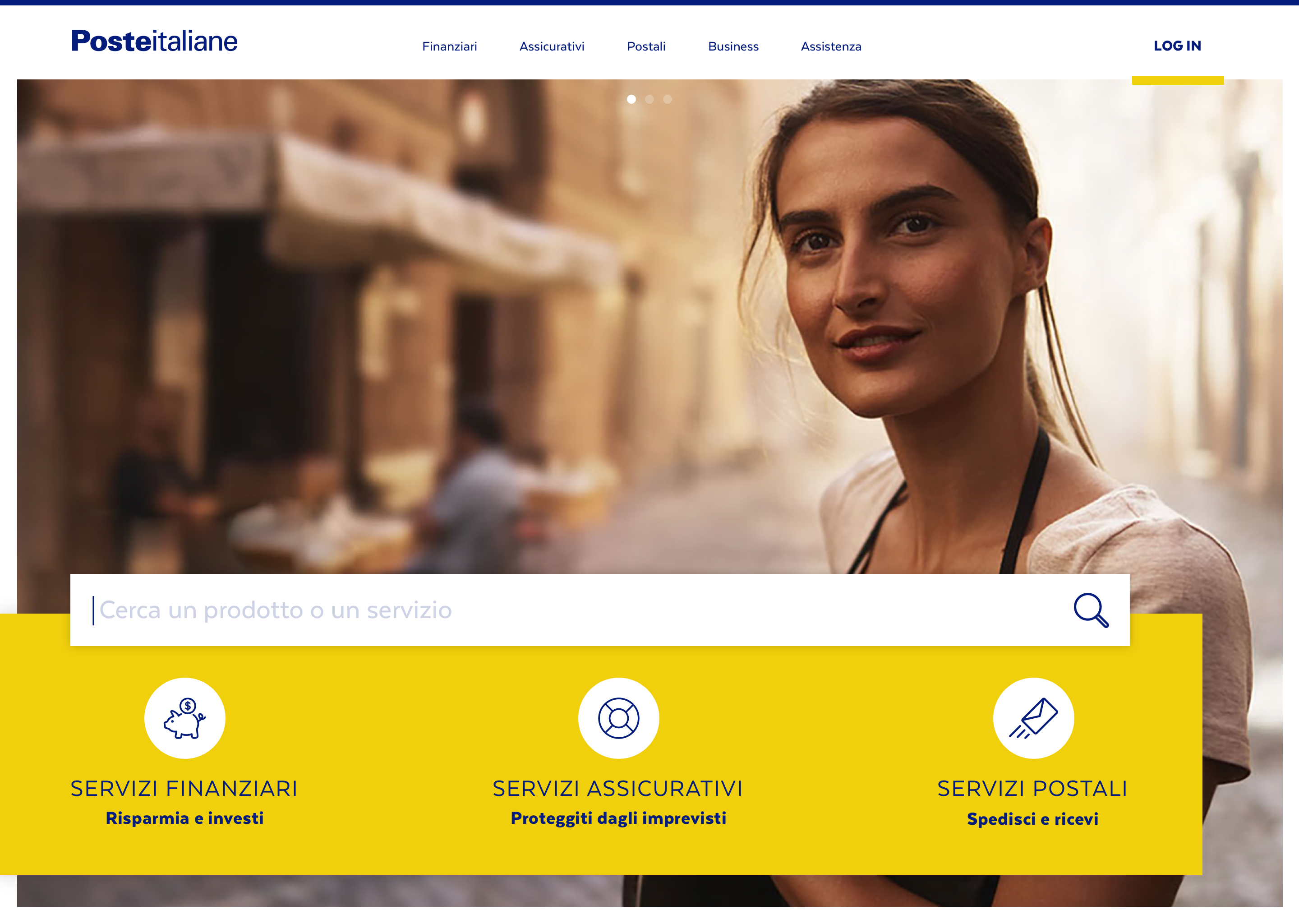
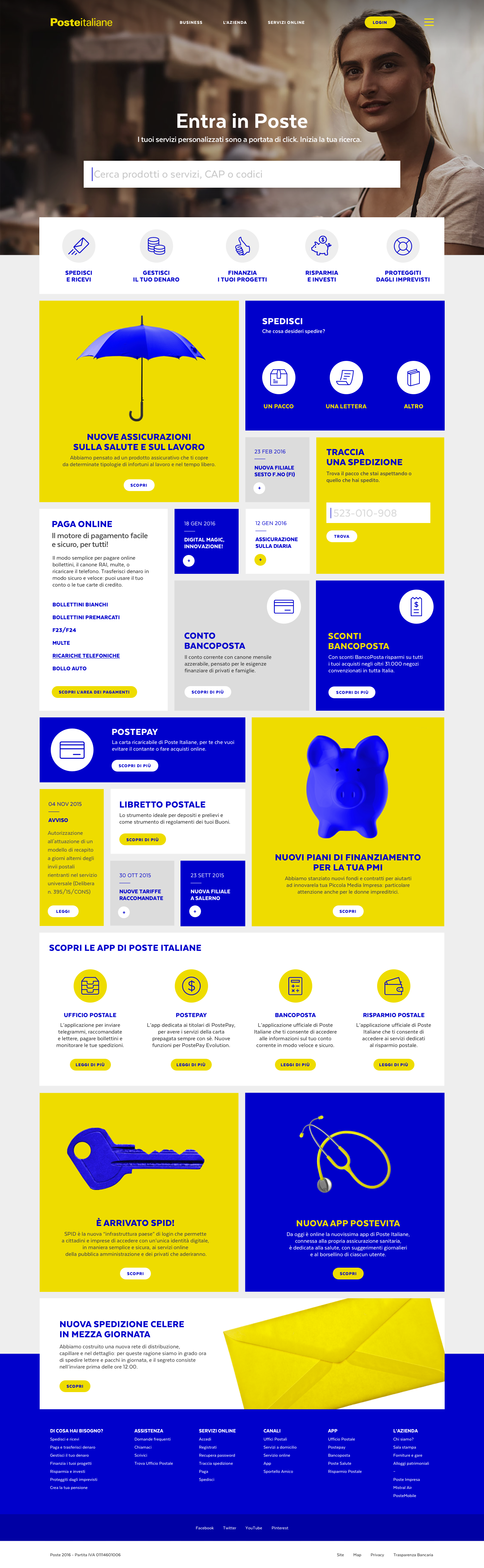
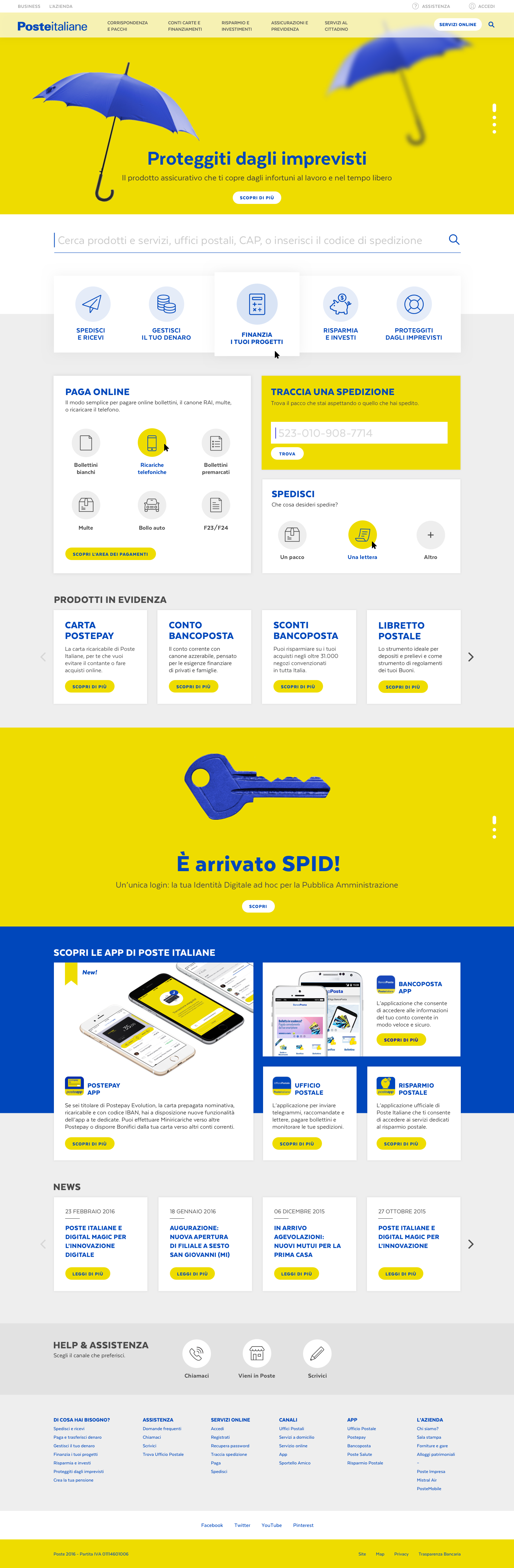
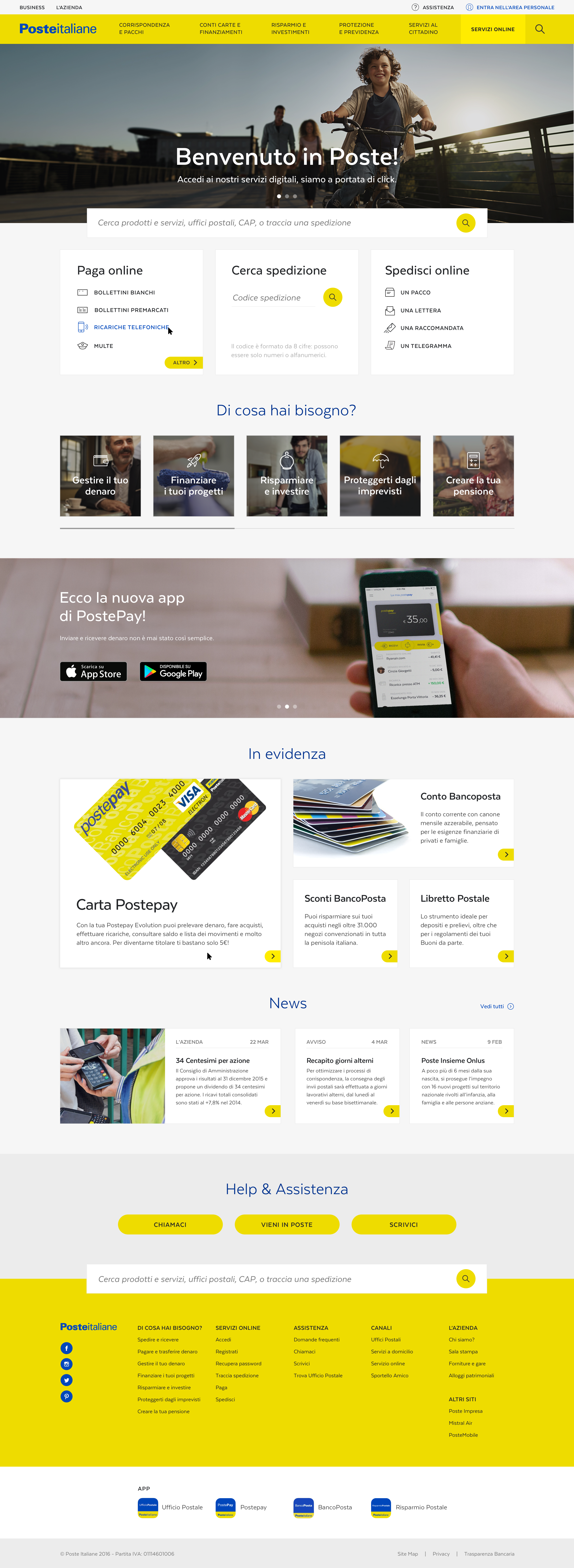
HOMEPAGE
Let's satisfy the user's needs
The landing page suggests the most commonly used services, as these will satisfy 80% of users' needs. Below this, all other secondary information will also be displayed.
First sketches
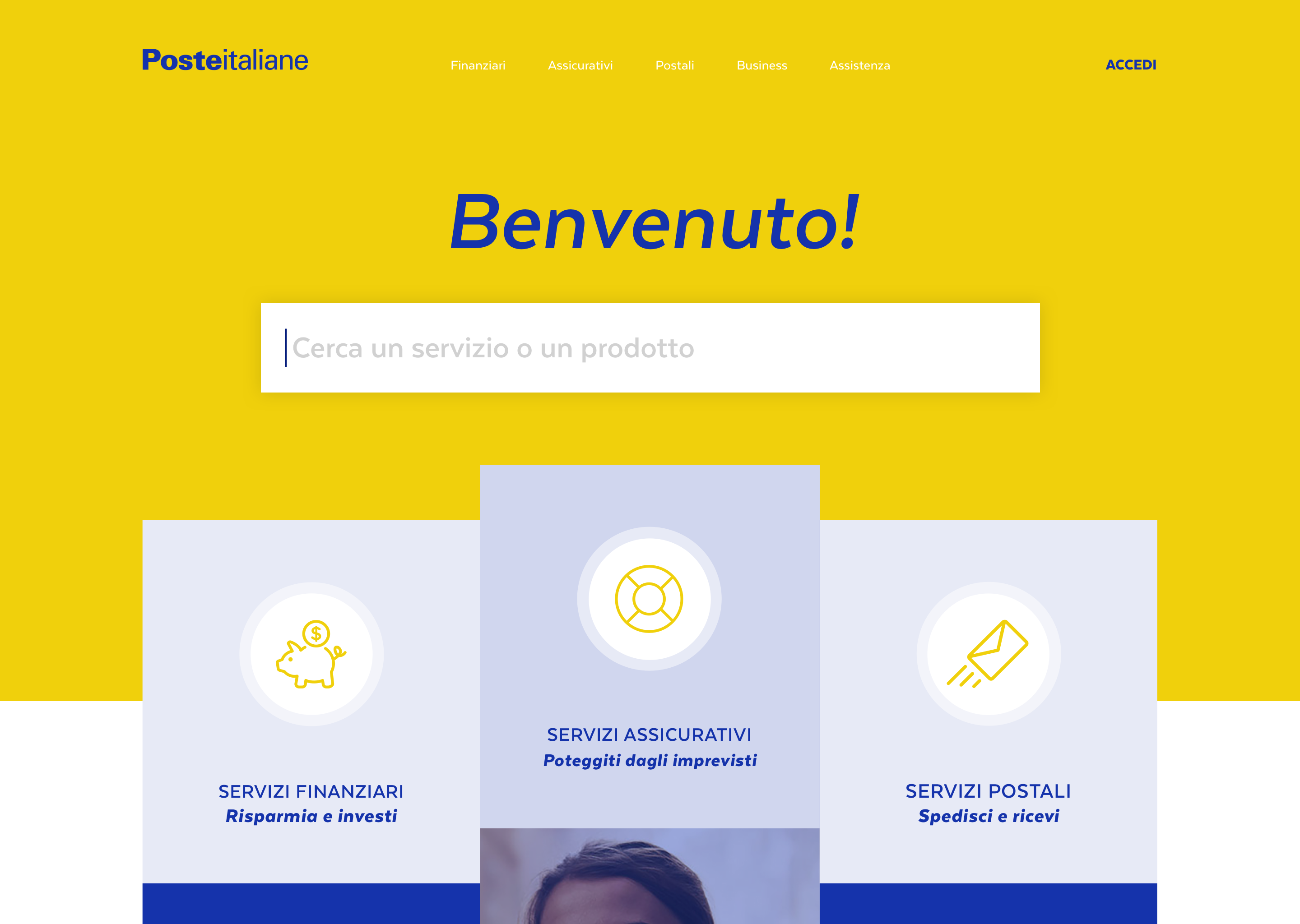
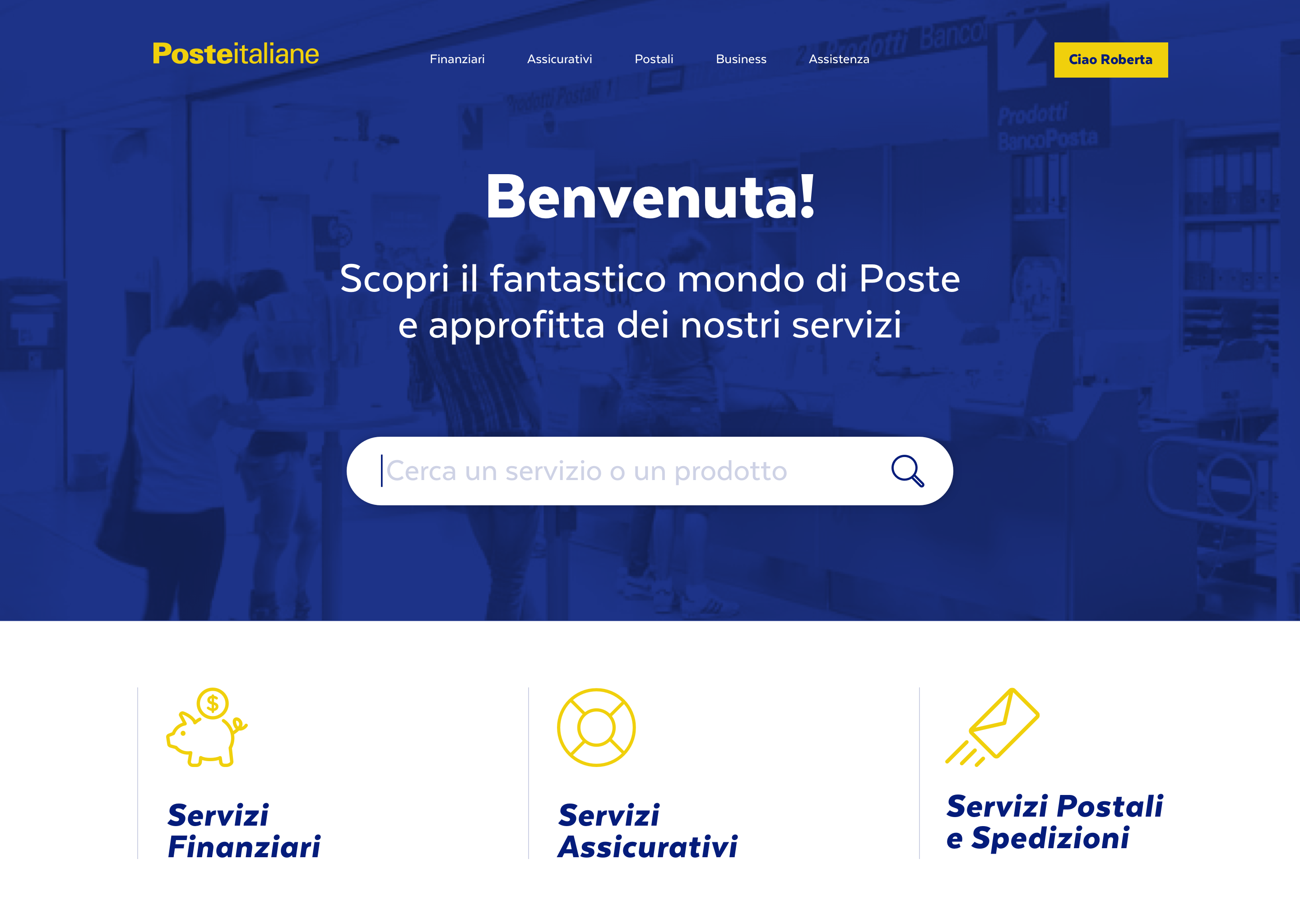
Chosen layout
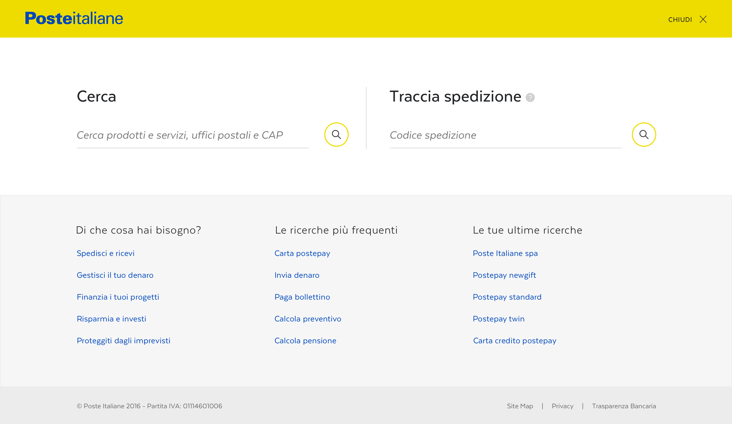
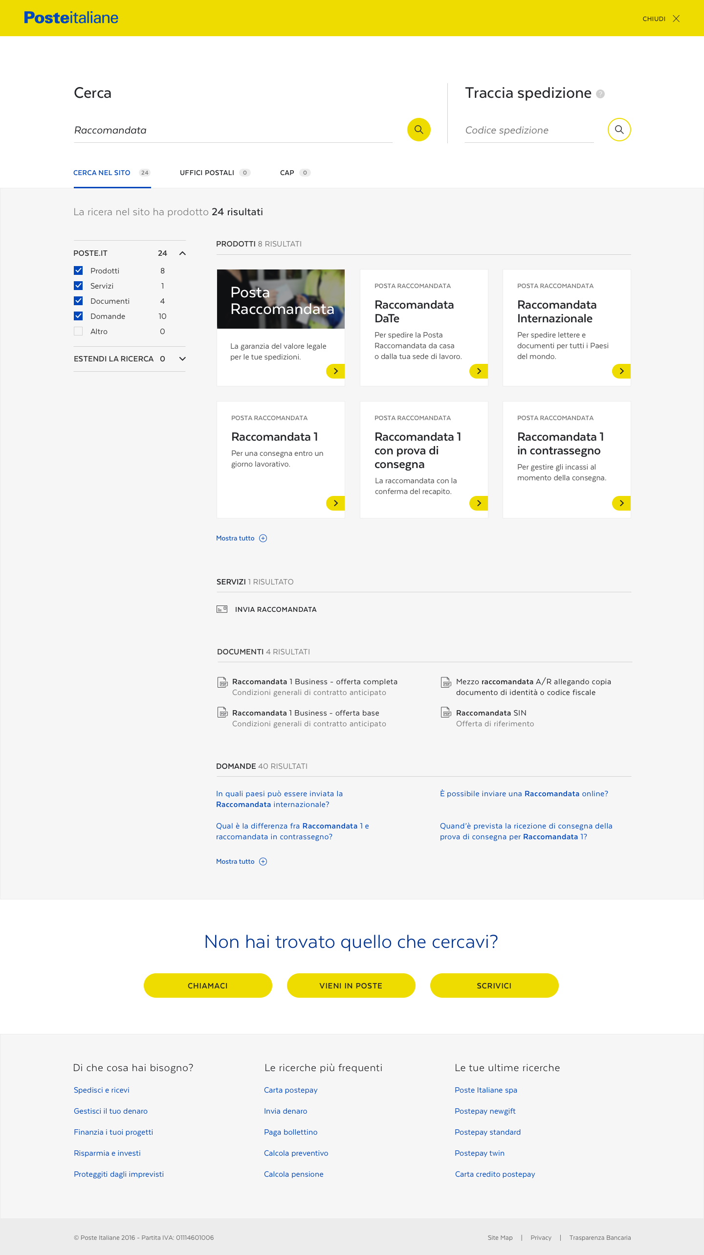
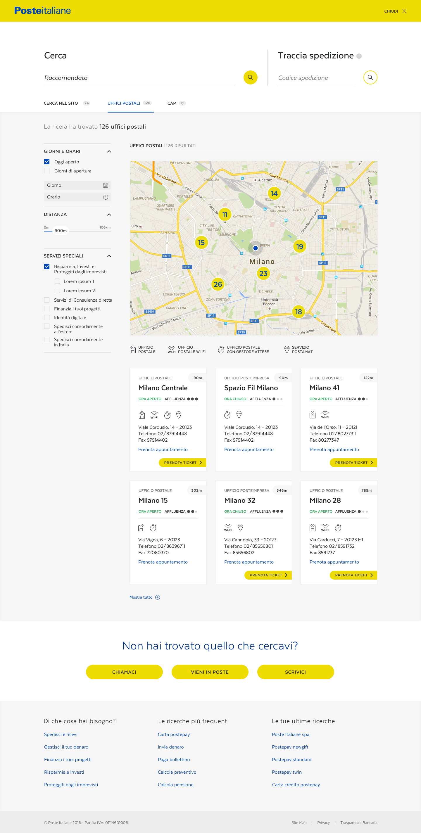
SEARCH AREA
An advanced tool for a massive amount of content
The search is a fullscreen-modal experience, presenting two search functions: general and deliveries. The general search covers a variety of topics, from products and services, to FAQ and documents. There is also a tab that lets users switch between the site's content and postal service listings.
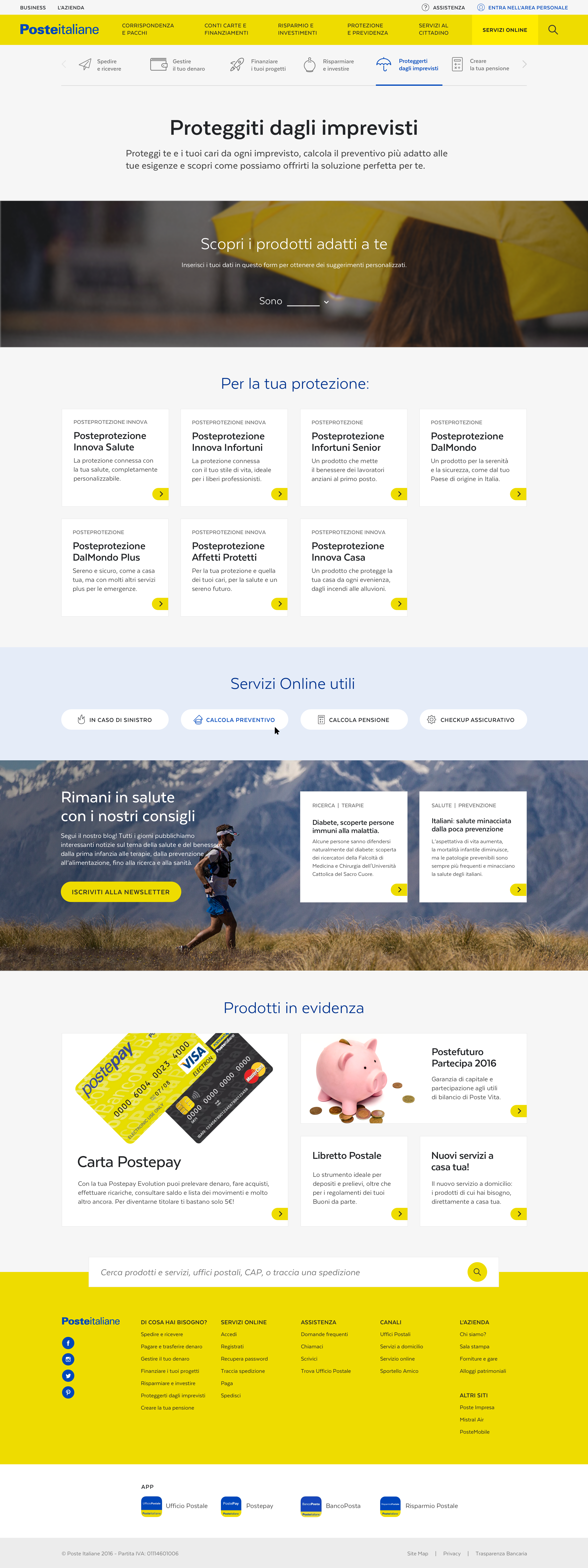
"NEEDS" TEMPLATE
Seven needs to explain the offer
To assist users who don't know which product to research, but are aware of their needs, we have designed a specific page covering the most common seven needs of Poste Italiane users: Send and Receive, Manage your Money, Finance your Project, Save and Invest, Protect from the Unforeseen, Planning your Retirement, Postage Services. Under each tab, the user sees all the products and services related to that need, and an easy wizard filters their search for them.
PRODUCT TEMPLATES
Well-defined and user-friendly product families
For each need, Poste Italiane has several product variants, so we designed two templates: Family and Product Specific. Family pages provide an overview of similar products with simplified information, while specific product pages offer a more in-depth look.
Family template
Product Specific template
SUB-BRAND TEMPLATE
A huge family of well-known products
Poste Italiane owns several sub-brands, which have become brands with their own recognizable identity and importance. We created a simple template displaying an overview of the brand, recommending related products and services, behaving as its own landing page.
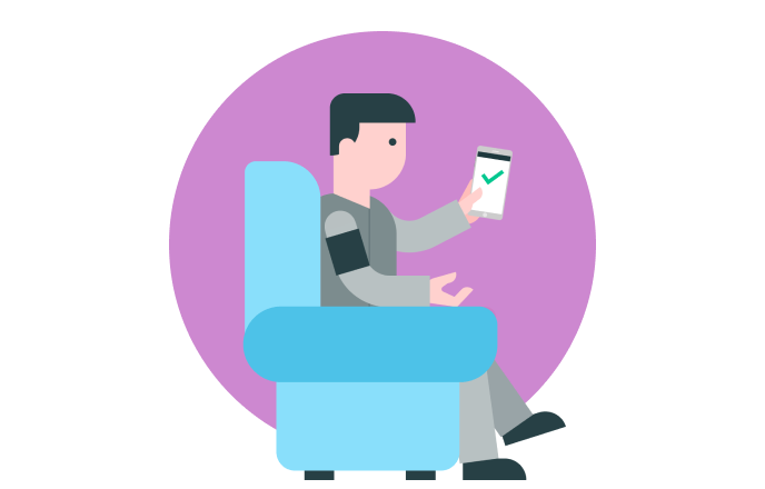
PERSONAL AREA
Giving the user a home
Within the personal area, the user can check and manage their business with Poste Italiane: from utilizing services and checking messages, to booking appointments and editing their profile.
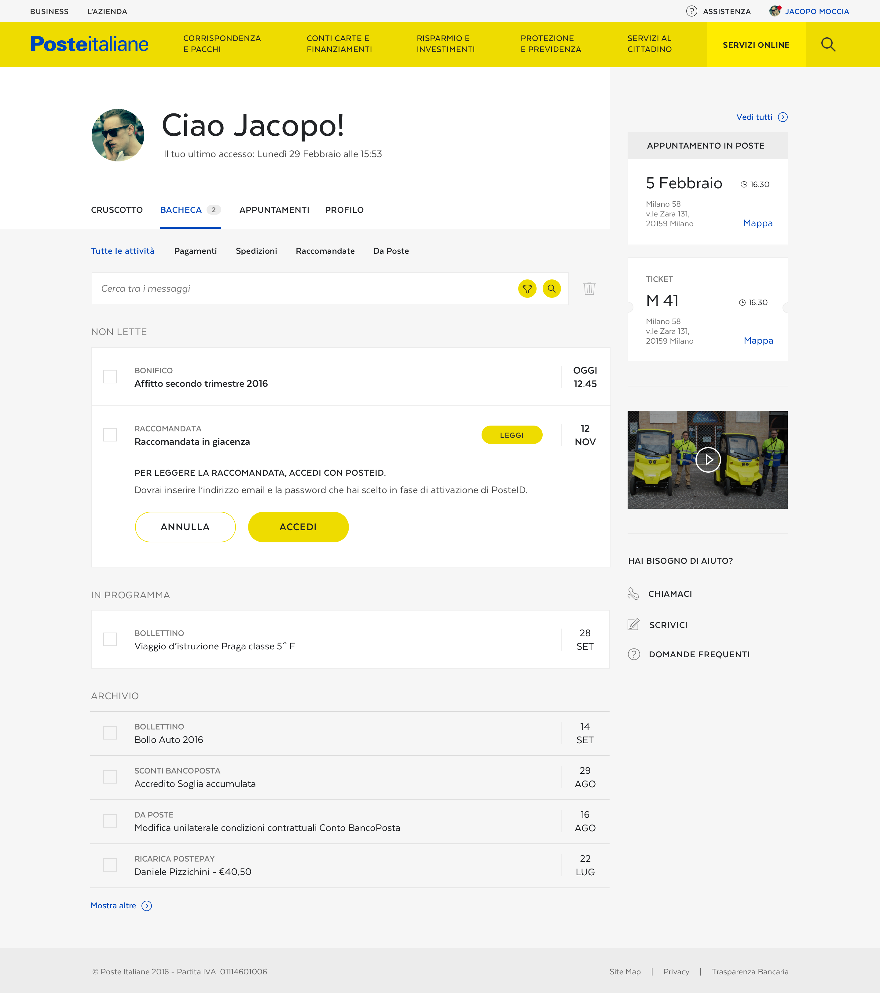
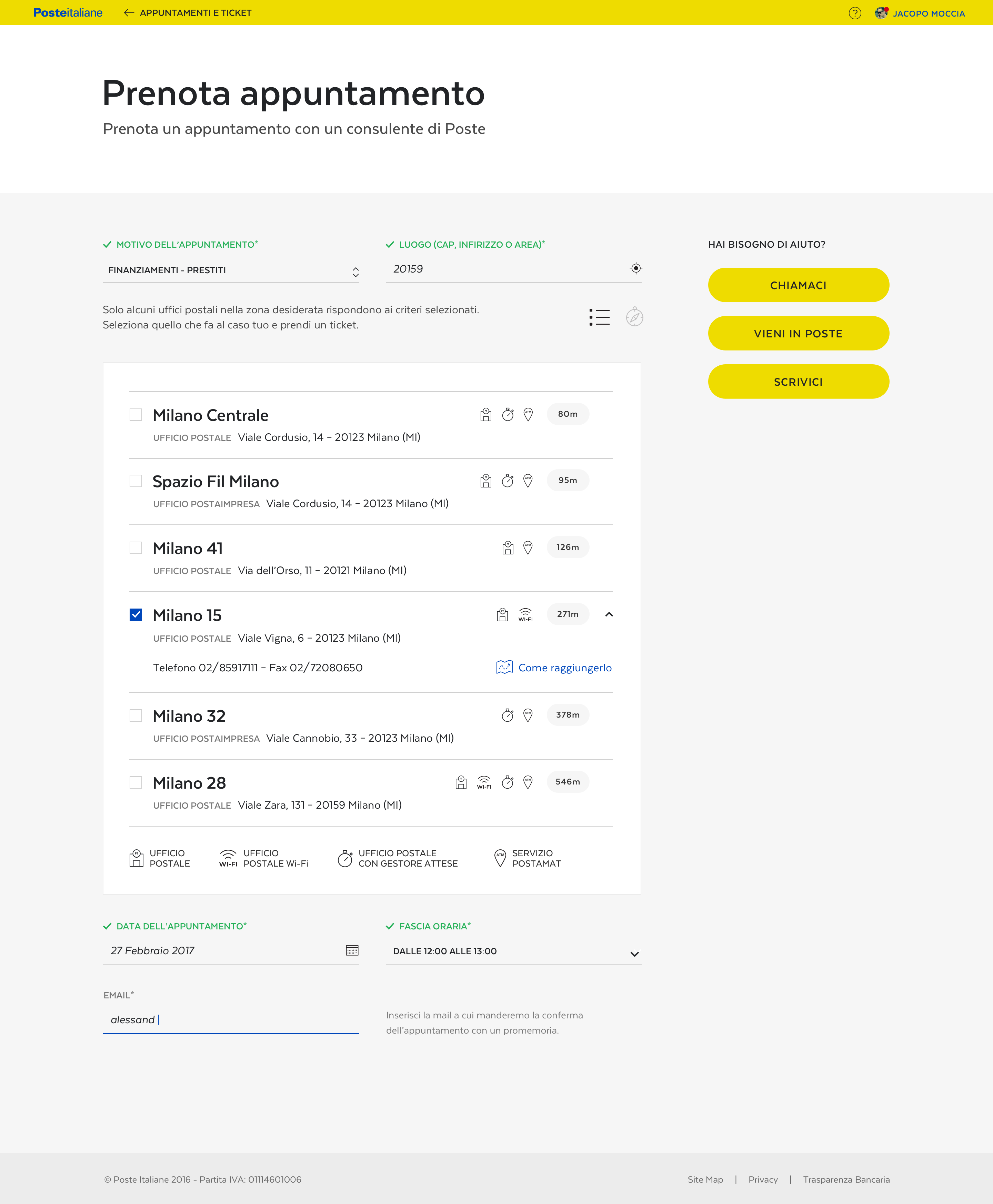
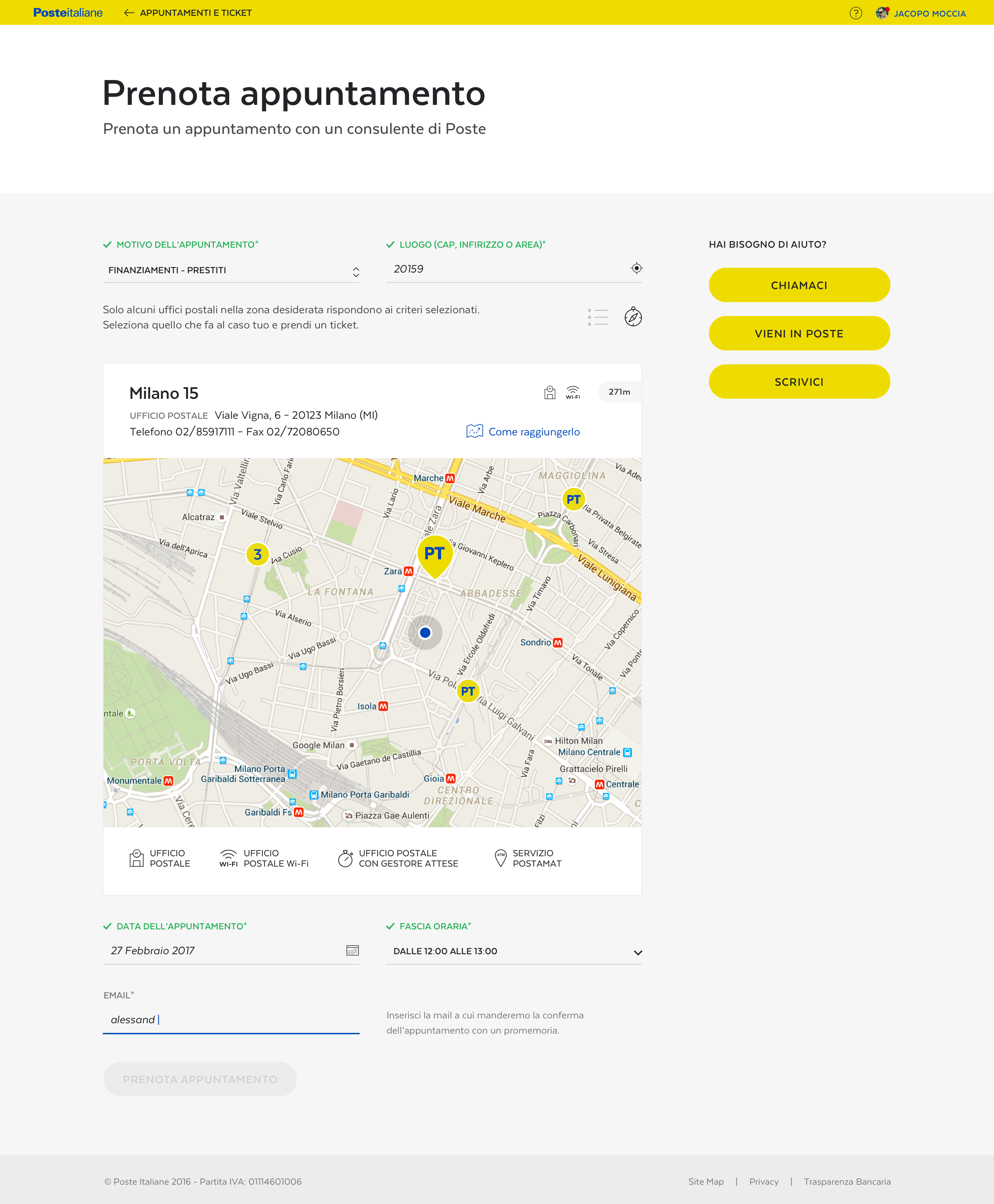
APPOINTMENT
Scheduling an in-person visit
Connected to the personal area and also present on the right-hand side of every page, the user is always invited to book an appointment at his favorite or closest post office: territory presence and personal touch being two extremely important pillars in Poste Italiane's customer service.
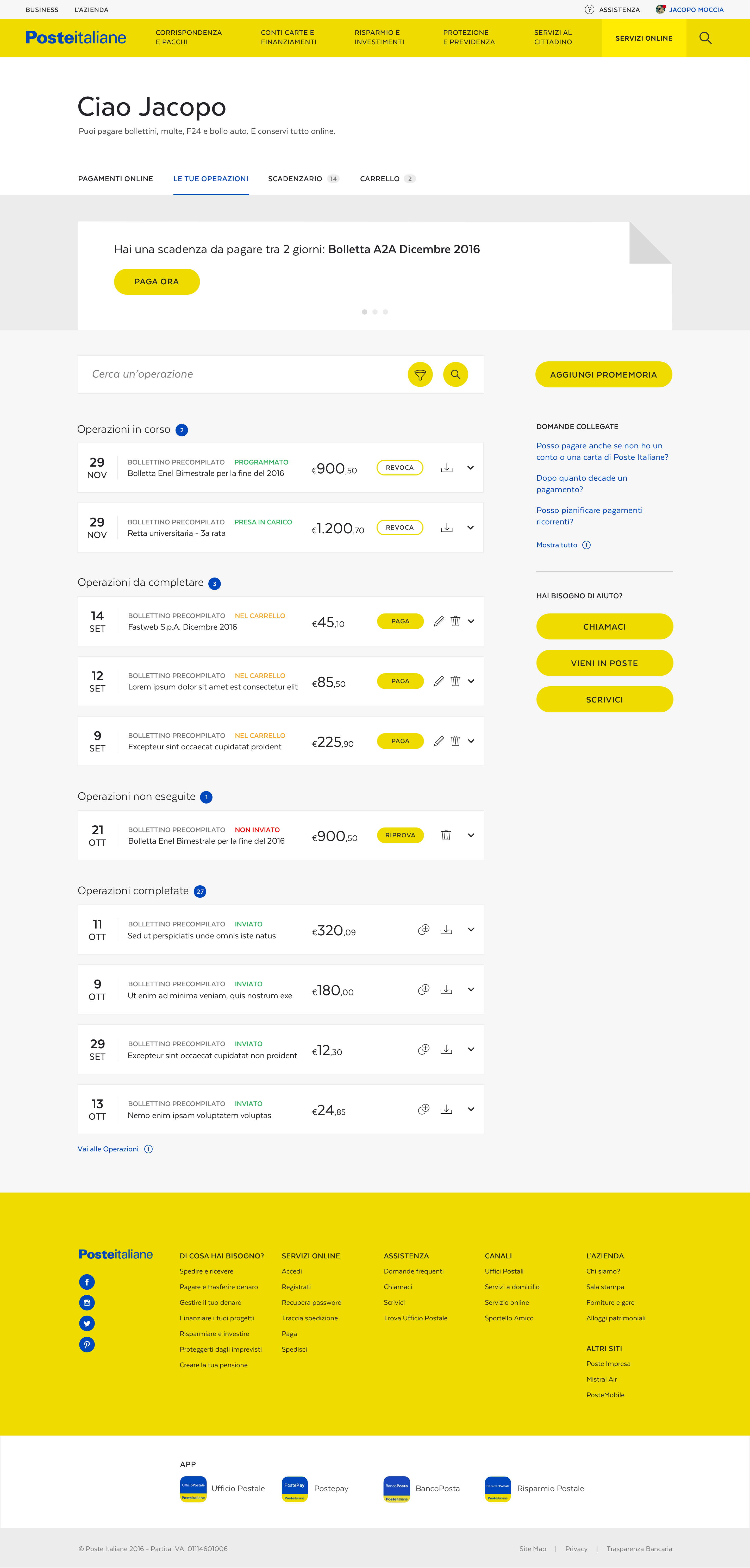
PAYMENT AREA
Everyday payments for everyday people
A dedicated page lets the user access payment services, explaining payment options and other relevant information. Once logged in, they can check their transaction history, and their list of upcoming bills/charges.
Payment page / Pre-login
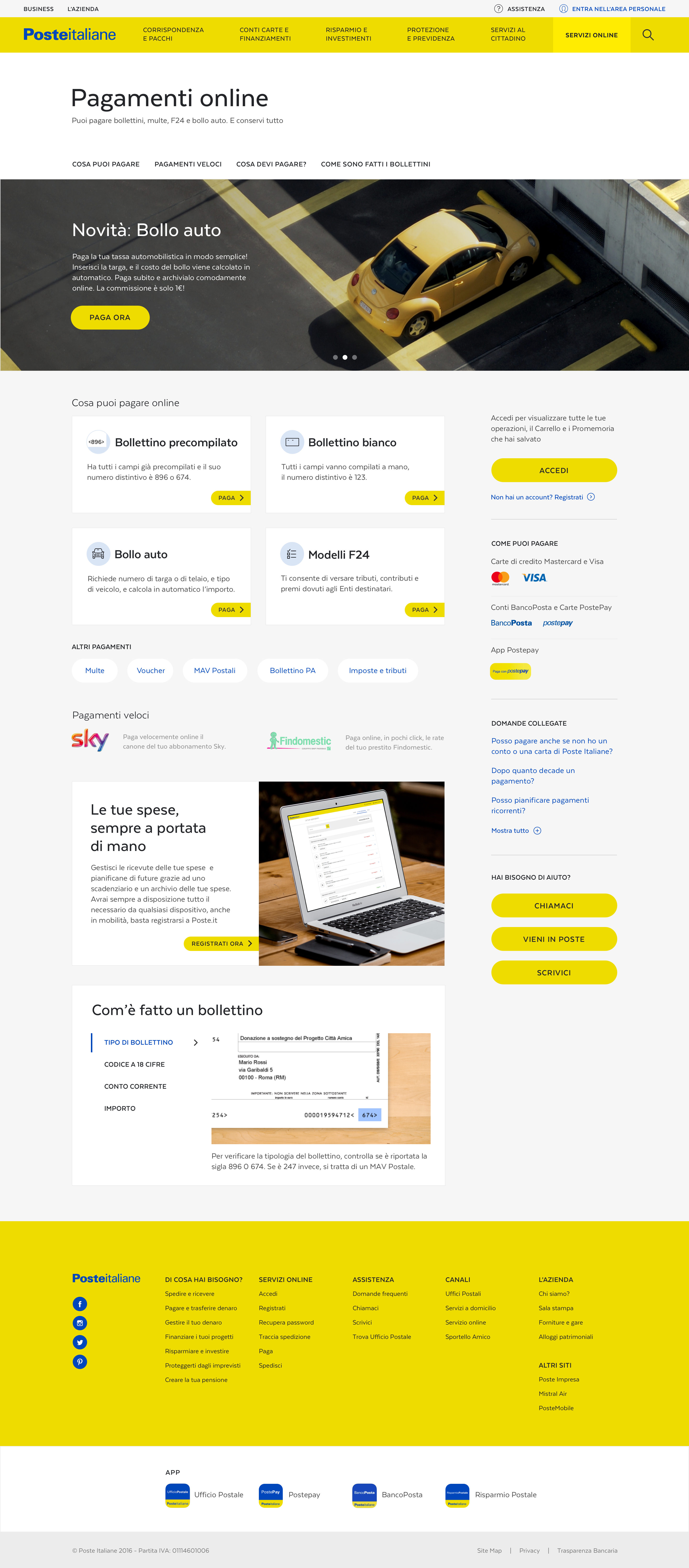
Payment area / Post-login
BIG PROJECT
Huge, complex, and demanding redesign
I'm not one to toot my own horn, but sometimes exceptions must be made. A lot of people including designers, quality assurance engineers, researchers, strategists, project managers, and so on were involved in this redesign – so, here are some numbers to dazzle!

594
UX templates

156
VD templates
498
Guidelines pages

+70mln
Monthly-views
Credits
Final thoughts
DESIGN
Gianluca Brugnoli, Creative Director
Laura Bordin, Team Lead
Daniele Lupatini, Interaction Designer
Mattia Parietti, Interaction Designer
Jacopo Pompilii, Interaction Designer
Marwa Boukarim, Visual Designer
Sofia Girelli, Visual Designer
Cristina Lusetti, Senior Quality Assurance
SPECIAL THANKS
Laura Licari, Antonello Crimi, Johan Heikensten, Paolo Decaro, Sara Manzini, Adriana Odor, Gabriele Salaris, Giorgio Cordiner, Luca Biego
This project was my first big redesign, requiring me to create an entire design system language from scratch. During this year of work, I experienced ups and downs. Some days I was eager to work on something that would be seen by millions of Italians, other days I would get bogged down seeing the same colors, typography, grid system, etc – frankly, I was never 100% on board with the yellow!
Still, I am grateful because I learned many lessons, some regarding design and teamwork, others related to stakeholder management. I'll be keeping these learnings always in mind, and – I cannot tell a lie – I prefer to work on shorter-term projects to ensure a high-level of engagement throughout the project.
Wanna see more?
Stove CookFood & Groceries, App
AirpenHealthcare, App
GoMobility, App
TabasReal Estate, Website

GrowBitEducation, App
Banco BPMFinance, App
WeBankFinance, App
GeneraliInsurance, Website
BPERFinance, App
Developers ItaliaPublic Services, Website
Docs ItaliaPublic Services, Website
Domicilio DigitalePublic Services, Website
Carrier PigeonNews & Information, App
Axa ItaliaInsurance, Website
DacadooHealthcare, Mobile App
BancoPostaFinance, App
Poste ItalianePostal Services, Website
AmicomedHealthcare, App
Buddy,
thanks for
scrolling
📬 WORK INQUIRIES
Got a project or an idea? Don't be shy, drop me a line, and let's make something cool!
📎 LINKS
© 2015–2022 Stefania Pizzichi
Special thanks to Aqquadro, Chobu, Shelby Morrison | Typeface Larsseit
Made with Semplice | Built with blood, sweat, and tears 🙌
